案例媒体
案例说明
这个页面把案例媒体、完整 Prompt 和出处放在一起,方便你先看结果,再判断这条 Prompt 是否值得复制、收藏或加入对比。
案例解读
为了方便搜索、引用和后续复用,这里会把案例的适用场景、画面重点和 Prompt 结构拆成更容易浏览的说明。
这类案例适合用在什么场景
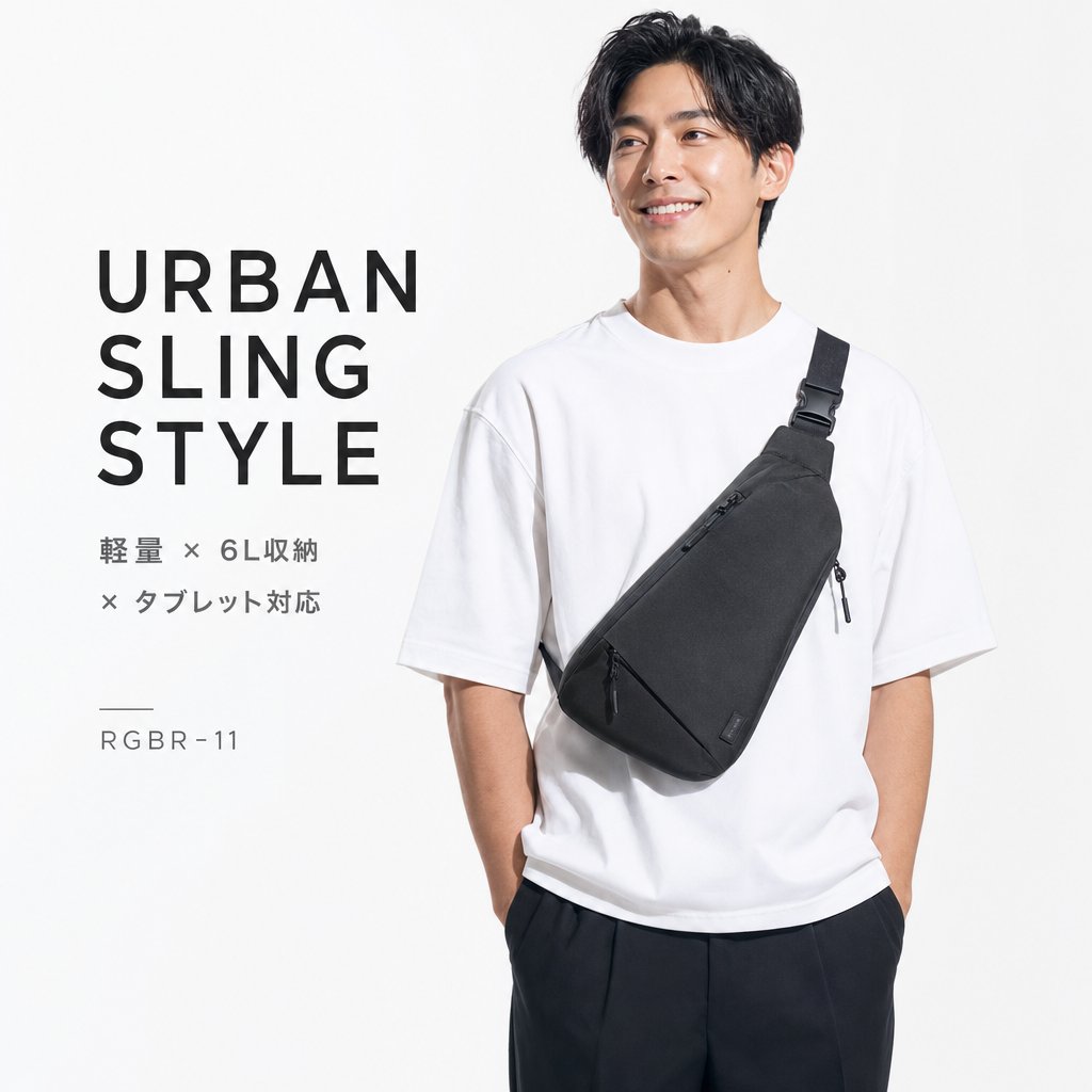
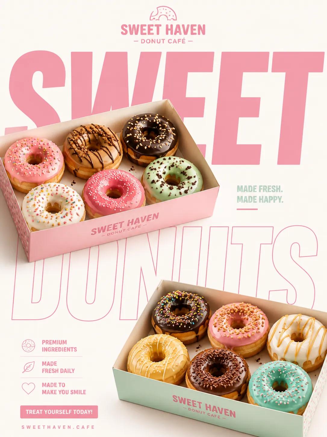
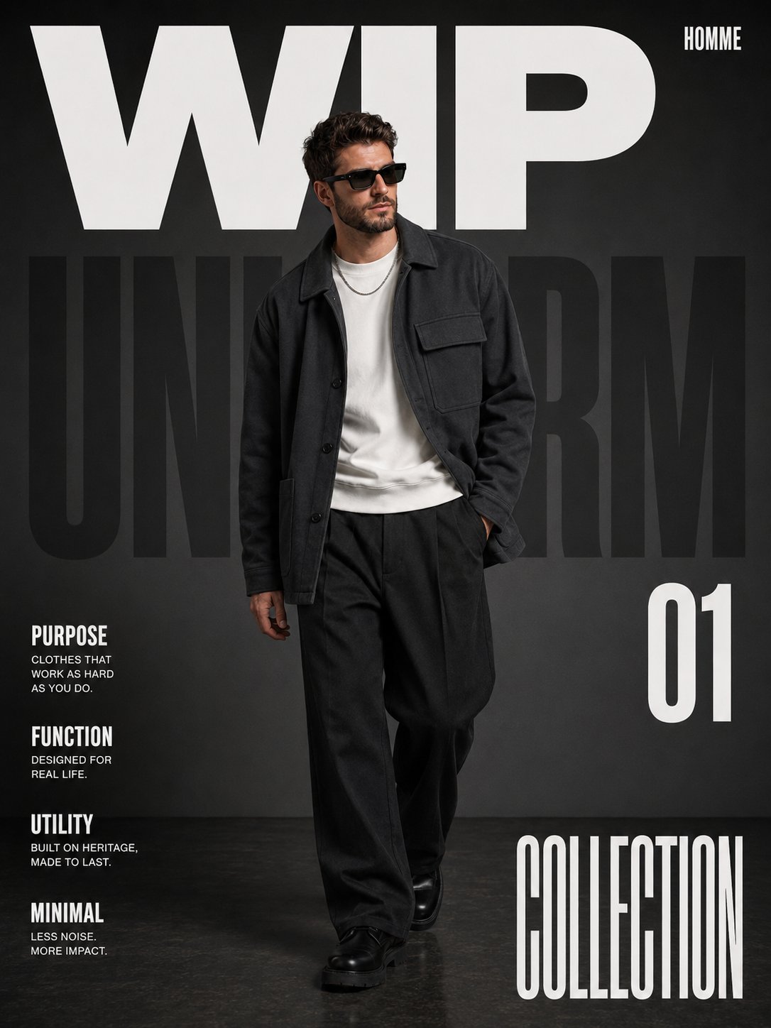
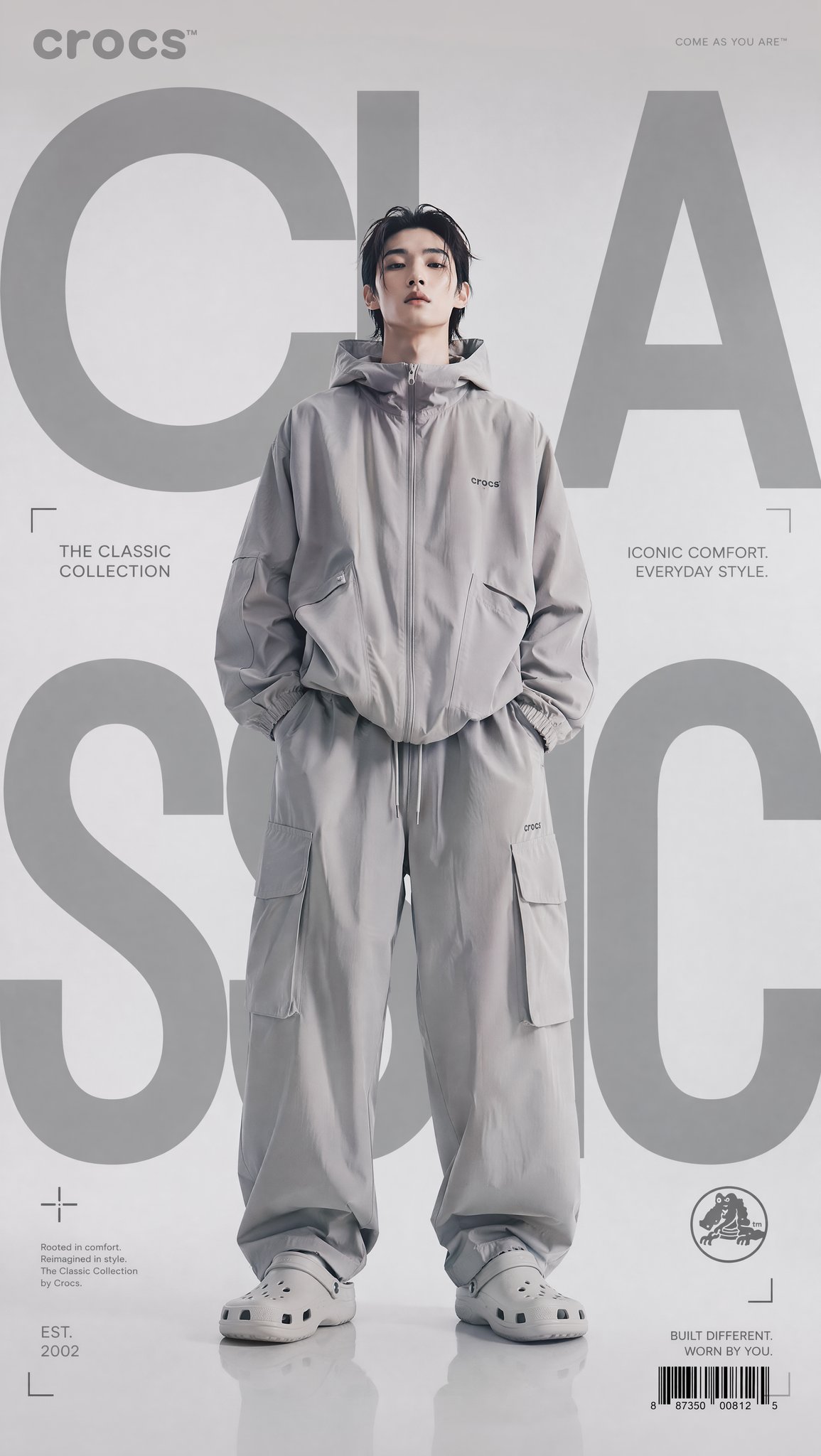
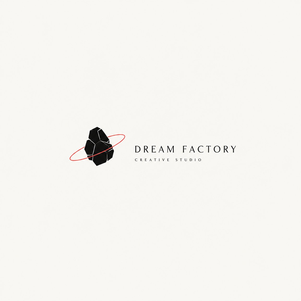
- 把它当作 人像与摄影 的基准案例最合适,先看成片方向,再决定自己的 Prompt 要往哪边改。
- 如果你的目标也落在 人像、时尚、海报 这些方向,这条案例特别适合先看图判断风格,再回头微调描述。
- 做 Prompt 对比时,也很适合作为控制组,只改一个变量去看结果变化。
画面重点与风格信号
- 这条案例最明显的风格信号集中在 人像、时尚、海报,所以第一次改写时最好先保留这些关键词。
- 重点先看构图、光线方向、人物姿态,以及主体和镜头之间的距离感。
- 当前保留了 2 份媒体输出,适合顺手观察同一方向在多张结果里的稳定性。
Prompt 结构可以怎么理解
- 这条 Prompt 整体属于一条比较长、约束条件很多的 Prompt,很适合拿来判断这类方向到底需要写到多细。
- 关键词簇主要围绕 人像、时尚、海报 展开,所以复用时可以先保留这组风格词,再替换主体、镜头、环境或文案信息。
- 最稳的改写方式通常是先保留结果方向和最强风格信号,只替换主体设定与场景块。
如果你是带着问题来的,可以先看这些角度
- 如果保留 人像、时尚、海报,只换主体题材,结果最先变化的会是哪一部分?
- 这条结果里,哪些特征更像是 人像与摄影 的结构特征,哪些又是标签风格本身带来的?
- 同分类的相关案例里,哪几条能给你更克制或更极致的相邻变体?
完整 Prompt
Please create a high-quality “Conceptual Narrative Minimal Logo” based on the following user inputs: [Brand Name / Project Name] [Subtitle / Product Name] [Industry / Category] [Brand Positioning] [Core Concept] [Metaphorical Motif] [Emotional Tone] [Primary Color] [Accent Color] [Aspect Ratio] 【User Input】 Brand Name / Project Name: [__________] Subtitle / Product Name: [__________] Industry / Category: [creative studio / visual lab / editorial project / independent fashion label / art space / publishing / architecture / music label / cultural brand / experimental project / etc.] Brand Positioning: [__________] Core Concept: [dream / control / distance / isolation / orbit / freedom / structure / memory / narrative / imagination / tension / future / etc.] Metaphorical Motif: [astronaut / orbit / rabbit ears / silhouette / marionette / box / thread / moon / hand / geometric structure / void / object / etc.] Emotional Tone: [quiet / restrained / poetic / cold / experimental / mysterious / intelligent / futuristic / minimal / conceptual / etc.] Primary Color: [black / white / gray / dark brown / charcoal / etc.] Accent Color: [small amount of red / muted red / subtle highlight / none] Aspect Ratio: [1:1 / 4:3 / 3:2] 【Creative Goal】 Design a “Conceptual Narrative Minimal Logo”. This is not a conventional commercial logo, not a decorative badge, and not a generic geometric icon. The goal is to create a logo that feels like a small visual idea: minimal, quiet, and concept-driven. The result should express the idea of “less is more”: less decoration, more meaning; less noise, more concept; less visual clutter, more narrative tension. 【Core Definition】 This type of logo should use: - a very small number of visual elements, - a strong sense of negative space, - a clear symbolic or metaphorical relationship, - restrained typography, - and a subtle narrative or conceptual layer. It should feel like a logo that belongs to an independent creative studio, an art-directed brand, an experimental project, or a design-led identity system. 【Essential Principles】 1. The logo must be minimal, but not empty. 2. The graphic must be simple, but not generic. 3. The symbol should carry metaphor, implication, or conceptual meaning. 4. The composition should use a lot of breathing room and negative space. 5. The logo should feel quiet, intentional, and art-directed. 6. Typography should be restrained, intelligent, and carefully placed. 7. The overall design should feel like a small visual statement, not a loud advertisement. 8. Avoid unnecessary decoration. 【Graphic Direction】 Create a minimal symbolic graphic, or a small narrative visual scene, based on the [Core Concept] and [Metaphorical Motif]. The graphic may include: - a simplified human silhouette, - a symbolic object, - a surreal relationship between a figure and a structure, - a small orbit or trajectory, - an abstract device-like form, - a geometric scene with narrative implication, - a metaphorical composition that suggests an idea rather than directly illustrating it. The graphic should: 1. be simple and highly distilled; 2. avoid excessive detail; 3. carry symbolic or poetic meaning; 4. suggest a story, relation, or emotional state; 5. feel conceptual rather than merely decorative. 【Typography Direction】 Typography must be minimal and controlled. Requirements: 1. The brand name should be clear and readable. 2. Typography should feel calm, modern, and deliberate. 3. It can be uppercase, small caps, narrow sans serif, or another restrained modern style. 4. Text should support the symbol, not overpower it. 5. The relationship between text and graphic should feel intentional and curated. 6. Subtitle / secondary text may be added in a very small amount if needed. 7. Avoid overly expressive, playful, or loud type. 【Composition Direction】 The overall composition should emphasize stillness and space. Requirements: 1. Use a lot of empty space. 2. Keep the main logo relatively small within the frame. 3. The symbol can sit left, center, or right, but the overall balance must feel refined. 4. The composition should feel like an identity presentation or a gallery-like display. 5. Small annotations, thin lines, or subtle structural alignments may be used if helpful. 6. Avoid making it feel like a poster, sticker sheet, or advertisement. 【Color Direction】 Keep the palette restrained. Recommended approach: - black, white, gray, charcoal, or deep neutral tones as the main palette; - optionally add a very small amount of red, muted red, or another subtle accent color; - the accent color should function as a point of tension, cut, orbit, line, or signal; - never let the accent color dominate the design; - avoid rich gradients and high-saturation color schemes. 【Mood & Aesthetic】 The final logo should feel: - minimal - conceptual - narrative - poetic - restrained - intelligent - art-directed - independent - experimental - less-is-more 【What to Avoid】 Please strictly avoid: 1. generic corporate logos; 2. decorative badge logos; 3. cute mascot logos; 4. overly geometric abstract marks with no meaning; 5. heavy ornament; 6. crowded compositions; 7. poster-like layouts; 8. colorful or noisy designs; 9. anything that feels generic, loud, or commercially over-explained. 【Output Requirement】 Generate one high-quality “Conceptual Narrative Minimal Logo” that communicates a clear idea through minimal form, strong negative space, and a quiet but meaningful symbolic gesture. The final result should feel like: a logo with a story, a symbol with tension, and a visual identity built on the principle that less is more.