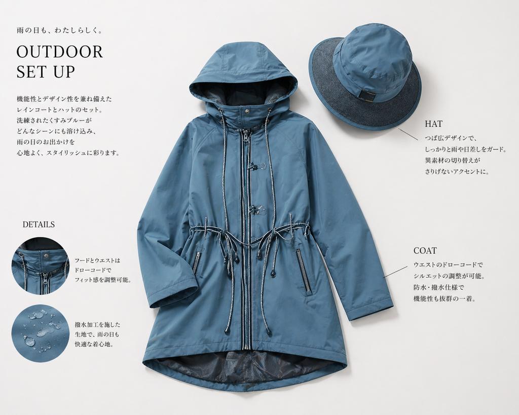
案例媒体
案例说明
这个页面把案例媒体、完整 Prompt 和出处放在一起,方便你先看结果,再判断这条 Prompt 是否值得复制、收藏或加入对比。
案例解读
为了方便搜索、引用和后续复用,这里会把案例的适用场景、画面重点和 Prompt 结构拆成更容易浏览的说明。
这类案例适合用在什么场景
- 把它当作 人像与摄影 的基准案例最合适,先看成片方向,再决定自己的 Prompt 要往哪边改。
- 如果你的目标也落在 人像、时尚、极简 这些方向,这条案例特别适合先看图判断风格,再回头微调描述。
- 做 Prompt 对比时,也很适合作为控制组,只改一个变量去看结果变化。
画面重点与风格信号
- 这条案例最明显的风格信号集中在 人像、时尚、极简,所以第一次改写时最好先保留这些关键词。
- 重点先看构图、光线方向、人物姿态,以及主体和镜头之间的距离感。
- 当前只有一张主图,所以第一张结果图就是最核心的参考基准。
Prompt 结构可以怎么理解
- 这条 Prompt 整体属于一条比较长、约束条件很多的 Prompt,很适合拿来判断这类方向到底需要写到多细。
- 关键词簇主要围绕 人像、时尚、极简 展开,所以复用时可以先保留这组风格词,再替换主体、镜头、环境或文案信息。
- 最稳的改写方式通常是先保留结果方向和最强风格信号,只替换主体设定与场景块。
如果你是带着问题来的,可以先看这些角度
- 如果保留 人像、时尚、极简,只换主体题材,结果最先变化的会是哪一部分?
- 这条结果里,哪些特征更像是 人像与摄影 的结构特征,哪些又是标签风格本身带来的?
- 同分类的相关案例里,哪几条能给你更克制或更极致的相邻变体?
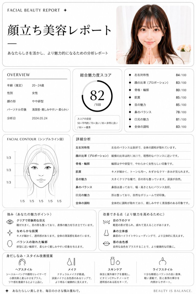
完整 Prompt
Using REFERENCE_0, turn the uploaded portrait into a clean, premium Japanese aesthetic analysis dashboard titled {argument name="headline text" default="顔立ち美容レポート"}. Keep the same photo as the source image, including the face blur/censor, and place it in a rounded card at the top right. Reformat the output as a white editorial report page with thin gray borders, black typography, and a luxury beauty-consultation layout. Add these 8 report sections: 1) top header with small English text "FACIAL BEAUTY REPORT ✦", the large Japanese title, and the subtitle "あなたらしさを活かし、より魅力的になるための分析レポート"; 2) an OVERVIEW box listing exactly 5 rows: 年齢(推定) 20–24歳, 性別 女性, 顔の形 やや卵型, パーソナル印象 清潔感・親しみやすい・柔らかい, 分析日 2024.05.24; 3) a total score box labeled 総合魅力度スコア with a circular gauge showing {argument name="total score" default="82"}/100 and a small score guide reading 50=平均的 / 70=良い / 85=非常に良い / 90+=優秀; 4) a metrics box with exactly 7 bullet scores: 左右対称性 84/100, 顔の比率(プロポーション) 83/100, 骨格・輪郭 80/100, 肌質 85/100, 目の魅力 85/100, 鼻のバランス 78/100, 口元の魅力 81/100, 全体の調和 83/100; 5) a FACIAL CONTOUR(シンプルライン図) panel showing a simplified line-art face diagram with the blurred face area masked and measurement guides labeled exactly 1/3, 1/3, 1/3 vertically and 1/5 repeated 5 times along the bottom; 6) a 詳細分析 section with exactly 8 rows matching the metrics above and short explanatory Japanese comments; 7) a strengths box titled 強み(あなたの魅力ポイント) with exactly 3 icon-led items: クリアで印象的な目元, なめらかな肌質, バランスの取れた輪郭; 8) an improvements box titled 改善できる点(より魅力を高めるために) with exactly 3 icon-led items: 目の下のクマ, 鼻の立体感, 唇の血色感; 9) a final recommendation row titled 身だしなみ・スタイル改善提案 with exactly 4 columns labeled ヘアスタイル, メイク, スキンケア, ライフスタイル, each with a simple black line icon and short Japanese advice. Add a small footer line on the bottom right reading {argument name="footer text" default="BEAUTY IS BALANCE."}. Overall style: minimalist clinic report, balanced grid layout, soft shadows, rounded panels, black and gray only, highly legible Japanese magazine design.