案例媒体
案例说明
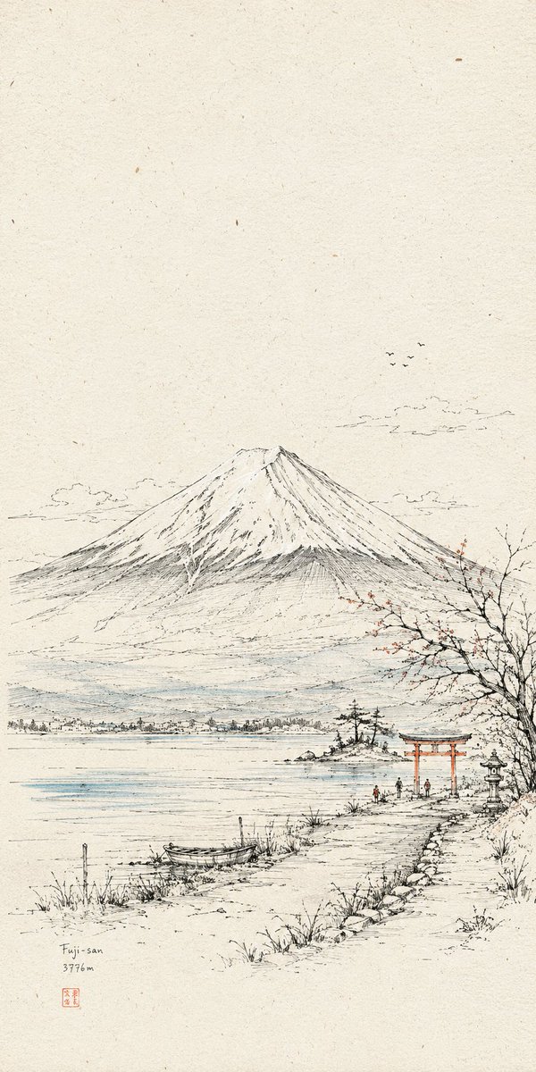
这个页面把案例媒体、完整 Prompt 和出处放在一起,方便你先看结果,再判断这条 Prompt 是否值得复制、收藏或加入对比。
案例解读
为了方便搜索、引用和后续复用,这里会把案例的适用场景、画面重点和 Prompt 结构拆成更容易浏览的说明。
这类案例适合用在什么场景
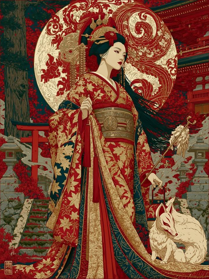
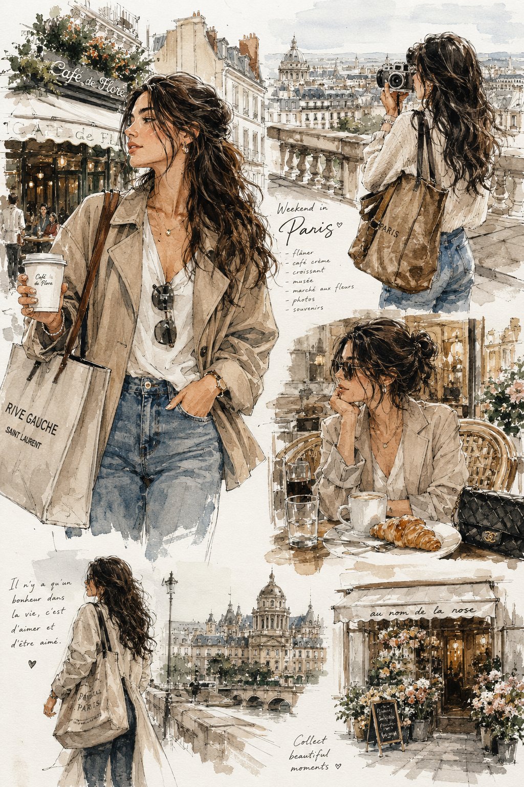
- 把它当作 人像与摄影 的基准案例最合适,先看成片方向,再决定自己的 Prompt 要往哪边改。
- 如果你的目标也落在 人像、插画、城市视觉 这些方向,这条案例特别适合先看图判断风格,再回头微调描述。
- 做 Prompt 对比时,也很适合作为控制组,只改一个变量去看结果变化。
画面重点与风格信号
- 这条案例最明显的风格信号集中在 人像、插画、城市视觉,所以第一次改写时最好先保留这些关键词。
- 重点先看构图、光线方向、人物姿态,以及主体和镜头之间的距离感。
- 当前保留了 4 份媒体输出,适合顺手观察同一方向在多张结果里的稳定性。
Prompt 结构可以怎么理解
- 这条 Prompt 整体属于一条比较长、约束条件很多的 Prompt,很适合拿来判断这类方向到底需要写到多细。
- 关键词簇主要围绕 人像、插画、城市视觉 展开,所以复用时可以先保留这组风格词,再替换主体、镜头、环境或文案信息。
- 最稳的改写方式通常是先保留结果方向和最强风格信号,只替换主体设定与场景块。
如果你是带着问题来的,可以先看这些角度
- 如果保留 人像、插画、城市视觉,只换主体题材,结果最先变化的会是哪一部分?
- 这条结果里,哪些特征更像是 人像与摄影 的结构特征,哪些又是标签风格本身带来的?
- 同分类的相关案例里,哪几条能给你更克制或更极致的相邻变体?
完整 Prompt
Generate a paper-based line drawing visual work based on a specific theme. The image is first established by extremely fine, slightly shaky hand-drawn lines to build space, subject outline, structural transitions, paths, and scale relationships. Then, a few high-purity color surfaces are introduced only to the most critical recognition planes, connection nodes, emotional pauses, and centers of gravity; color is not a full fill but acts as precise annotations to edit attention. The overall visual area is dominated by warm off-white paper and black fine lines. Paper texture, tiny spots, and a slight scan feel should be clearly present. Ample white space is reserved above or around to make the subject appear as if observed in a page of a travel manuscript. Visual weight is concentrated in the middle or lower-middle part, maintaining breathable distance around the subject. The composition consists of a clear anchor, a low-density environment layer, and a few colored nodes. The core object maintains recognizable structural lines, outlines, local hatching, and compressed details. Details gather along edges, openings, corners, and movement paths. Volume and shadows are achieved through fine hatching and varying line density. Background appears as a low-density line-art memory layer. Added tiny figures or symbols serve as scale 'noise' to give a sense of life and usage. If text is needed, use narrow, restrained annotation-style fonts. The final surface shows the finish of pen line drawing, colored pencil, or light ink overlay, with quiet, open, manual textures and slight perspective errors. Theme: {argument name="subject" default="Close-up of the Great Hall of the People"} Aspect Ratio: {argument name="ratio" default="1:2"} Usage: {argument name="usage" default="Mobile wallpaper"}