案例媒体
案例说明
这个页面把案例媒体、完整 Prompt 和出处放在一起,方便你先看结果,再判断这条 Prompt 是否值得复制、收藏或加入对比。
案例解读
为了方便搜索、引用和后续复用,这里会把案例的适用场景、画面重点和 Prompt 结构拆成更容易浏览的说明。
这类案例适合用在什么场景
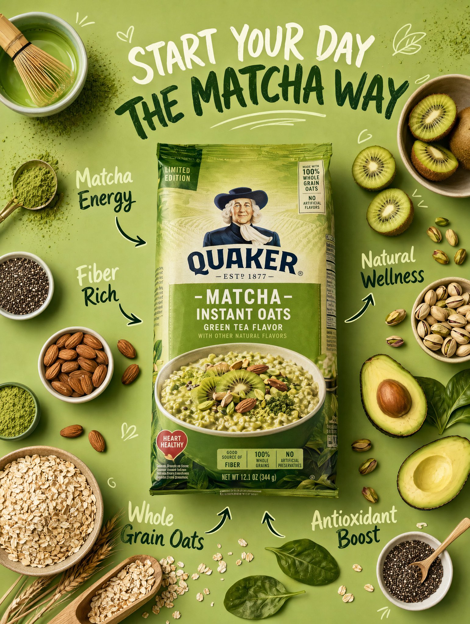
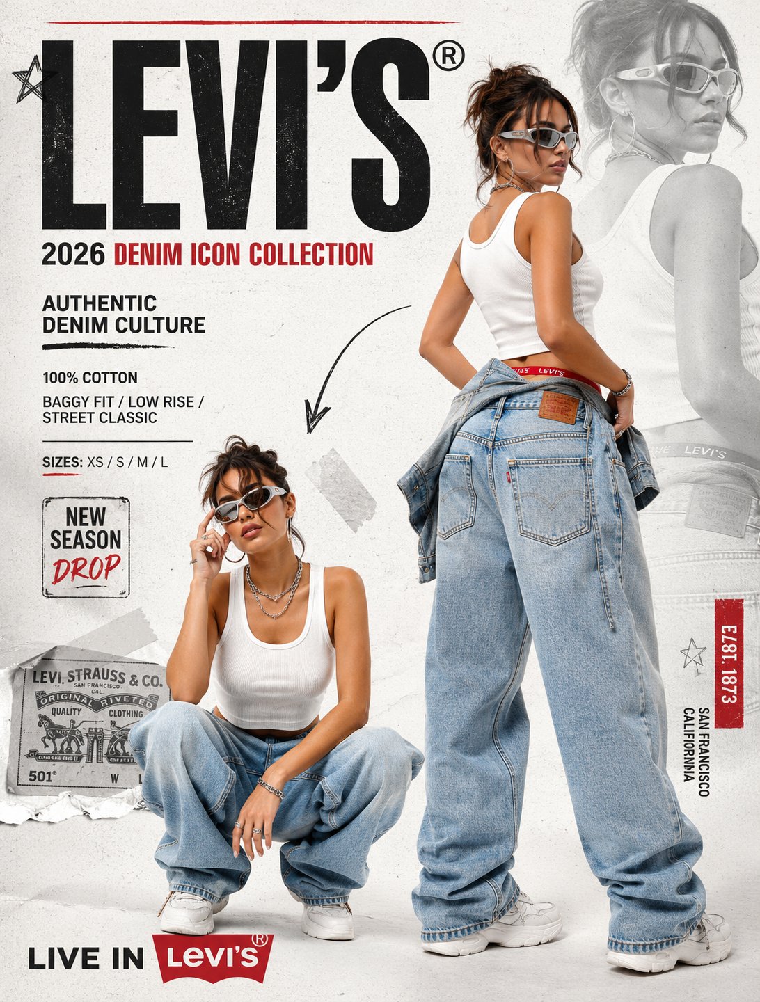
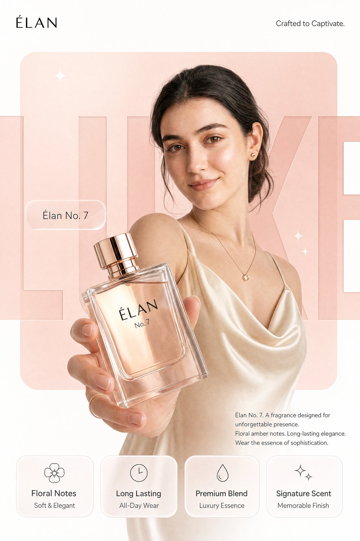
- 把它当作 人像与摄影 的基准案例最合适,先看成片方向,再决定自己的 Prompt 要往哪边改。
- 如果你的目标也落在 霓虹、人像、时尚 这些方向,这条案例特别适合先看图判断风格,再回头微调描述。
- 做 Prompt 对比时,也很适合作为控制组,只改一个变量去看结果变化。
画面重点与风格信号
- 这条案例最明显的风格信号集中在 霓虹、人像、时尚,所以第一次改写时最好先保留这些关键词。
- 重点先看构图、光线方向、人物姿态,以及主体和镜头之间的距离感。
- 当前保留了 2 份媒体输出,适合顺手观察同一方向在多张结果里的稳定性。
Prompt 结构可以怎么理解
- 这条 Prompt 整体属于一条比较长、约束条件很多的 Prompt,很适合拿来判断这类方向到底需要写到多细。
- 关键词簇主要围绕 霓虹、人像、时尚 展开,所以复用时可以先保留这组风格词,再替换主体、镜头、环境或文案信息。
- 最稳的改写方式通常是先保留结果方向和最强风格信号,只替换主体设定与场景块。
如果你是带着问题来的,可以先看这些角度
- 如果保留 霓虹、人像、时尚,只换主体题材,结果最先变化的会是哪一部分?
- 这条结果里,哪些特征更像是 人像与摄影 的结构特征,哪些又是标签风格本身带来的?
- 同分类的相关案例里,哪几条能给你更克制或更极致的相邻变体?
完整 Prompt
REFERENCE IMAGE INSTRUCTION: Use the uploaded product photo as the exact source of truth for the product's appearance, color, finish, branding, and form factor. Do not invent or alter any product detail. Reproduce it with photorealistic precision. --- Create a photorealistic premium [PRODUCT CATEGORY] campaign poster in a 4:5 vertical aspect ratio. Design it as a clean global OOH, digital, and social campaign layout with strict grid alignment, premium white space, and precise typography. The campaign idea is "[CAMPAIGN TAGLINE]," but do not render that phrase as visible text. Use a strict 12-column poster grid with 6% outer margins. Keep all text aligned to this grid. The image has four layers: background shape, giant background typography, subject/product photography, and clean graphic text overlays. BACKGROUND: Pure matte white canvas. Place one large rounded-rectangle block behind the subject, occupying roughly 70% of the poster height and 76% of the width, centered slightly above the middle. The block uses a controlled [PRIMARY BRAND COLOR] gradient, glowing gently from top-left to bottom-right. Behind the subject and product, place giant cropped typography reading "[BACKGROUND HERO WORD]" in ultra-bold geometric sans-serif letters. The word is a background layer only: huge, partially cropped by the frame edges, wide letter spacing, darker [PRIMARY BRAND COLOR] than the rectangle, subtle embossed depth, soft shadow, and low enough contrast that it does not fight the product. SUBJECT AND PRODUCT: [DESCRIBE MODEL OR SUBJECT — e.g., "a female model with a clean editorial look, neutral confident expression, natural slightly wind-touched hair, muted off-white outfit, and [ACCENT COLOR] jacket"]. Shoot from a slightly low hero angle. Body angled for depth, face turned toward the viewer with direct eye contact. One hand extends toward the camera holding the product from the uploaded reference image. The product is the dominant foreground object, slightly tilted to reveal [KEY PRODUCT DETAIL — e.g., "the triple camera system, brushed titanium edges, and centered brand logo"]. Keep the product sharp with realistic surface reflections, material texture, faint micro-details, and soft bloom around premium features. Keep the model's face readable behind it. LIGHTING: Soft studio key light from front-left, warm rim light from the right, and subtle [PRIMARY BRAND COLOR] bounce from the background block. Skin remains natural and non-airbrushed with realistic catchlights. Product edges have clean [MATERIAL FINISH — e.g., "metallic / matte / glossy"] highlights. Shadows are soft and controlled. TYPOGRAPHY OVERLAY: All text must be flat, crisp, perfectly aligned graphic typography — not painted onto the scene. Render exactly these text elements once, with no extra text: Top left, small black logo: [BRAND LOGO NAME/MARK] Top right, thin sans-serif: "[BRAND SUB-TAGLINE — e.g., 'Built for Apple Intelligence.']" Mid left, glassmorphism pill: "[PRODUCT NAME — e.g., 'iPhone 17 Pro']" Large background type: "[BACKGROUND HERO WORD]" Bottom right body copy, small clean sans-serif: "[PRODUCT NAME]. [POWER STATEMENT — one sentence.] [FEATURE 1]. [FEATURE 2]. [CLOSING LINE — e.g., 'Designed for what's next.']" BOTTOM FEATURE STRIP: Place four equal-width glass-white rounded cards along the bottom, aligned to the grid, same height, same spacing, same baseline alignment. Each card has one minimal line icon above the heading. Render exactly: Card 1: "[FEATURE HEADING 1]" / "[FEATURE SUBLINE 1]" Card 2: "[FEATURE HEADING 2]" / "[FEATURE SUBLINE 2]" Card 3: "[FEATURE HEADING 3]" / "[FEATURE SUBLINE 3]" Card 4: "[FEATURE HEADING 4]" / "[FEATURE SUBLINE 4]" GRAPHIC DETAILS: Two or three small sparkle icons only, subtle grain, soft glassmorphism, controlled [PRIMARY BRAND COLOR]-white-[ACCENT COLOR] palette, no neon, no oversaturation.