案例媒体
案例说明
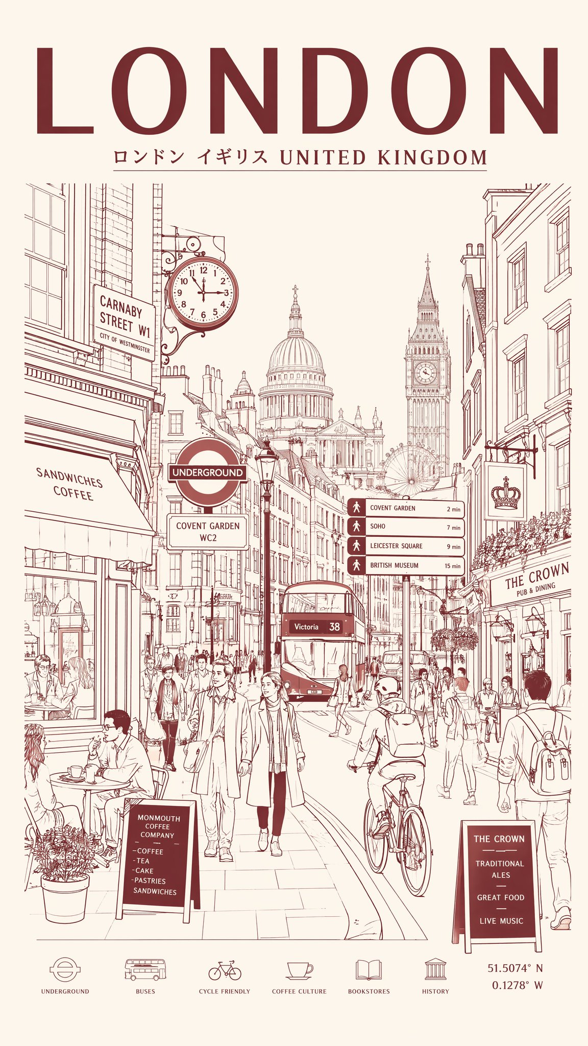
这个页面把案例媒体、完整 Prompt 和出处放在一起,方便你先看结果,再判断这条 Prompt 是否值得复制、收藏或加入对比。
案例解读
为了方便搜索、引用和后续复用,这里会把案例的适用场景、画面重点和 Prompt 结构拆成更容易浏览的说明。
这类案例适合用在什么场景
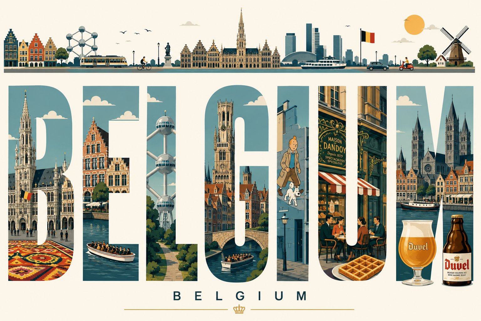
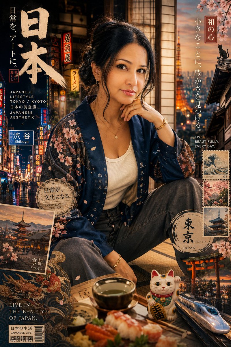
- 把它当作 人像与摄影 的基准案例最合适,先看成片方向,再决定自己的 Prompt 要往哪边改。
- 如果你的目标也落在 霓虹、人像、时尚 这些方向,这条案例特别适合先看图判断风格,再回头微调描述。
- 做 Prompt 对比时,也很适合作为控制组,只改一个变量去看结果变化。
画面重点与风格信号
- 这条案例最明显的风格信号集中在 霓虹、人像、时尚,所以第一次改写时最好先保留这些关键词。
- 重点先看构图、光线方向、人物姿态,以及主体和镜头之间的距离感。
- 当前保留了 2 份媒体输出,适合顺手观察同一方向在多张结果里的稳定性。
Prompt 结构可以怎么理解
- 这条 Prompt 整体属于一条比较长、约束条件很多的 Prompt,很适合拿来判断这类方向到底需要写到多细。
- 关键词簇主要围绕 霓虹、人像、时尚 展开,所以复用时可以先保留这组风格词,再替换主体、镜头、环境或文案信息。
- 最稳的改写方式通常是先保留结果方向和最强风格信号,只替换主体设定与场景块。
如果你是带着问题来的,可以先看这些角度
- 如果保留 霓虹、人像、时尚,只换主体题材,结果最先变化的会是哪一部分?
- 这条结果里,哪些特征更像是 人像与摄影 的结构特征,哪些又是标签风格本身带来的?
- 同分类的相关案例里,哪几条能给你更克制或更极致的相邻变体?
完整 Prompt
Create an ultra-high-resolution minimalist line-art travel poster of [CITY DESTINATION], portraying the city as a stylish everyday urban scene rather than a tourist postcard.CORE COMPOSITION: Central composition features the city’s most iconic street, avenue, tram route, pedestrian district, or urban intersection Foreground includes commuters, cyclists, café visitors, tourists, students, business professionals, and pedestrians naturally interacting People should reflect the authentic local lifestyle and fashion culture of the city Background filled with realistic storefronts, cafés, restaurants, transportation signage, local businesses, bicycles, street furniture, and architectural details Major landmarks should appear subtly integrated into everyday city life, never oversized or exaggerated Include authentic local-language typography, transit signs, shop signage, menus, and culturally recognizable visual elements Large bold typography at the top center: [CITY NAME] Subtitle below: local language + country name STYLE: ultra-clean vector illustration Swiss modernist travel poster aesthetic minimalist monoline drawing mid-century editorial design architectural illustration Japanese-inspired graphic poster style precise geometric perspective extremely clean negative space premium luxury travel branding aesthetic LINE STYLE: monochrome line-art illustration only thin and highly precise linework minimal fill areas intricate architectural and street-detail density rhythmic layering of signs, buildings, windows, vehicles, and street objects visually dense yet highly organized composition COLOR SYSTEM — VERY IMPORTANT: use ONLY one main color + one background color Main color: deep muted maroon / burgundy inspired by vintage Japanese travel posters Background: warm cream / ivory paper tone monochrome silkscreen poster aesthetic no neon or rainbow palettes timeless premium atmosphere COMPOSITION: vertical 4:5 poster layout frontal street-level perspective natural pedestrian movement balanced visual rhythm and layering should feel like a premium city-brand campaign poster MOOD: calm but lively urban atmosphere editorial travel magazine cover aesthetic timeless city identity elegant and sophisticated minimal yet highly detailed TEXT QUALITY — EXTREMELY IMPORTANT: all typography must be readable and professionally aligned no distorted or broken letters authentic local signage style clean editorial typography hierarchy OUTPUT: vertical poster composition 8K ultra detailed print-ready ultra-sharp vector quality refined monochrome maroon aesthetic similar to vintage Japanese city posters