案例媒体
案例说明
这个页面把案例媒体、完整 Prompt 和出处放在一起,方便你先看结果,再判断这条 Prompt 是否值得复制、收藏或加入对比。
案例解读
为了方便搜索、引用和后续复用,这里会把案例的适用场景、画面重点和 Prompt 结构拆成更容易浏览的说明。
这类案例适合用在什么场景
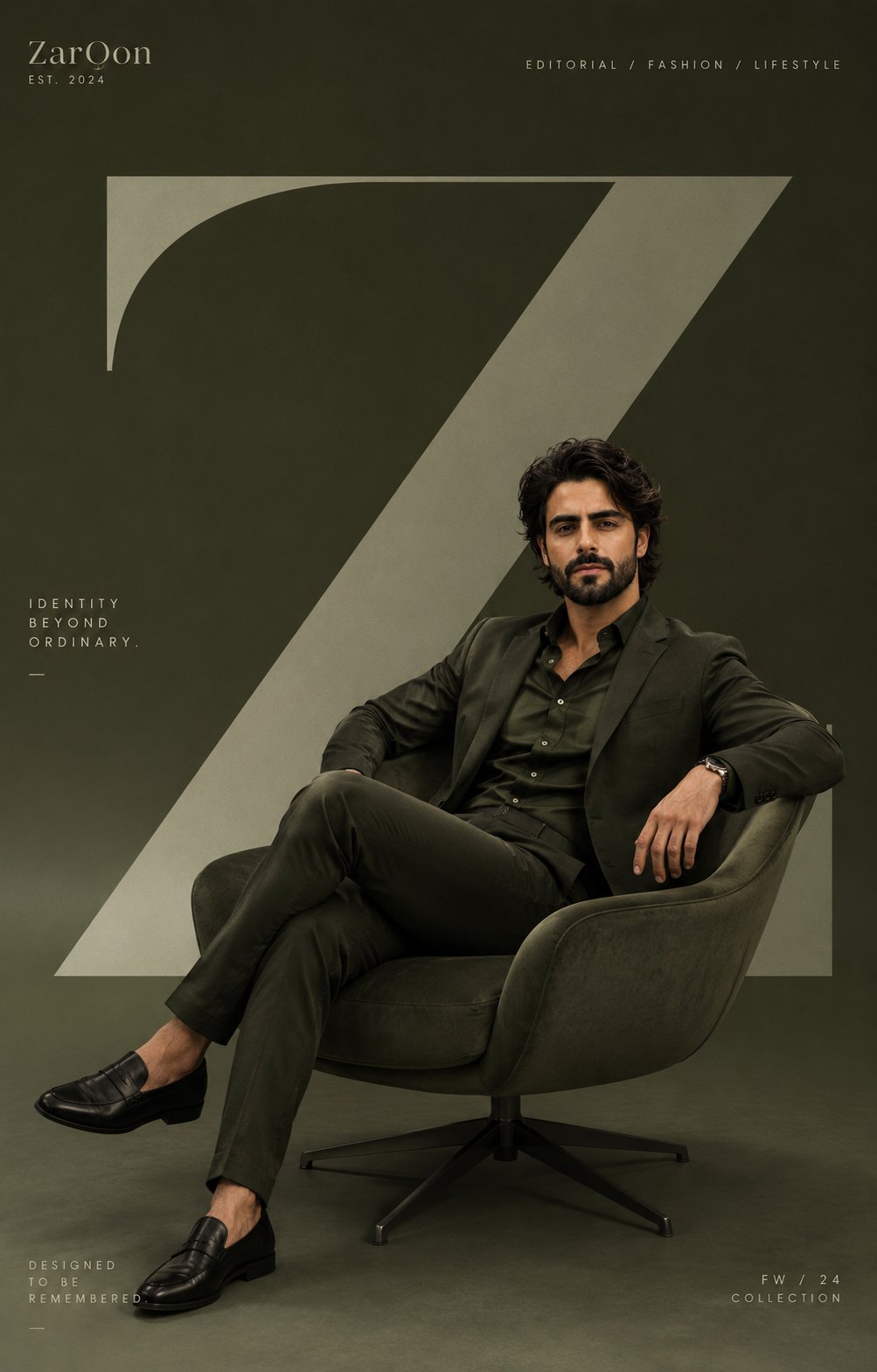
- 把它当作 人像与摄影 的基准案例最合适,先看成片方向,再决定自己的 Prompt 要往哪边改。
- 如果你的目标也落在 人像、电影感、时尚 这些方向,这条案例特别适合先看图判断风格,再回头微调描述。
- 做 Prompt 对比时,也很适合作为控制组,只改一个变量去看结果变化。
画面重点与风格信号
- 这条案例最明显的风格信号集中在 人像、电影感、时尚,所以第一次改写时最好先保留这些关键词。
- 重点先看构图、光线方向、人物姿态,以及主体和镜头之间的距离感。
- 当前保留了 2 份媒体输出,适合顺手观察同一方向在多张结果里的稳定性。
Prompt 结构可以怎么理解
- 这条 Prompt 整体属于一条比较长、约束条件很多的 Prompt,很适合拿来判断这类方向到底需要写到多细。
- 关键词簇主要围绕 人像、电影感、时尚 展开,所以复用时可以先保留这组风格词,再替换主体、镜头、环境或文案信息。
- 最稳的改写方式通常是先保留结果方向和最强风格信号,只替换主体设定与场景块。
如果你是带着问题来的,可以先看这些角度
- 如果保留 人像、电影感、时尚,只换主体题材,结果最先变化的会是哪一部分?
- 这条结果里,哪些特征更像是 人像与摄影 的结构特征,哪些又是标签风格本身带来的?
- 同分类的相关案例里,哪几条能给你更克制或更极致的相邻变体?
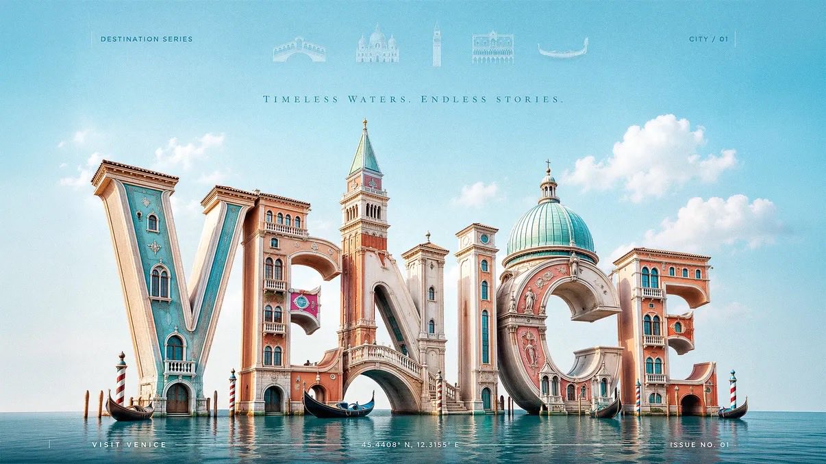
完整 Prompt
Create a 3:2 premium 3D typography-based travel poster for [CITY], using luxury editorial destination advertising fused with realistic sculptural letterform architecture. The city name “[CITY]” must be the dominant subject, occupying most of the canvas. Build the letters as large, realistic, three-dimensional sculptural forms made from glossy painted material, polished ceramic, soft plaster, carved stone, sunlit architectural surfaces, or city-adaptive materials. Each letter should physically transform into the city’s identity: landmarks, skyline silhouettes, arches, towers, domes, bridges, windows, balconies, cultural patterns, coastal forms, or street details must grow directly out of the letterforms. Landmarks should feel architecturally integrated, not pasted behind or around the word. A tower may rise from a vertical stem, a bridge may connect two letters, a dome may form the curve of a rounded letter, rooftops may shape the top edges, and windows or ornamental details may be embedded into the letter faces. Use a low-angle three-quarter camera view so the typography feels monumental, cinematic, premium, and friendly. Place the 3D city-name sculpture slightly low in the frame, filling the central and lower portions of the poster, with generous negative space above. At the top header, add a refined horizontal row of faded landmark symbols related to the city: tiny vector icons, or translucent architectural glyphs. Keep them very soft, elegant, and secondary, like premium magazine header details. Add each landmark name below its icon. Keep all faded and premium. Remove any visible sun from the top-left corner. Use bright natural daylight with a soft key light from the upper-left, gentle fill light, clean highlights, subtle ambient occlusion, and soft contact shadows beneath the letters. The lighting should feel cheerful, fresh, and editorial, not dark or overly cinematic. Use a bright city-adaptive palette based on [CITY]: coastal cities use aqua, coral, cream, and sunny yellow; historic cities use warm stone, terracotta, olive, and soft sky blue; tropical cities use turquoise, mango, palm green, and white; mountain cities use alpine blue, meadow green, snow white, and golden warmth; nightlife cities use violet, cyan, peach, and amber. Keep colors clean, optimistic, premium, and controlled. Add subtle editorial text elements to improve the poster: small uppercase header text such as “DESTINATION SERIES”, a tiny location code like “CITY / 01”, delicate vertical divider lines, a minimal footer line such as “VISIT [CITY]”, and small microtype coordinates or issue number near the bottom edge. These text elements must remain quiet and secondary so the large 3D city name stays the hero. Background should be clean and spacious with a soft sky gradient, delicate clouds, or abstract color field only. Do not place extra landmarks in the background; all major city identity must come from the typography itself, except the faded symbolic header row. Style: premium editorial travel advertising, luxury magazine cover, realistic 3D typographic sculpture, bright modern optimism, cheerful wanderlust, cultural identity, clean art direction. Negative prompt: avoid generic travel posters, separate landmark collages, landmarks pasted behind text, flat typography, cluttered backgrounds, visible sun in the top-left corner, excessive icons, dark cinematic lighting, muddy colors, cheap souvenir aesthetics, unreadable city name, distorted letters, random gradients, noisy textures, stock-template layouts, and overdecorated tourist graphics.