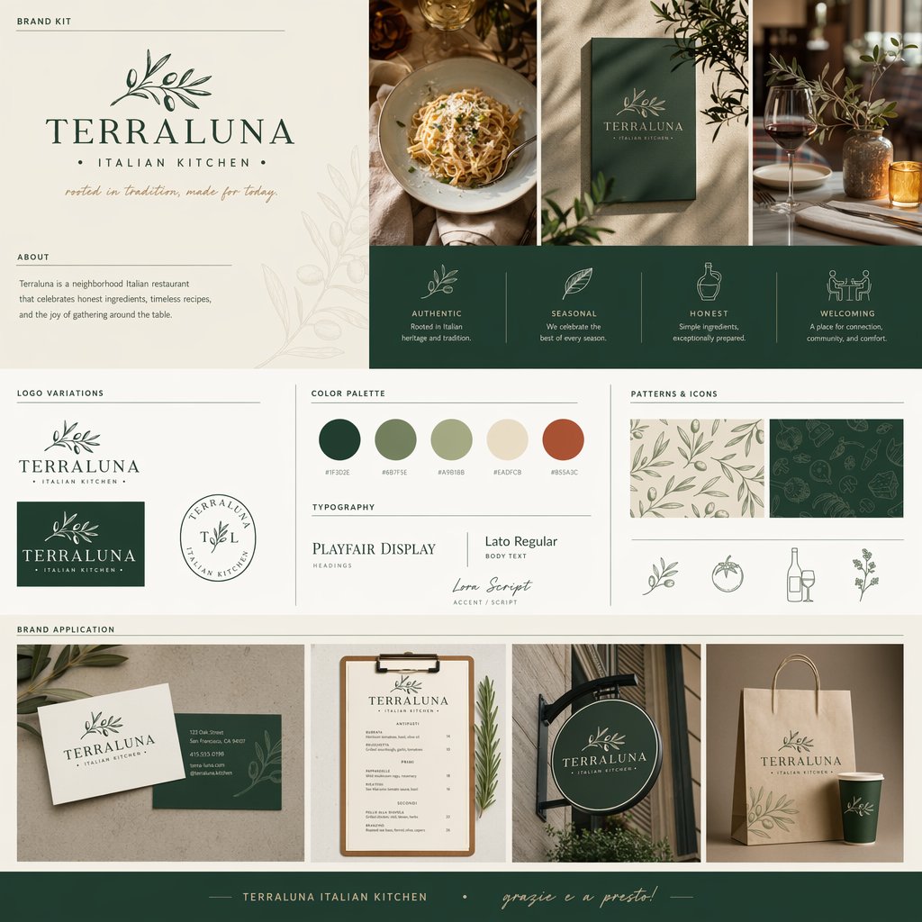
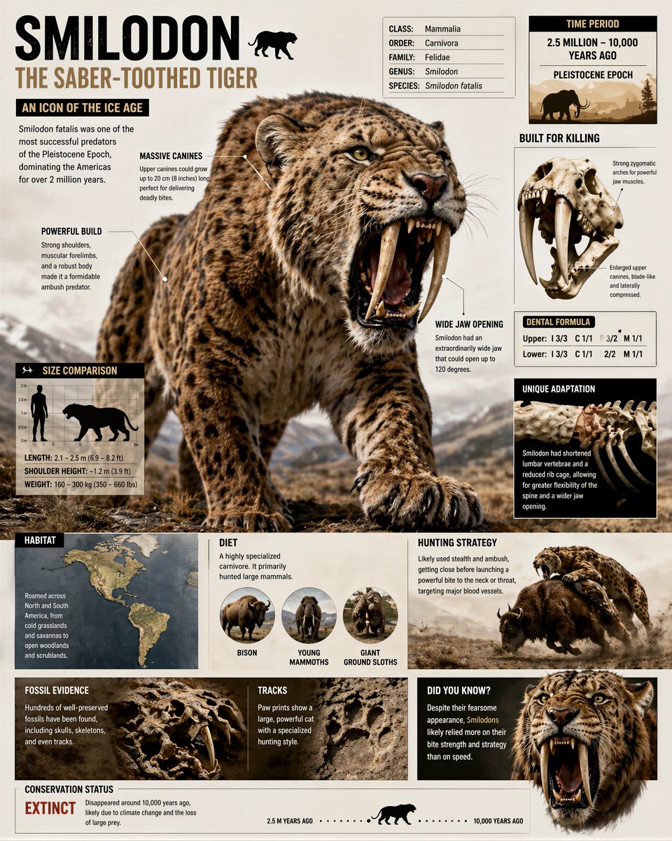
案例媒体
案例说明
这个页面把案例媒体、完整 Prompt 和出处放在一起,方便你先看结果,再判断这条 Prompt 是否值得复制、收藏或加入对比。
案例解读
为了方便搜索、引用和后续复用,这里会把案例的适用场景、画面重点和 Prompt 结构拆成更容易浏览的说明。
这类案例适合用在什么场景
- 把它当作 模型对比与社区 的基准案例最合适,先看成片方向,再决定自己的 Prompt 要往哪边改。
- 如果你的目标也落在 时尚、极简、排版 这些方向,这条案例特别适合先看图判断风格,再回头微调描述。
- 做 Prompt 对比时,也很适合作为控制组,只改一个变量去看结果变化。
画面重点与风格信号
- 这条案例最明显的风格信号集中在 时尚、极简、排版,所以第一次改写时最好先保留这些关键词。
- 这类案例最有价值的地方通常是看差异:到底改了什么、哪里崩了、是哪段 Prompt 造成的变化。
- 当前只有一张主图,所以第一张结果图就是最核心的参考基准。
Prompt 结构可以怎么理解
- 这条 Prompt 整体属于一条比较长、约束条件很多的 Prompt,很适合拿来判断这类方向到底需要写到多细。
- 关键词簇主要围绕 时尚、极简、排版 展开,所以复用时可以先保留这组风格词,再替换主体、镜头、环境或文案信息。
- 最稳的改写方式通常是先保留结果方向和最强风格信号,只替换主体设定与场景块。
如果你是带着问题来的,可以先看这些角度
- 如果保留 时尚、极简、排版,只换主体题材,结果最先变化的会是哪一部分?
- 这条结果里,哪些特征更像是 模型对比与社区 的结构特征,哪些又是标签风格本身带来的?
- 同分类的相关案例里,哪几条能给你更克制或更极致的相邻变体?
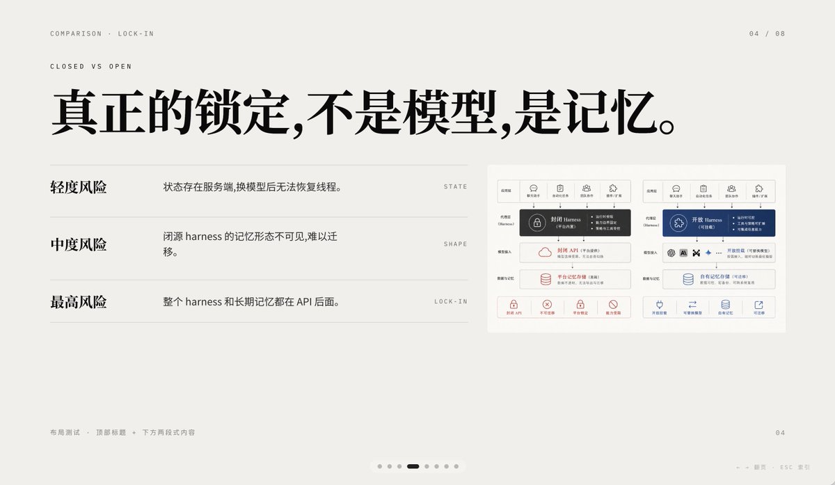
完整 Prompt
A minimalist editorial presentation slide in 16:9 format with a warm light-gray paper background, lots of negative space, refined Swiss-style grid layout, and high-end PPT/keynote design aesthetics. The slide is a comparison page about lock-in, using elegant Chinese typography mixed with tiny English navigation text. At the top left, place two small uppercase English breadcrumb lines: “COMPARISON · LOCK-IN” and below it “CLOSED VS OPEN”, in a thin sans-serif with wide tracking. At the top right, place the page indicator “04 / 08”. Center-left across the upper half, add a very large bold black Chinese headline: “真正的锁定,不是模型,是记忆。” On the left half below the headline, create a three-row comparison list separated by thin horizontal gray rules. Row 1 has the bold Chinese label “轻度风险” on the left, with the explanatory sentence “状态存在服务端,换模型后无法恢复线程。” to its right, and a tiny uppercase English keyword aligned far right: “STATE”. Row 2 has the bold label “中度风险”, with the sentence “闭源 harness 的记忆形态不可见,难以迁移。” and the far-right keyword “SHAPE”. Row 3 has the bold label “最高风险”, with the sentence “整个 harness 和长期记忆都在 API 后面。” and the far-right keyword “LOCK-IN”. On the right side of the slide, place a small inset comparison diagram card with a white background and subtle border, containing 2 side-by-side system architecture panels. The left panel represents a closed system in dark gray and muted red accents; the right panel represents an open system in deep blue accents. Each panel should have 5 small top icon tabs, a central highlighted harness block, several stacked rounded rectangular modules below, and a bottom row of 4 small capability icons with short Chinese labels. Keep the inset detailed but small, so it reads as a supporting visual rather than the main focus. At the bottom left, add tiny light-gray Chinese footer text: “布局测试 · 顶部标题 + 下方两段式内容”. At the bottom right, place a small page number “04”. Centered near the bottom edge, add a carousel indicator with exactly 7 small dots, where the 4th dot is a short dark rounded pill indicating the active slide and the other 6 dots are pale gray circles. Also add tiny faint navigation hints at the lower right edge reading “← → 翻页 ESC 关闭”. Use crisp vector text rendering, understated contrast, elegant spacing, and a calm premium infographic style suitable for a business presentation about AI platform comparison and API memory lock-in.