案例媒体
案例说明
这个页面把案例媒体、完整 Prompt 和出处放在一起,方便你先看结果,再判断这条 Prompt 是否值得复制、收藏或加入对比。
案例解读
为了方便搜索、引用和后续复用,这里会把案例的适用场景、画面重点和 Prompt 结构拆成更容易浏览的说明。
这类案例适合用在什么场景
- 把它当作 模型对比与社区 的基准案例最合适,先看成片方向,再决定自己的 Prompt 要往哪边改。
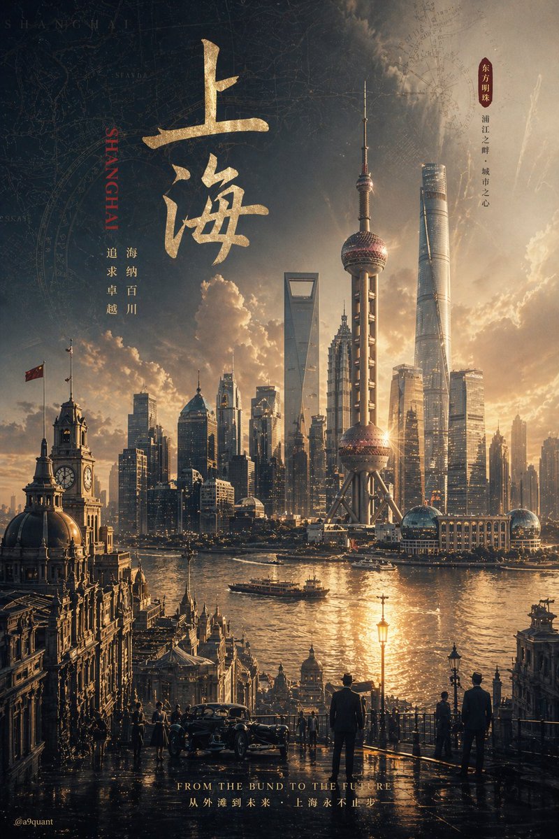
- 如果你的目标也落在 电影感、时尚、海报 这些方向,这条案例特别适合先看图判断风格,再回头微调描述。
- 做 Prompt 对比时,也很适合作为控制组,只改一个变量去看结果变化。
画面重点与风格信号
- 这条案例最明显的风格信号集中在 电影感、时尚、海报,所以第一次改写时最好先保留这些关键词。
- 这类案例最有价值的地方通常是看差异:到底改了什么、哪里崩了、是哪段 Prompt 造成的变化。
- 当前只有一张主图,所以第一张结果图就是最核心的参考基准。
Prompt 结构可以怎么理解
- 这条 Prompt 整体属于一条比较长、约束条件很多的 Prompt,很适合拿来判断这类方向到底需要写到多细。
- 关键词簇主要围绕 电影感、时尚、海报 展开,所以复用时可以先保留这组风格词,再替换主体、镜头、环境或文案信息。
- 最稳的改写方式通常是先保留结果方向和最强风格信号,只替换主体设定与场景块。
如果你是带着问题来的,可以先看这些角度
- 如果保留 电影感、时尚、海报,只换主体题材,结果最先变化的会是哪一部分?
- 这条结果里,哪些特征更像是 模型对比与社区 的结构特征,哪些又是标签风格本身带来的?
- 同分类的相关案例里,哪几条能给你更克制或更极致的相邻变体?
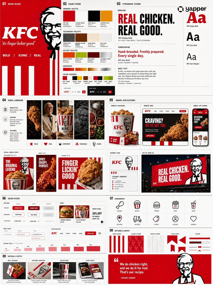
完整 Prompt
{ "prompt": { "title": "Agency-Grade Brand Identity System Poster", "trigger": "Upload a logo. From it, construct a complete, investment-worthy brand identity system poster — the kind that closes client deals and dominates Behance front pages.", "prime_directive": { "rule": "Every element — color, tone, shape, texture, personality — must be extracted directly from the uploaded logo.", "enforcement": "Nothing generic. Nothing templated. Nothing borrowed. Strip the logo. Decode it. Build an entire visual universe from its DNA." }, "format": { "orientation": "Vertical", "aspect_ratio": "4:5", "layout": "Multi-column grid", "composition": "Layered, dense, intentional — zero wasted space" }, "sections": { "01_brand_header": { "label": "Open With Authority", "elements": [ "Brand name in commanding, high-hierarchy typography", "Brand statement — 6 words maximum, razor-sharp", "Three soul descriptors (e.g. Raw / Futuristic / Grounded)" ] }, "02_color_system": { "label": "Build The Color World", "palettes": { "primary": "3–5 colors extracted from logo", "secondary": "3–5 supporting colors", "accent": "High-impact hit colors" }, "per_color_display": [ "Wide swatch block", "HEX code", "Role label: foundation / emphasis / atmosphere" ], "extras": [ "Gradient blends", "Color-on-color pairings", "Light mode vs dark mode behavior" ] }, "03_typography_system": { "label": "Establish The Type Voice", "tiers": { "headline": "Commanding, bold — show a punchy title example", "subheadline": "Structured, clear — show a descriptive line example", "body": "Readable, intentional — show a paragraph fragment example" }, "requirement": "Hierarchy must be undeniable at a glance" }, "04_visual_language": { "label": "Define The Visual World", "define": [ "Image style (editorial / industrial / cinematic / organic / etc.)", "Lighting quality and direction", "Texture references and material moods" ], "visual_tiles": { "count": "3–5 tiles", "style": "Art-directed style previews — mood board squares from a real shoot brief" } }, "05_brand_applications": { "label": "Bring The Brand To Life", "rule": "Every mockup must feel like the same brand. Same DNA. Zero inconsistency.", "mockups": [ { "type": "Product Packaging", "detail": "Dimensional, realistic render" }, { "type": "Website Hero", "detail": "Full desktop viewport" }, { "type": "Mobile App Screen", "detail": "One key UI moment" }, { "type": "Social Media Posts", "detail": "3 formats — square, story, banner" }, { "type": "Business Card", "detail": "Front and back" }, { "type": "Out-of-Home Ad", "detail": "Billboard or transit panel" } ] }, "06_design_system": { "label": "Show The System Working", "components": [ "Buttons — default, hover, disabled states", "Cards", "Input fields", "Navigation bar", "Spacing scale" ], "requirement": "Must resemble a real design system handoff document" }, "07_iconography": { "label": "Iconography", "count": "6–10 icons", "style_rule": "Same visual grammar as the logo — geometric, organic, sharp, or soft", "consistency": "Uniform stroke weight or fill logic throughou" }, 08_patterns_and_motifs": {"label": "Patterns & Motion Artifacts", "sources": "Derived from logo geometry only", "elements": ["Background patterns", "Decorative shapes", "Repeating motifs", "Structural dividers" ], "philosophy": "These are not decoration — they are brand DNA made visible" }, "09_material_and_depth": {"label": "Material & Depth", "details": ["Shadows with real, directional logic", "Surface textures — glass, matte, paper, metal (brand-appropriate)", "Reflections where contextually fitting", "Layer depth that makes elements feel physically present" ] } }, "scale_target": {"total_elements": "30–50 distinct visual elements", "balance": "Large anchors offset by fine micro-details", "rule": "No filler. No padding. Every centimeter earns its place." }, "quality_standard": {"benchmark": "Must look like it costs $15, 000 to produce", "references": ["Top-tier Behance brand case study", "Real agency brand guideline board", "Client-ready deliverable" ], "failure_conditions": ["Looks templated", "Contains generic placeholders", "Elements feel disconnected", "Any section feels unfished or sparse" ] } } }