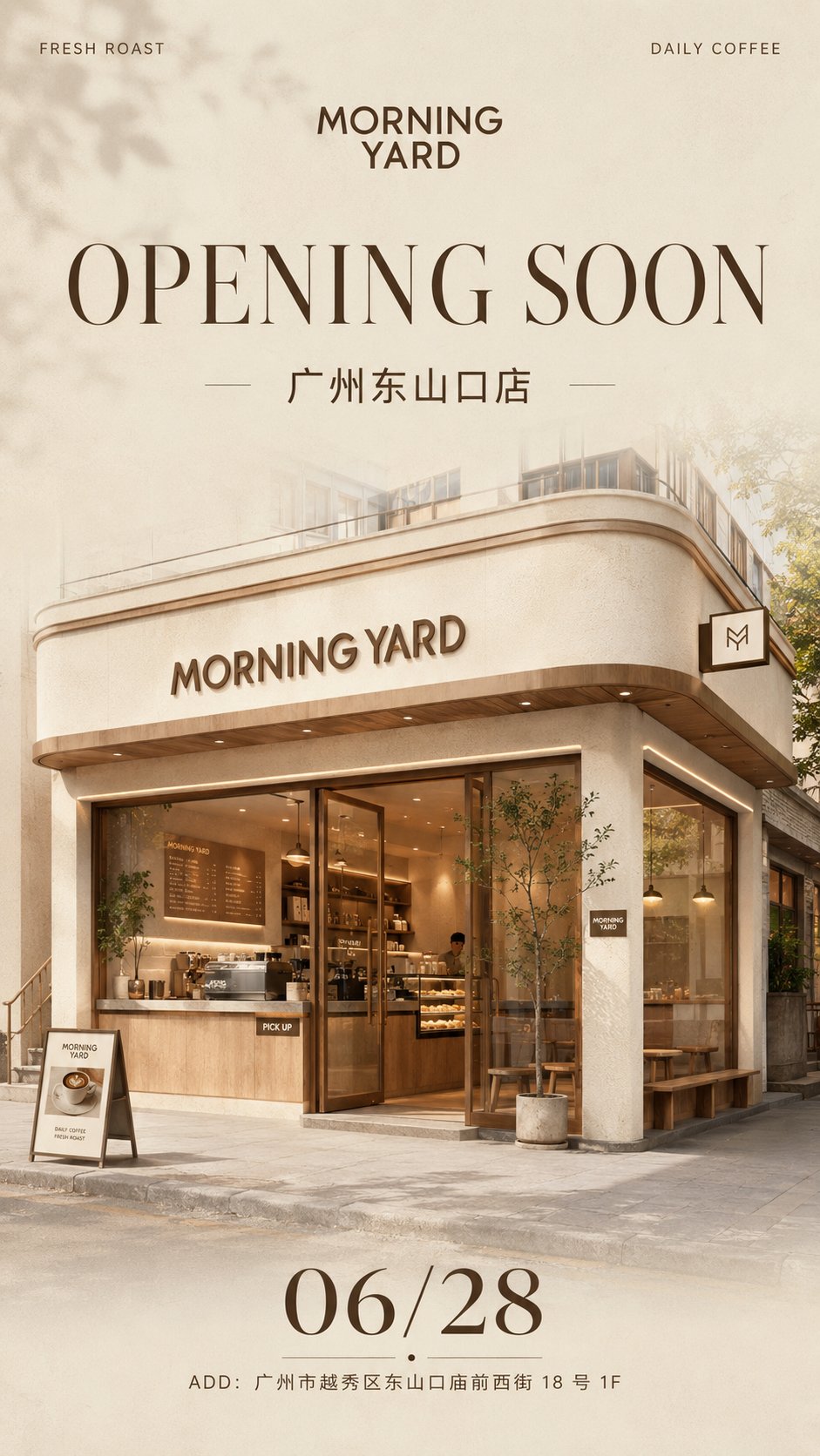
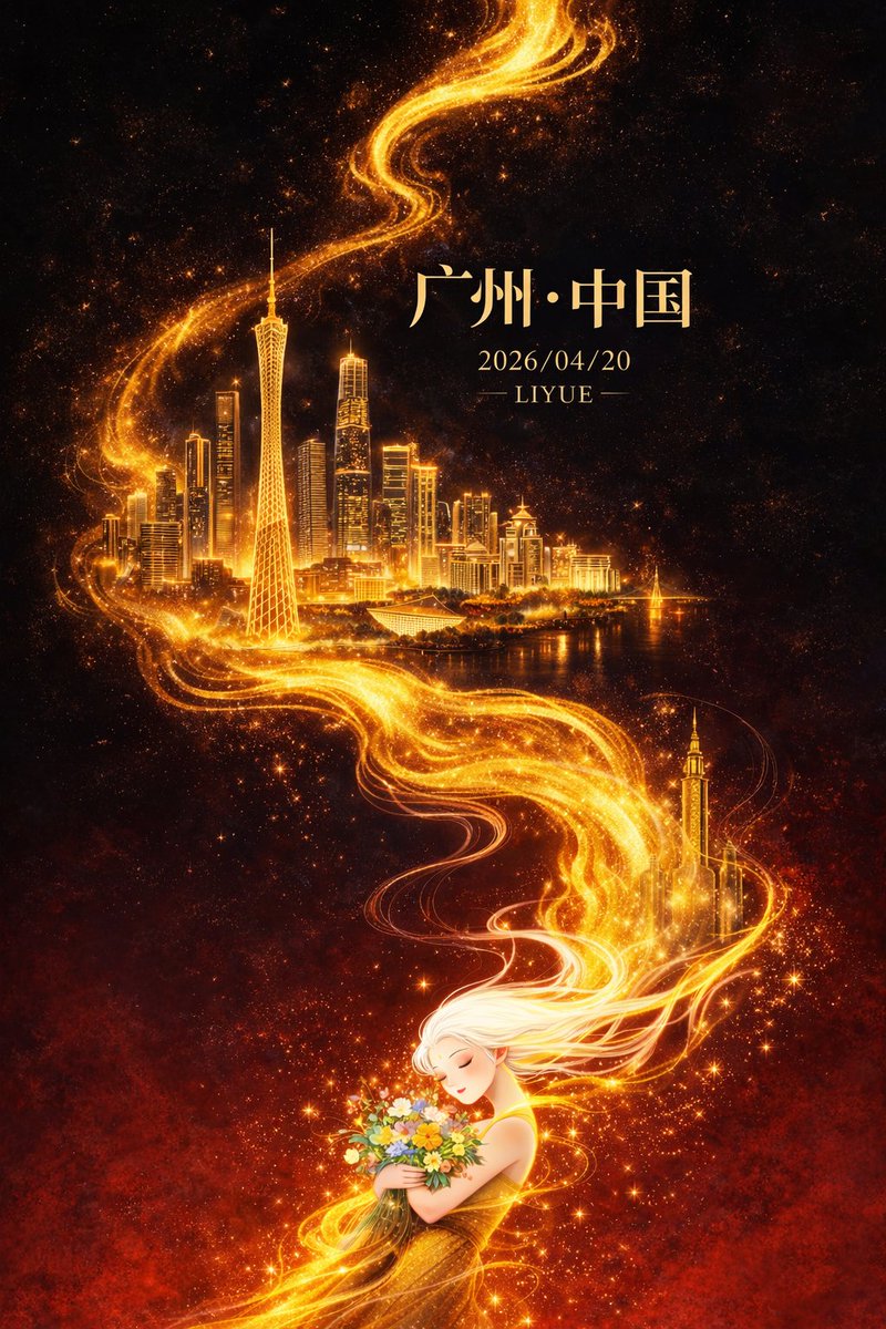
案例媒体
案例说明
这个页面把案例媒体、完整 Prompt 和出处放在一起,方便你先看结果,再判断这条 Prompt 是否值得复制、收藏或加入对比。
案例解读
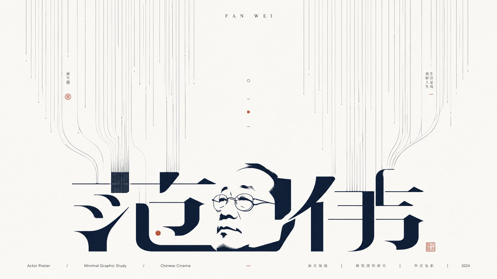
为了方便搜索、引用和后续复用,这里会把案例的适用场景、画面重点和 Prompt 结构拆成更容易浏览的说明。
这类案例适合用在什么场景
- 把它当作 模型对比与社区 的基准案例最合适,先看成片方向,再决定自己的 Prompt 要往哪边改。
- 如果你的目标也落在 海报、插画、城市视觉 这些方向,这条案例特别适合先看图判断风格,再回头微调描述。
- 做 Prompt 对比时,也很适合作为控制组,只改一个变量去看结果变化。
画面重点与风格信号
- 这条案例最明显的风格信号集中在 海报、插画、城市视觉,所以第一次改写时最好先保留这些关键词。
- 这类案例最有价值的地方通常是看差异:到底改了什么、哪里崩了、是哪段 Prompt 造成的变化。
- 当前保留了 2 份媒体输出,适合顺手观察同一方向在多张结果里的稳定性。
Prompt 结构可以怎么理解
- 这条 Prompt 整体属于一条比较长、约束条件很多的 Prompt,很适合拿来判断这类方向到底需要写到多细。
- 关键词簇主要围绕 海报、插画、城市视觉 展开,所以复用时可以先保留这组风格词,再替换主体、镜头、环境或文案信息。
- 最稳的改写方式通常是先保留结果方向和最强风格信号,只替换主体设定与场景块。
如果你是带着问题来的,可以先看这些角度
- 如果保留 海报、插画、城市视觉,只换主体题材,结果最先变化的会是哪一部分?
- 这条结果里,哪些特征更像是 模型对比与社区 的结构特征,哪些又是标签风格本身带来的?
- 同分类的相关案例里,哪几条能给你更克制或更极致的相邻变体?
完整 Prompt
Generate a minimalist graphic image around any subject, letting the theme appear as if pulled downward by an invisible force and growing in white space: the upper part consists of a large number of slender, uniform lines with slight hand-drawn pauses falling from the edges toward the interior, with the line groups maintaining clear spacing to form directional pressure like roots, light beams, or data streams; the middle part retains a highly airy white space, letting a few broken lines, short strokes, and tiny symbols become breathing points; the lower part features a giant main form derived from the subject, which can be transformed from the subject's name, core glyphs, symbolic outlines, or abstract structures, with strokes elongated, split, and bent, creating connections and echoes with the line groups, appearing as both text and a graphic installation. The information layer should be sparse and precise, with a short English title at the top and tiny explanatory text at the bottom, using starkly different font size hierarchies; the main form is the heaviest, while small text is calm and restrained like design archive annotations. Colors are extracted from the material, emotion, and cultural signals of the subject itself, mapped as large areas of high-brightness clean background colors, a few clear structural colors, and very few accent colors, maintaining a bright, clear, clean, calm, and precise mood; dark colors only carry lines, text, and structural skeletons, with controlled saturation and sharp boundaries, without any dirty, smoky, grayish-yellow, or retro stains. The overall completion should be like a combination of font design experiments and Eastern negative space concepts, building memory points through line density, intermittence, negative space, and glyph tension, rather than filling the screen with complex illustrations. Subject: Dream of the Red Chamber Purpose: Book Poster Ratio: 16:9