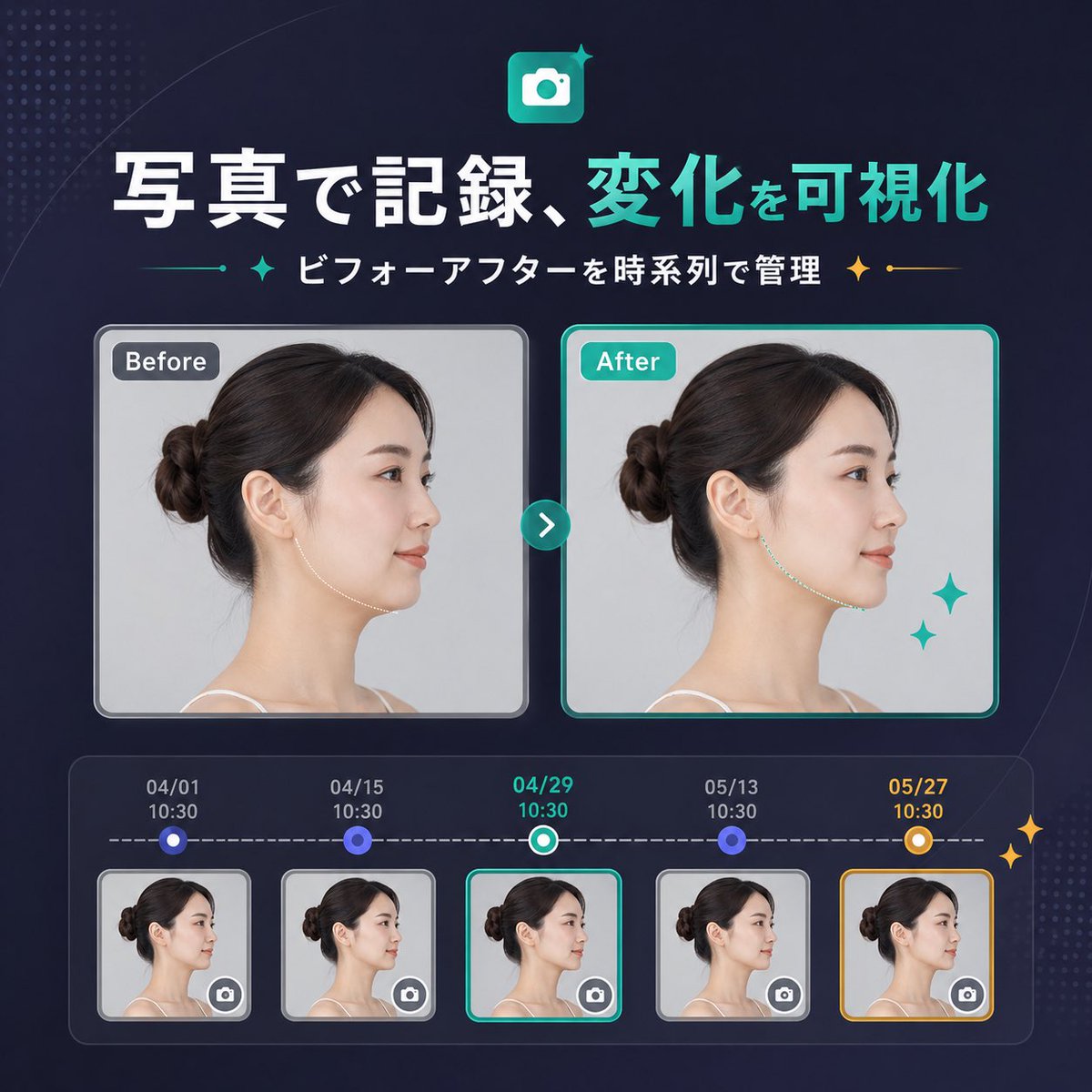
案例媒体
案例说明
这个页面把案例媒体、完整 Prompt 和出处放在一起,方便你先看结果,再判断这条 Prompt 是否值得复制、收藏或加入对比。
案例解读
为了方便搜索、引用和后续复用,这里会把案例的适用场景、画面重点和 Prompt 结构拆成更容易浏览的说明。
这类案例适合用在什么场景
- 把它当作 模型对比与社区 的基准案例最合适,先看成片方向,再决定自己的 Prompt 要往哪边改。
- 如果你的目标也落在 霓虹、海报、截图 这些方向,这条案例特别适合先看图判断风格,再回头微调描述。
- 做 Prompt 对比时,也很适合作为控制组,只改一个变量去看结果变化。
画面重点与风格信号
- 这条案例最明显的风格信号集中在 霓虹、海报、截图,所以第一次改写时最好先保留这些关键词。
- 这类案例最有价值的地方通常是看差异:到底改了什么、哪里崩了、是哪段 Prompt 造成的变化。
- 当前只有一张主图,所以第一张结果图就是最核心的参考基准。
Prompt 结构可以怎么理解
- 这条 Prompt 整体属于一条比较长、约束条件很多的 Prompt,很适合拿来判断这类方向到底需要写到多细。
- 关键词簇主要围绕 霓虹、海报、截图 展开,所以复用时可以先保留这组风格词,再替换主体、镜头、环境或文案信息。
- 最稳的改写方式通常是先保留结果方向和最强风格信号,只替换主体设定与场景块。
如果你是带着问题来的,可以先看这些角度
- 如果保留 霓虹、海报、截图,只换主体题材,结果最先变化的会是哪一部分?
- 这条结果里,哪些特征更像是 模型对比与社区 的结构特征,哪些又是标签风格本身带来的?
- 同分类的相关案例里,哪几条能给你更克制或更极致的相邻变体?
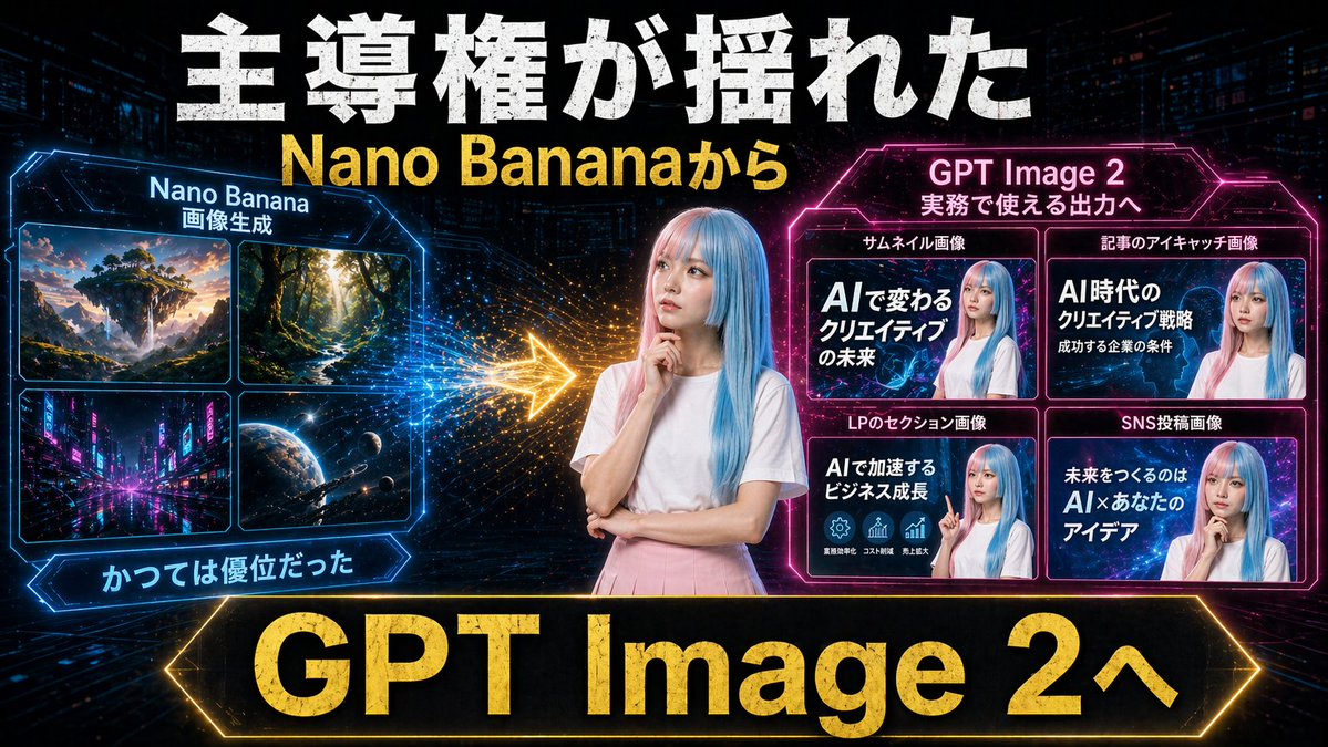
完整 Prompt
Create a dramatic Japanese YouTube thumbnail in a futuristic neon cyberpunk style, 16:9 landscape. Use a dark tech-city background with faint skyscrapers, digital grid lines, glowing particles, and high-contrast blue, pink, and gold lighting. In the exact center, place a young woman from the waist up with long straight pastel blue hair, wearing a plain white short-sleeve T-shirt and a light pink skirt, posing thoughtfully with one hand near her chin and the other arm folded; anonymize her face with a soft rectangular blur. Across the very top, add huge distressed bold white Japanese headline text reading 主導権が揺れた, and directly below it add large bold yellow text reading {argument name="subheadline text" default="Nano Bananaから"}. On the left side, create a glowing blue hexagonal-framed panel titled Nano Banana with a smaller subtitle 画像生成. Inside that panel, include exactly 4 image tiles in a 2x2 grid: 1) a fantasy floating island landscape at sunset, 2) a sunlit forest path with tall trees, 3) a neon futuristic city street at night, 4) an outer-space planet scene with stars and a spacecraft. Beneath the left panel, add a blue glowing ribbon label reading かつては優位だった. On the right side, create a glowing magenta hexagonal-framed panel titled {argument name="right panel title" default="GPT Image 2"} with a smaller subtitle 実務で使える出力へ. Inside it, include exactly 4 example thumbnail cards in a 2x2 grid, each featuring the same blue-haired woman with a blurred face and bold Japanese text. The 4 card labels above the tiles are: サムネイル画像, 記事のアイキャッチ画像, LPのセクション画像, SNS投稿画像. The large text inside the 4 cards should read respectively: 1) AIで変わるクリエイティブの未来, 2) AI時代のクリエイティブ戦略 成功する企業の条件, 3) AIで加速するビジネス成長, 4) 未来をつくるのは AI×あなたのアイデア. Between the left and right panels, place a bright glowing gold arrow pointing from left to right with spark-like particle trails, indicating transition or superiority shift. Along the bottom, add a very large black banner with a glowing gold border and massive bold gold text reading {argument name="bottom banner text" default="GPT Image 2へ"}. Overall composition should feel like a comparison graphic showing a shift from older image generation to more practical commercial output, with aggressive thumbnail typography, strong glow effects, metallic texture on major text, and polished social-media marketing visuals.