案例媒体
案例说明
这个页面把案例媒体、完整 Prompt 和出处放在一起,方便你先看结果,再判断这条 Prompt 是否值得复制、收藏或加入对比。
案例解读
为了方便搜索、引用和后续复用,这里会把案例的适用场景、画面重点和 Prompt 结构拆成更容易浏览的说明。
这类案例适合用在什么场景
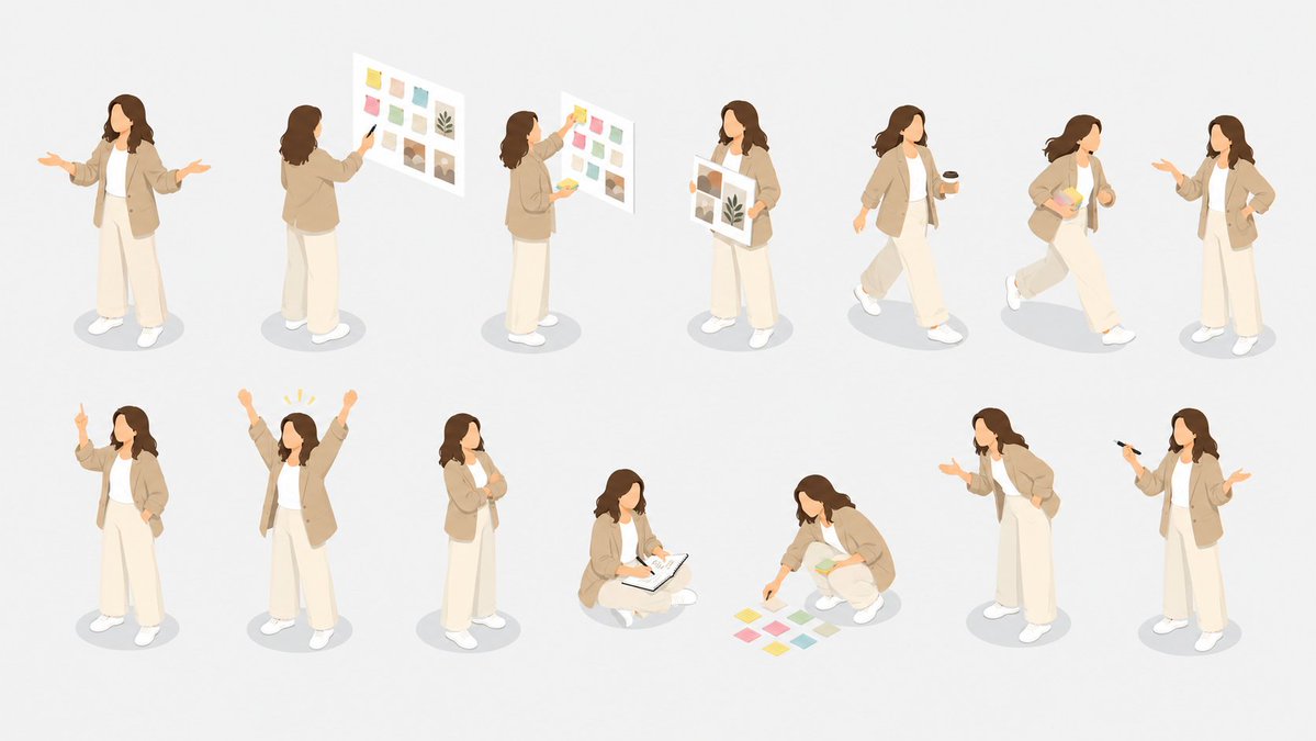
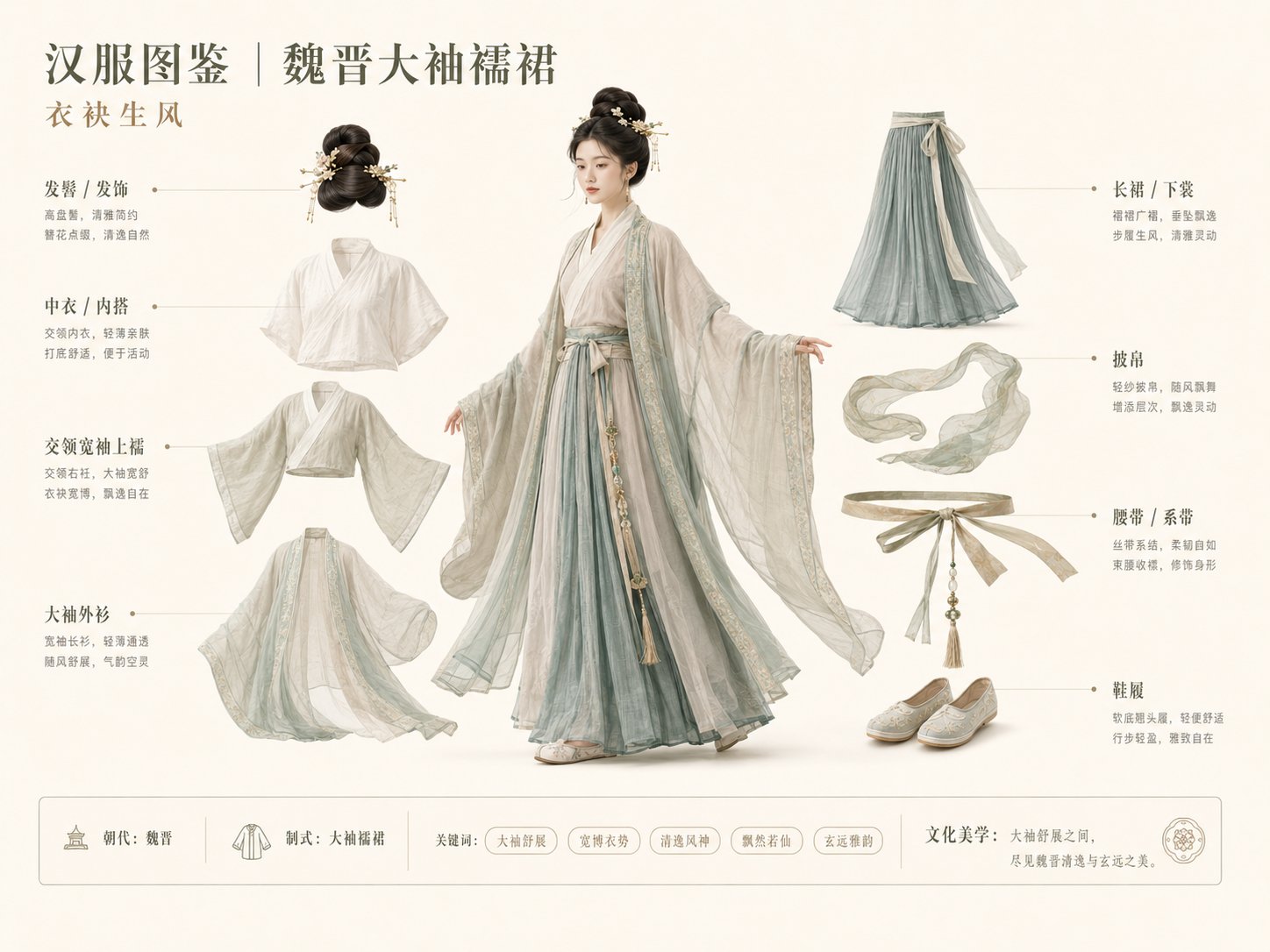
- 把它当作 角色设计 的基准案例最合适,先看成片方向,再决定自己的 Prompt 要往哪边改。
- 如果你的目标也落在 插画、截图、角色 这些方向,这条案例特别适合先看图判断风格,再回头微调描述。
- 做 Prompt 对比时,也很适合作为控制组,只改一个变量去看结果变化。
画面重点与风格信号
- 这条案例最明显的风格信号集中在 插画、截图、角色,所以第一次改写时最好先保留这些关键词。
- 重点可以先看轮廓、服饰语言、情绪气质,以及角色是否一眼就能立住。
- 当前保留了 4 份媒体输出,适合顺手观察同一方向在多张结果里的稳定性。
Prompt 结构可以怎么理解
- 这条 Prompt 整体属于一条比较长、约束条件很多的 Prompt,很适合拿来判断这类方向到底需要写到多细。
- 关键词簇主要围绕 插画、截图、角色 展开,所以复用时可以先保留这组风格词,再替换主体、镜头、环境或文案信息。
- 最稳的改写方式通常是先保留结果方向和最强风格信号,只替换主体设定与场景块。
如果你是带着问题来的,可以先看这些角度
- 如果保留 插画、截图、角色,只换主体题材,结果最先变化的会是哪一部分?
- 这条结果里,哪些特征更像是 角色设计 的结构特征,哪些又是标签风格本身带来的?
- 同分类的相关案例里,哪几条能给你更克制或更极致的相邻变体?
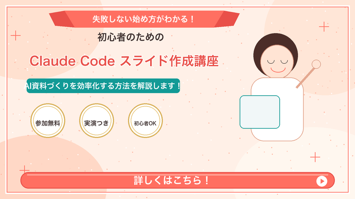
完整 Prompt
Goal: Create a Japanese webinar/lesson announcement slide in a cute, simple “Marcy-style” presentation design for {argument name="course topic" default="Claude Code slide creation course"}. Canvas: 16:9 horizontal slide, 1200×675 px, warm cream-peach background with soft abstract circular blobs in pale peach and off-white. Add a thin coral-red rectangular border inset about 20 px from the edge. Layout: Center-left text-heavy composition with a simple mascot illustration on the right. At the top center, place a wide coral-red folded ribbon banner with angled darker red folded ends. Below it, stack the main headline and subheadline. Place three circular badges in a row under the subheadline. Along the bottom, add one large rounded coral-red call-to-action bar spanning almost the full width. Text content: Use Japanese text exactly as follows. Top ribbon text: {argument name="top ribbon text" default="失敗しない始め方がわかる!"}. Small centered heading below ribbon: {argument name="audience line" default="初心者のための"}. Large main title in coral-red with white outline/drop shadow: {argument name="main title" default="Claude Code スライド作成講座"}. Teal rounded label below title: {argument name="supporting line" default="AI資料づくりを効率化する方法を解説します!"}. Three badge labels, exactly 3 badges from left to right: 「参加無料」, 「実演つき」, 「初心者OK」. Bottom CTA text: 「詳しくはこちら!」 in large bold white letters. Add a white circular play button at the right end of the CTA bar with a small coral-red triangle inside. Subject details: On the right side, draw one minimalist female presenter mascot with a round face, closed eyes, simple smile, short dark-brown bob hair, peach outline, and a white body. Her right arm is raised diagonally holding a small circular pointer. In front of her torso, place one pale blue rounded rectangle laptop/tablet with teal outline. Decorative elements: Add exactly 4 thin coral plus signs: one near the upper-left edge, one near the upper-right area, one near the lower-left area above the CTA, and one near the lower-right area. Scatter many tiny coral and white dots across the background like confetti, keeping them subtle and not text-like. Visual style: Flat vector illustration, soft pastel colors, clean Japanese slide design, friendly educational seminar aesthetic. Coral red, teal, cream, gold, and dark brown palette. Use bold rounded sans-serif Japanese typography. Keep all text crisp and centered/aligned like a polished promotional slide. Constraints: Include exactly 3 circular badges, exactly 1 mascot, exactly 1 CTA bar, exactly 1 play icon, and exactly 4 plus-sign decorations. Do not add logos, watermarks, extra characters, extra badges, QR codes, or additional text.