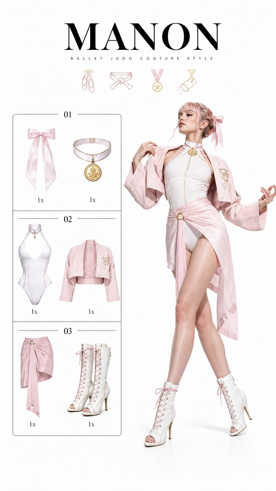
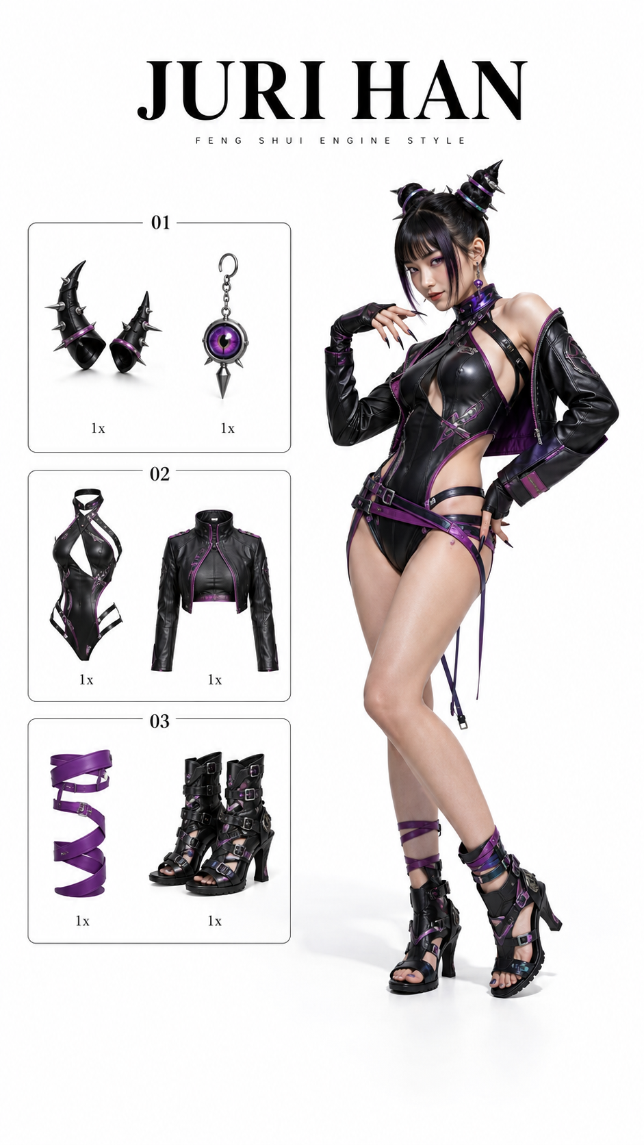
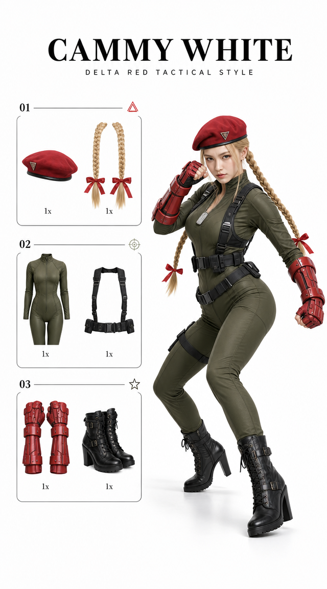
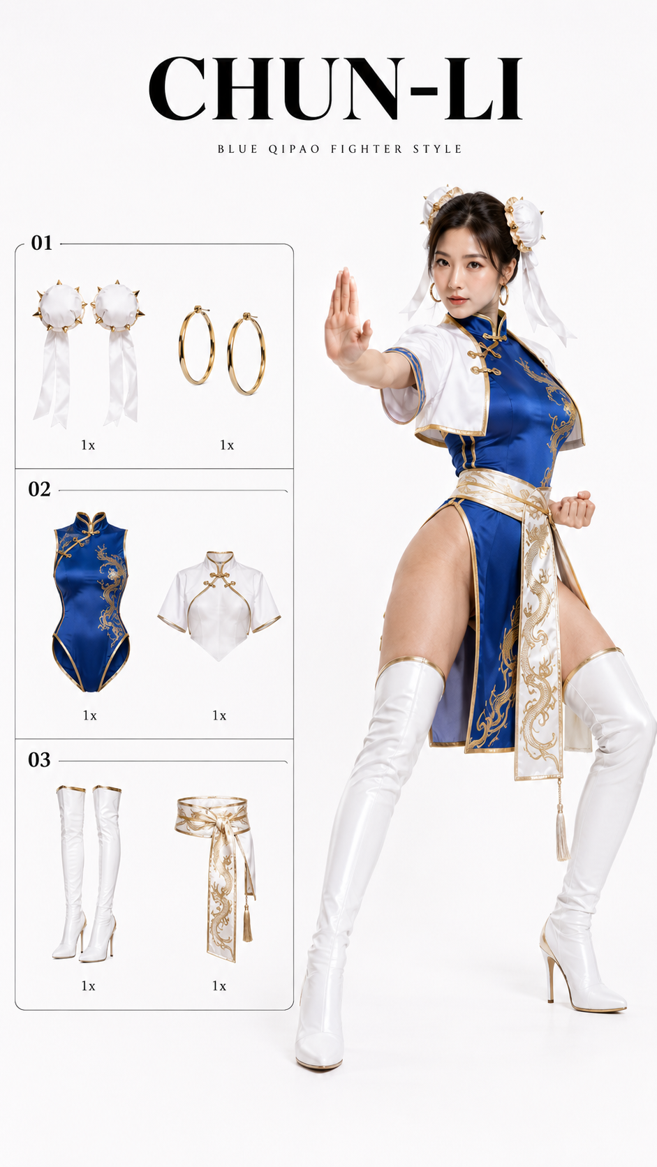
案例媒体
案例说明
这个页面把案例媒体、完整 Prompt 和出处放在一起,方便你先看结果,再判断这条 Prompt 是否值得复制、收藏或加入对比。
案例解读
为了方便搜索、引用和后续复用,这里会把案例的适用场景、画面重点和 Prompt 结构拆成更容易浏览的说明。
这类案例适合用在什么场景
- 把它当作 角色设计 的基准案例最合适,先看成片方向,再决定自己的 Prompt 要往哪边改。
- 如果你的目标也落在 时尚、角色、二次元 这些方向,这条案例特别适合先看图判断风格,再回头微调描述。
- 做 Prompt 对比时,也很适合作为控制组,只改一个变量去看结果变化。
画面重点与风格信号
- 这条案例最明显的风格信号集中在 时尚、角色、二次元,所以第一次改写时最好先保留这些关键词。
- 重点可以先看轮廓、服饰语言、情绪气质,以及角色是否一眼就能立住。
- 当前只有一张主图,所以第一张结果图就是最核心的参考基准。
Prompt 结构可以怎么理解
- 这条 Prompt 整体属于一条比较长、约束条件很多的 Prompt,很适合拿来判断这类方向到底需要写到多细。
- 关键词簇主要围绕 时尚、角色、二次元 展开,所以复用时可以先保留这组风格词,再替换主体、镜头、环境或文案信息。
- 最稳的改写方式通常是先保留结果方向和最强风格信号,只替换主体设定与场景块。
如果你是带着问题来的,可以先看这些角度
- 如果保留 时尚、角色、二次元,只换主体题材,结果最先变化的会是哪一部分?
- 这条结果里,哪些特征更像是 角色设计 的结构特征,哪些又是标签风格本身带来的?
- 同分类的相关案例里,哪几条能给你更克制或更极致的相邻变体?
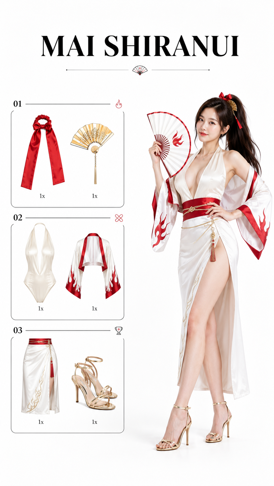
完整 Prompt
Vertical 9:16, keep the exact same structure, minimalist white cosplay outfit information page, generous white empty space at both the top and bottom, especially clear bottom breathing room. Pure white photography studio background, bright high-key soft lighting, realistic commercial studio photography, premium fashion magazine layout, clean, restrained, artistic. The overall page has a slightly elevated editorial layout feeling. Add a few tiny elegant black-and-red line icons as decorative accents: a folding fan icon, a small flame icon, a ribbon knot icon, and a minimalist tournament badge icon. Keep these icons very small, refined, sparse, and aligned with the catalog layout, never crowded. The full-body character photo on the right uses a subtle low-angle fashion photography perspective, the camera slightly looking upward to elongate the legs and create a stronger model-like silhouette. The model is a clearly adult Asian female fashion blogger with a graceful hourglass body outline, open shoulders, defined waistline, long legs, realistic proportions, elegant confident posture. At the top, a large bold black title reads: “MAI SHIRANUI”. Leave obvious white breathing room above the title, below the title, and at the bottom of the whole composition. Do not make the layout crowded. The left side is a unified black thin-line bordered outfit and accessory checklist, fixed into 3 numbered sections. Each section contains exactly 2 product cutouts, six product cutouts total: Section 1: red high-pony tail ribbon and gold folding-fan hairpin; Section 2: ivory plunging halter bodysuit and cropped red-and-white lightweight kimono bolero; Section 3: high-waist white slit wrap skirt with red obi belt and gold strappy high-heel sandals. Each item is shown as a clean white-background product cutout, with a small “1x” quantity label below each product. Minimal, organized, spacious, high-end catalog style. Automatically reinterpret Mai Shiranui from The King of Fighters into a more fashionable, sexy, luxury kunoichi-fighter resort cosplay outfit. Preserve the recognizable character identity: very long brown hair in a high ponytail, red ribbon, confident fighting-game heroine aura, folding fan motif, flame motif, red / white / gold color palette, playful but powerful expression, elegant martial-arts stage presence. On the right side, the clearly adult Asian female fashion blogger stands full-body wearing a complete Mai Shiranui-inspired high-fashion sexy outfit: an ivory plunging halter bodysuit, a cropped lightweight red-and-white kimono bolero worn open, a high-waist white slit wrap skirt with subtle flame-line embroidery, a structured red obi belt, a slim gold waist chain, gold folding-fan hairpin, red hair ribbon, and gold strappy high-heel sandals. She holds an elegant opened folding fan in one hand, the other hand naturally resting on her waist. Her expression is confident, playful, stylish, and powerful, like a luxury fashion blogger presenting a complete KOF-inspired fighter cosplay outfit. Make the person realistic and alive: natural skin texture, realistic brown hair strands, believable fabric folds, elegant silk and satin texture, elongated legs without distortion, soft studio floor shadow. Avoid cheap plastic cosplay, messy background, exaggerated anime filter, bad text, crowded layout, distorted body proportions, unofficial messy logo marks, and placing the character or checklist too close to the bottom edge.