案例媒体
案例说明
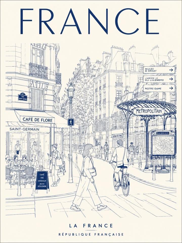
这个页面把案例媒体、完整 Prompt 和出处放在一起,方便你先看结果,再判断这条 Prompt 是否值得复制、收藏或加入对比。
案例解读
为了方便搜索、引用和后续复用,这里会把案例的适用场景、画面重点和 Prompt 结构拆成更容易浏览的说明。
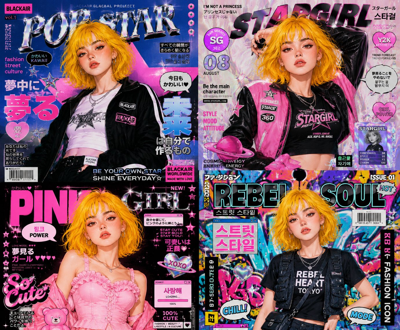
这类案例适合用在什么场景
- 把它当作 角色设计 的基准案例最合适,先看成片方向,再决定自己的 Prompt 要往哪边改。
- 如果你的目标也落在 霓虹、时尚、海报 这些方向,这条案例特别适合先看图判断风格,再回头微调描述。
- 做 Prompt 对比时,也很适合作为控制组,只改一个变量去看结果变化。
画面重点与风格信号
- 这条案例最明显的风格信号集中在 霓虹、时尚、海报,所以第一次改写时最好先保留这些关键词。
- 重点可以先看轮廓、服饰语言、情绪气质,以及角色是否一眼就能立住。
- 当前保留了 2 份媒体输出,适合顺手观察同一方向在多张结果里的稳定性。
Prompt 结构可以怎么理解
- 这条 Prompt 整体属于一条比较长、约束条件很多的 Prompt,很适合拿来判断这类方向到底需要写到多细。
- 关键词簇主要围绕 霓虹、时尚、海报 展开,所以复用时可以先保留这组风格词,再替换主体、镜头、环境或文案信息。
- 最稳的改写方式通常是先保留结果方向和最强风格信号,只替换主体设定与场景块。
如果你是带着问题来的,可以先看这些角度
- 如果保留 霓虹、时尚、海报,只换主体题材,结果最先变化的会是哪一部分?
- 这条结果里,哪些特征更像是 角色设计 的结构特征,哪些又是标签风格本身带来的?
- 同分类的相关案例里,哪几条能给你更克制或更极致的相邻变体?
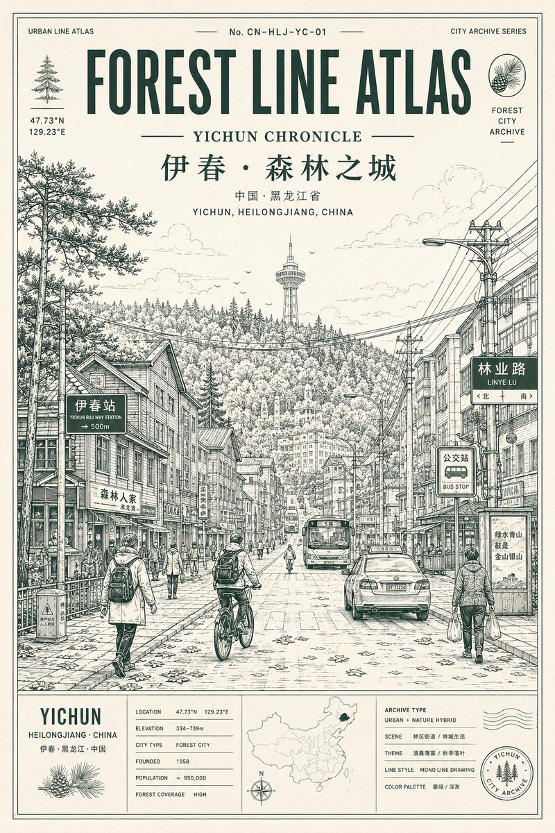
完整 Prompt
Create a minimalist, ultra-high-resolution line art travel poster about [TOKYO], depicting the city as a stylish, everyday urban scene, not a tourist postcard. MAIN COMPOSITION: - The central composition features the city's most iconic street, intersection, alley, tramway, or pedestrian alley. - Foreground: Locals, commuters, cyclists, travelers, shoppers, students, and cafe patrons - People should naturally reflect the local lifestyle and trendy culture of the city - Background: filled with realistic local signage, cafes, restaurants, transit signs, shop windows, and architectural details - Attractions should seamlessly integrate into everyday life, rather than be exaggerated - Use authentic typography in the local language and culturally recognizable visual elements - Large font at top center: "TOKYO" - Subheading at bottom: Examples of country names in the local language Style: Ultra clean vector illustration, Swiss Art Nouveau travel poster, minimalist line art, monoline art, mid-century editorial aesthetic, architectural illustration, Japanese graphic poster style, clear geometric perspective, extremely clean negative space, tourism brand aesthetic Premium LINEAR STYLE: - Only monochrome line illustrations - Thin and precise lines - Minimal fill areas - Intricate detailing, like a city map - Rhythmic arrangement of signs, buildings, windows, and street objects - Visually dense yet highly organized composition COLOR SYSTEM - VERY IMPORTANT: - Use only ONE primary color + ONE background color - Automatically select the color that best conveys the atmosphere of the city - Monochrome silkscreen poster aesthetics - No rainbow palettes - No excessive neon - Color should reflect the architecture, climate, nightlife, and cultural identity of the city. Examples: Tokyo → bright red on warm ivory Paris → navy blue on cream New York → charcoal on light gray Kyoto → muted burgundy on warm cream Hong Kong → turquoise on pale ivory Santorini → Mediterranean blue on white Cairo → desert sepia on sandy beige Composition: - vertical poster layout - frontal perspective at street level - pedestrians crossing streets or moving naturally - balanced urban rhythm and visual flow - should resemble a premium urban brand advertising poster Mood: stylish city life, calm yet vibrant travel magazine cover timeless city identity visual imagery for a tourism campaign Premium, minimalist, yet highly detailed TEXT QUALITY IS CRUCIAL: - all fonts must be legible and neat - no stray characters - no broken or distorted letters - local signage must look authentic and natural - professional typography Output: - vertical poster composition - ultra-detailed 8K format - print-ready - ultra-precise vector quality