案例媒体
案例说明
这个页面把案例媒体、完整 Prompt 和出处放在一起,方便你先看结果,再判断这条 Prompt 是否值得复制、收藏或加入对比。
案例解读
为了方便搜索、引用和后续复用,这里会把案例的适用场景、画面重点和 Prompt 结构拆成更容易浏览的说明。
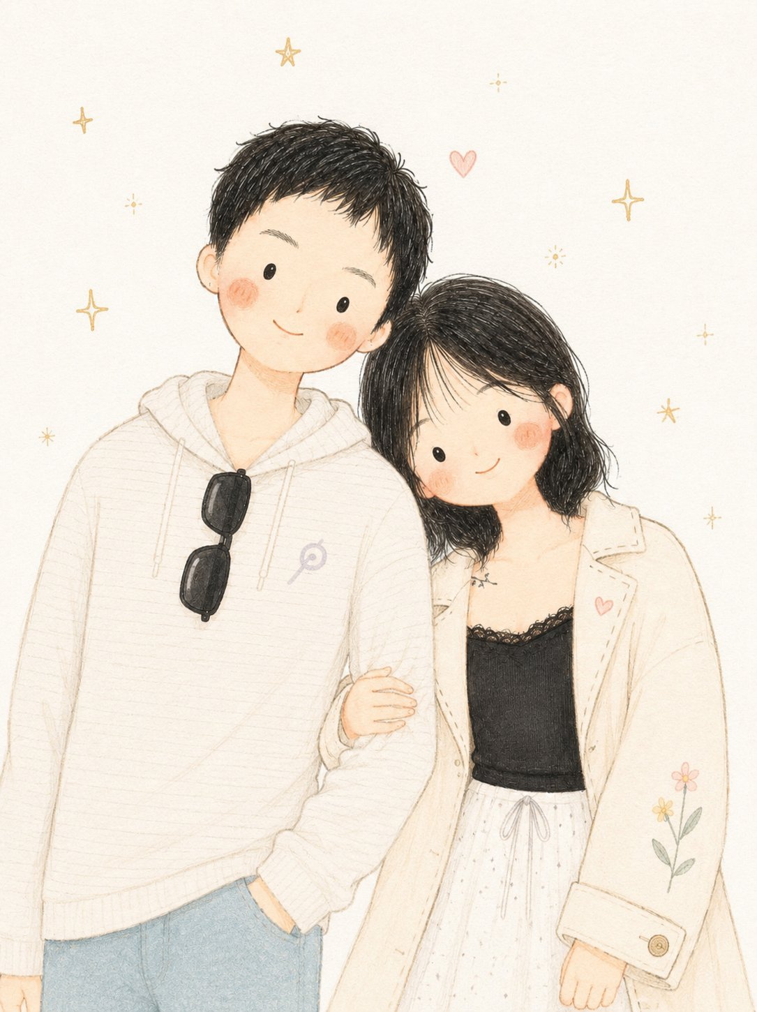
这类案例适合用在什么场景
- 把它当作 角色设计 的基准案例最合适,先看成片方向,再决定自己的 Prompt 要往哪边改。
- 如果你的目标也落在 人像、插画、角色 这些方向,这条案例特别适合先看图判断风格,再回头微调描述。
- 做 Prompt 对比时,也很适合作为控制组,只改一个变量去看结果变化。
画面重点与风格信号
- 这条案例最明显的风格信号集中在 人像、插画、角色,所以第一次改写时最好先保留这些关键词。
- 重点可以先看轮廓、服饰语言、情绪气质,以及角色是否一眼就能立住。
- 当前保留了 2 份媒体输出,适合顺手观察同一方向在多张结果里的稳定性。
Prompt 结构可以怎么理解
- 这条 Prompt 整体属于一条比较长、约束条件很多的 Prompt,很适合拿来判断这类方向到底需要写到多细。
- 关键词簇主要围绕 人像、插画、角色 展开,所以复用时可以先保留这组风格词,再替换主体、镜头、环境或文案信息。
- 最稳的改写方式通常是先保留结果方向和最强风格信号,只替换主体设定与场景块。
如果你是带着问题来的,可以先看这些角度
- 如果保留 人像、插画、角色,只换主体题材,结果最先变化的会是哪一部分?
- 这条结果里,哪些特征更像是 角色设计 的结构特征,哪些又是标签风格本身带来的?
- 同分类的相关案例里,哪几条能给你更克制或更极致的相邻变体?
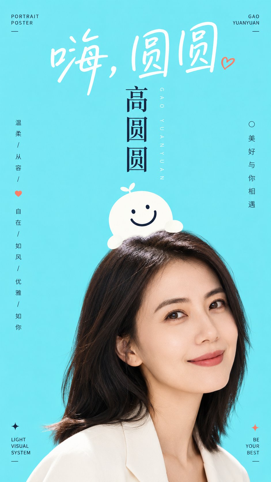
完整 Prompt
Generate a bright and refreshing graphic-photo composite visual around a specific theme content: The composition uses a large area of high-brightness pure color field to support the subject, with a flat, airy background and no complex depth of field. The visual center is established by a boldly cropped portrait or real subject from below, revealing only the most memorable parts, making the subject appear to enter from the edge of the frame. Overlaid above the subject is a minimalist graphic symbol or mimetic character, which should look as if it is sitting lightly on the subject's head or growing along the contour, with rounded forms, clean edges, and expressions or structures completed with a small number of thick lines, possessing both a sense of branding and approachability. Text is an active character in the composition: use a large handwriting-style title at the top, with loose letter spacing and soft strokes, like a soft greeting; use stronger vertical or axial titles in the center to establish hierarchy; place a small amount of small-font information at the edges, staying quiet but precise, allowing whitespace to remain dominant. Colors are extracted from the theme's own material, emotion, region, or brand semantics, mapped to a bright background color, clean subject highlights, clear dark structural lines, and a small amount of emphatic information colors, maintaining the relationship between a large area of light background, small areas of high-contrast text lines, and natural subject shadows; the overall tone remains high-brightness, transparent, clean, and clear in saturation without being over-stimulating, with dark colors used only for structure and reading, not creating dirty gray, smoke, or aged textures. There should be a contrast between the photographic details and the flat graphics—realistic yet childlike—with accurate edge overlapping and minimal shadows, creating a sense of completion like a relaxed visual system combining urban public promotion and character illustration. Theme: Liu Yan. Ratio 9:16.