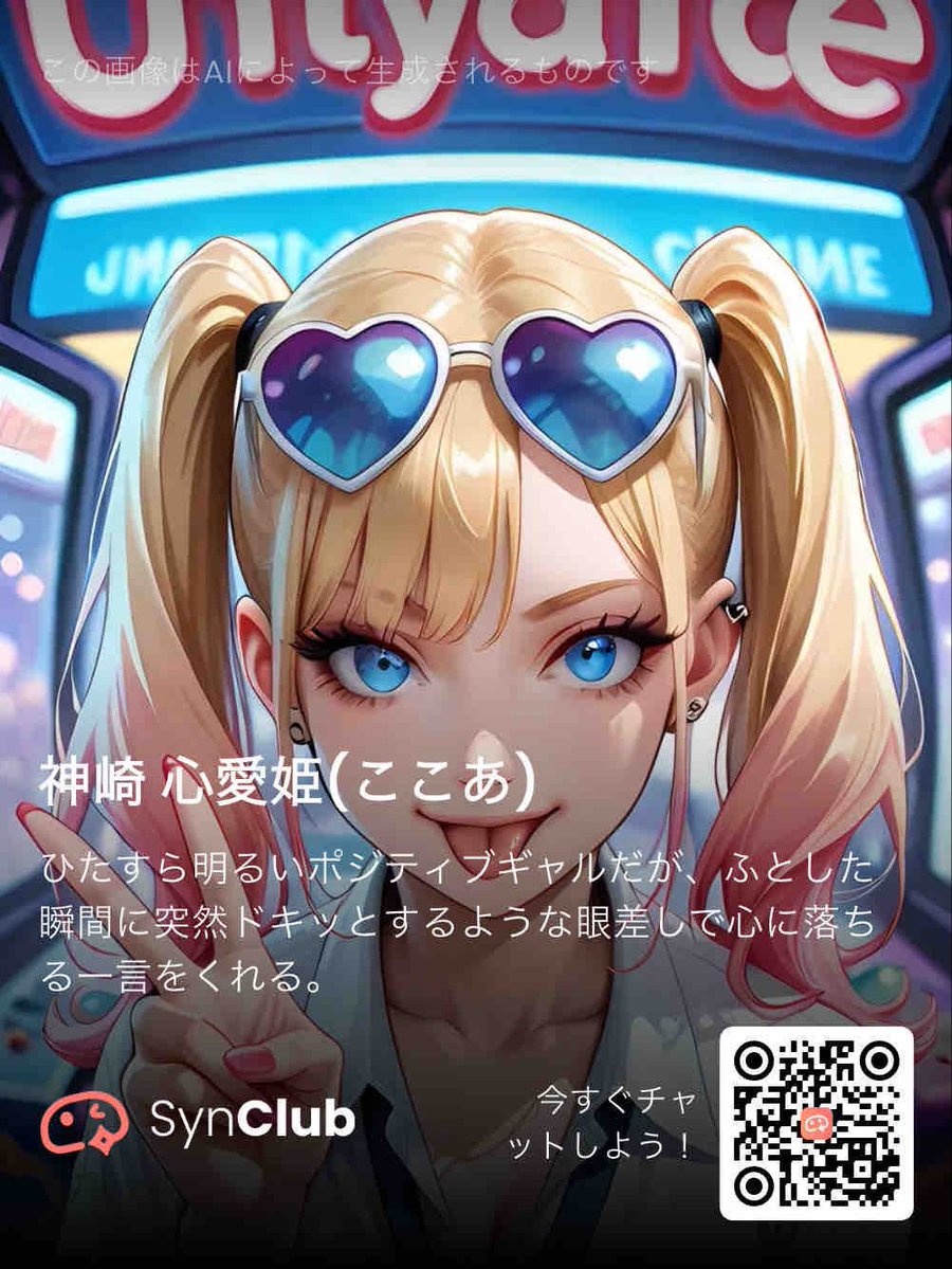
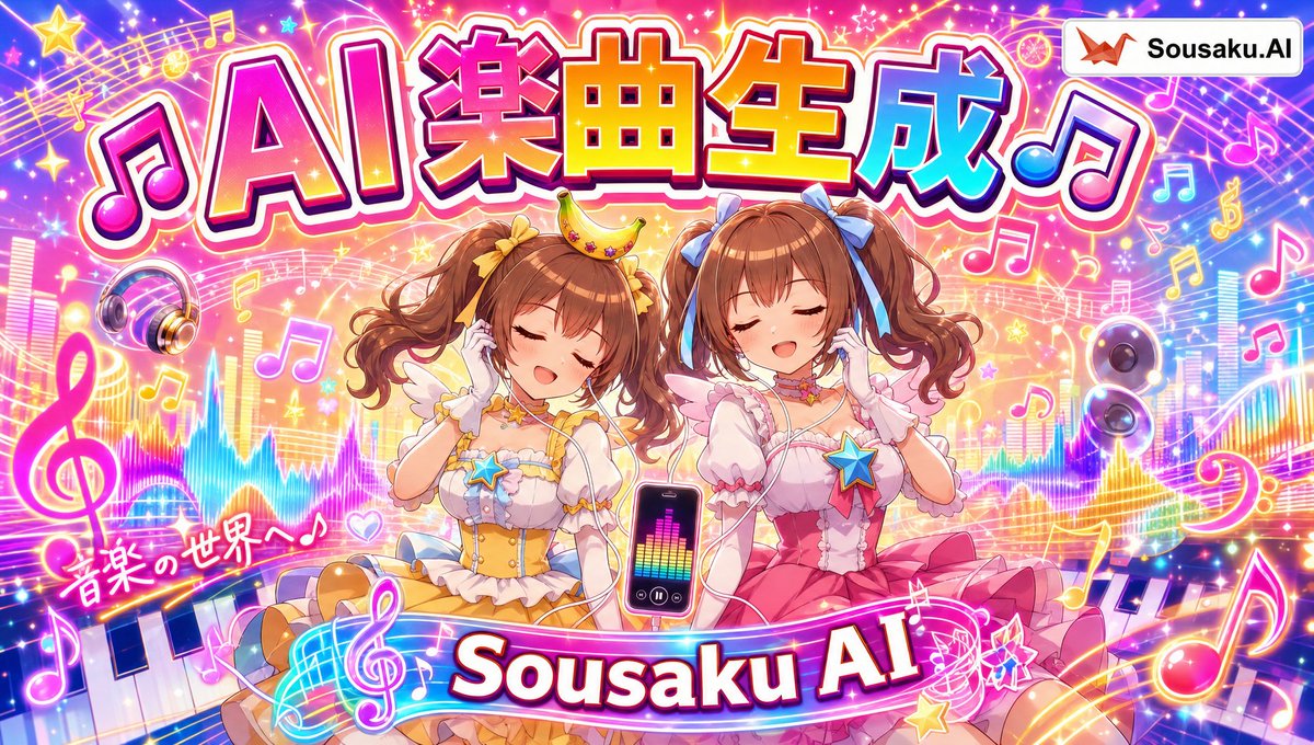
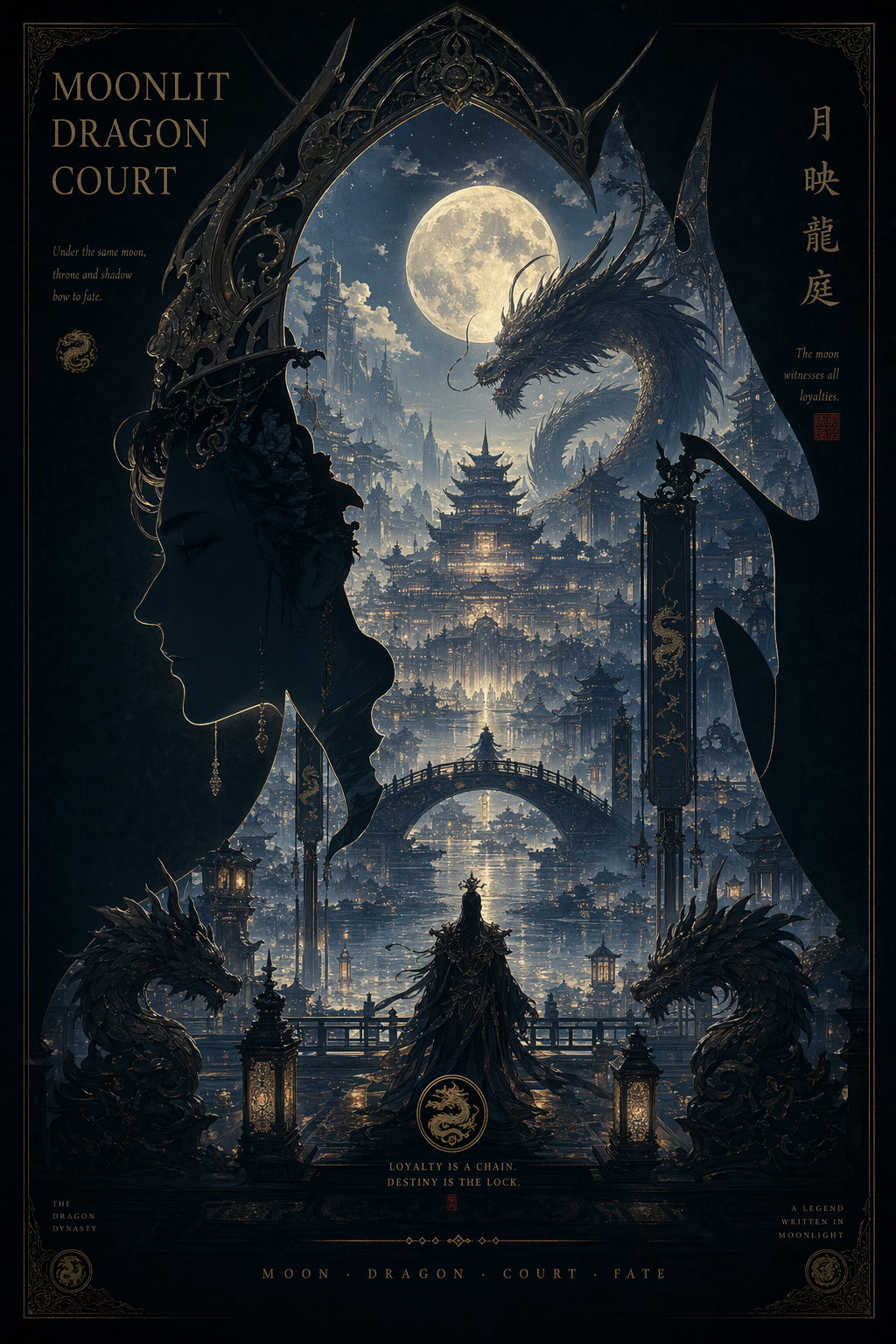
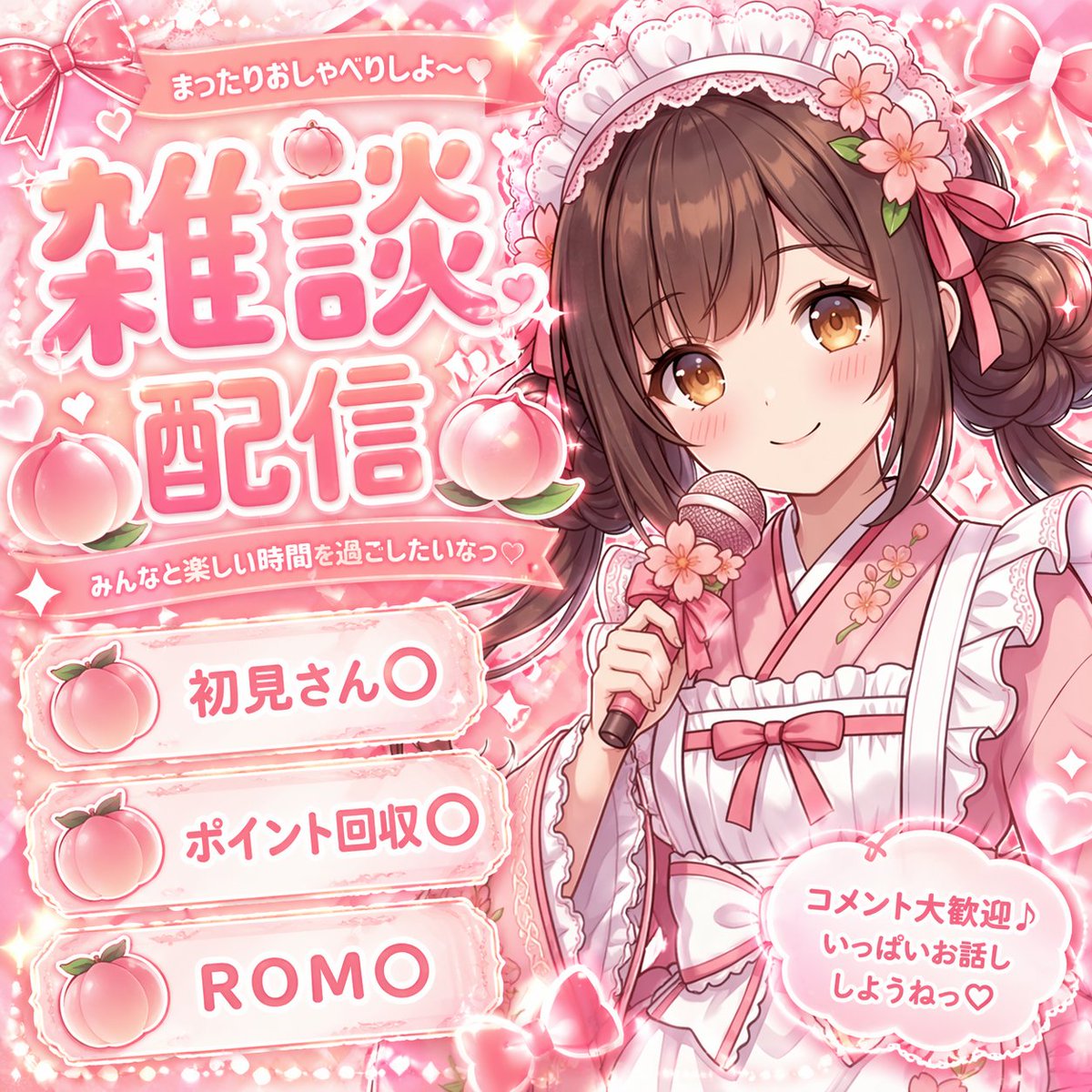
案例媒体
案例说明
这个页面把案例媒体、完整 Prompt 和出处放在一起,方便你先看结果,再判断这条 Prompt 是否值得复制、收藏或加入对比。
案例解读
为了方便搜索、引用和后续复用,这里会把案例的适用场景、画面重点和 Prompt 结构拆成更容易浏览的说明。
这类案例适合用在什么场景
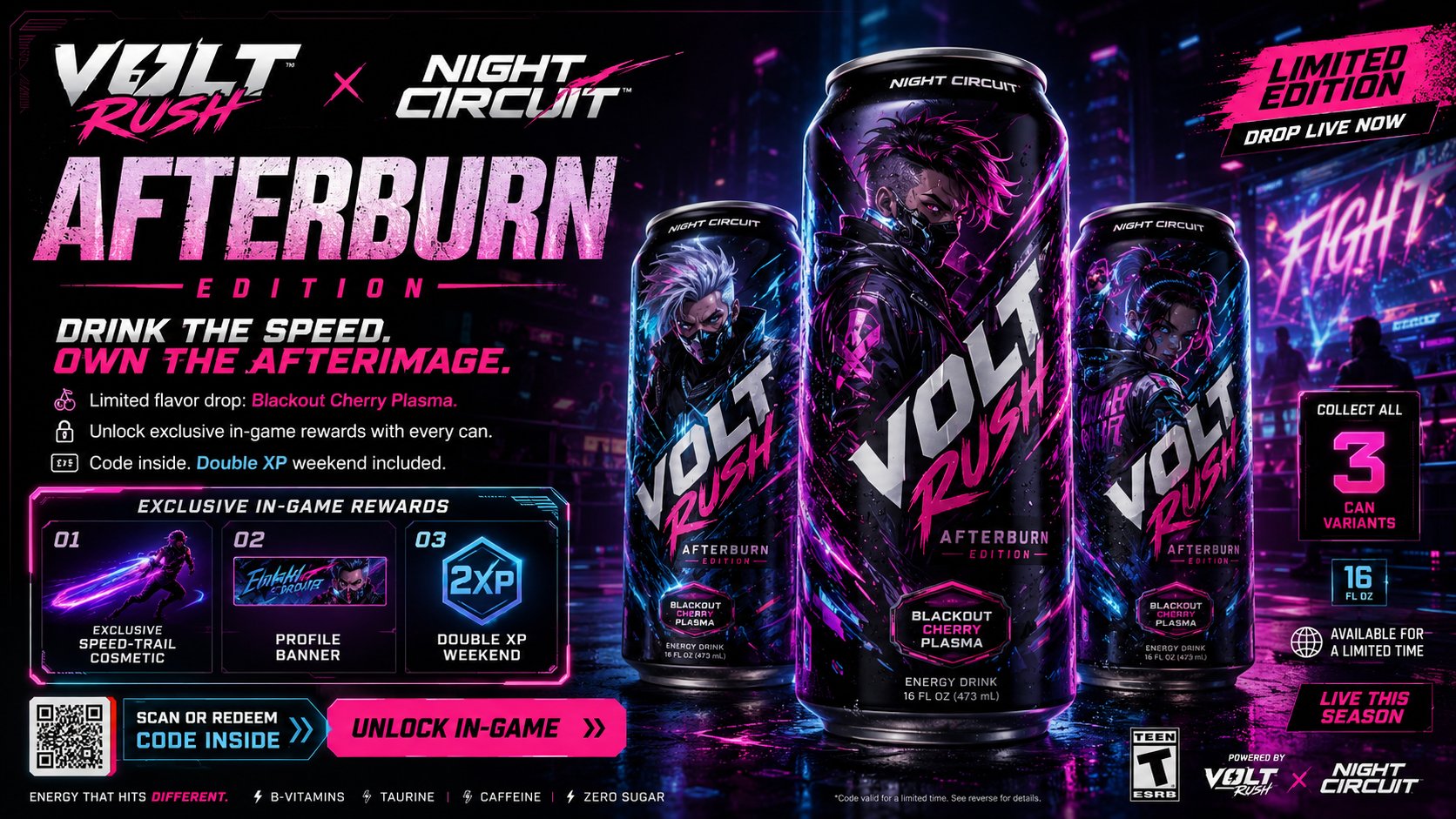
- 把它当作 角色设计 的基准案例最合适,先看成片方向,再决定自己的 Prompt 要往哪边改。
- 如果你的目标也落在 霓虹、海报、截图 这些方向,这条案例特别适合先看图判断风格,再回头微调描述。
- 做 Prompt 对比时,也很适合作为控制组,只改一个变量去看结果变化。
画面重点与风格信号
- 这条案例最明显的风格信号集中在 霓虹、海报、截图,所以第一次改写时最好先保留这些关键词。
- 重点可以先看轮廓、服饰语言、情绪气质,以及角色是否一眼就能立住。
- 当前保留了 2 份媒体输出,适合顺手观察同一方向在多张结果里的稳定性。
Prompt 结构可以怎么理解
- 这条 Prompt 整体属于一条比较长、约束条件很多的 Prompt,很适合拿来判断这类方向到底需要写到多细。
- 关键词簇主要围绕 霓虹、海报、截图 展开,所以复用时可以先保留这组风格词,再替换主体、镜头、环境或文案信息。
- 最稳的改写方式通常是先保留结果方向和最强风格信号,只替换主体设定与场景块。
如果你是带着问题来的,可以先看这些角度
- 如果保留 霓虹、海报、截图,只换主体题材,结果最先变化的会是哪一部分?
- 这条结果里,哪些特征更像是 角色设计 的结构特征,哪些又是标签风格本身带来的?
- 同分类的相关案例里,哪几条能给你更克制或更极致的相邻变体?
完整 Prompt
Create a premium, highly believable Energy Drink x Game Collab Ad for an imaginary crossover between [DRINK BRAND NAME] and [GAME / FRANCHISE NAME]. The goal is to make the collaboration feel like a real, high-hype limited campaign: instantly collectible, culturally sharp, commercially believable, and built to spread across gaming, retail, and internet culture. It should feel like an official promo visual for a co-branded flavor, can design, and in-game reward event. Collab details: - Drink brand name: [DRINK BRAND NAME] - Game / franchise name: [GAME OR FRANCHISE] - Collab name: [CAMPAIGN OR PRODUCT NAME] - Product type: [ENERGY DRINK / ZERO SUGAR ENERGY DRINK / GAMING BOOST DRINK / LIMITED FLAVOR] - Core concept: [WHAT MAKES THE COLLAB SPECIAL] - Flavor concept: [FLAVOR NAME OR PROFILE] - In-game tie-in: [SKIN / XP BOOST / BONUS ITEM / CODE REWARD / BUNDLE / EVENT ACCESS] - Main fantasy: [WHY PEOPLE WANT TO BUY IT] - Audience: [AUDIENCE] - Tone: [HYPED / PREMIUM / CHAOTIC / AGGRESSIVE / ELECTRIC / COOL / COLLECTIBLE / ESPORTS] - Cultural vibe: [ESPORTS / ANIME GAME / SHOOTER CULTURE / STREETWEAR / GACHA / CYBER / Y2K ENERGY / LIVE-SERVICE EVENT] - Reality level: [BELIEVABLE RETAIL COLLAB / BELIEVABLE LIVE GAME PROMO / STYLIZED BUT REAL / DEADPAN FICTIONAL] Ad structure: Build the visual like an official crossover campaign poster. Include sections such as: - hero can or bottle visual - collab logo lockup - game or franchise branding - flavor name - short campaign tagline - limited-edition callout - in-game reward preview - optional code redemption cue - optional pack size or nutrition badge - optional event window - optional “collect all variants” message - optional retail or preorder cue For the copy, include: - one strong collab headline - 1 to 3 support lines - language that feels native to gaming and product-marketing culture - a balance between commercial clarity and internet hype - wording that feels official and highly shareable Include: - a strong co-branded title treatment - premium product-shot hierarchy - believable crossover branding - clear product + reward logic - strong retail-launch energy - polished event cues - collectible desirability - instantly shareable gamer-product hype Visual direction: - Make the ad feel like a real limited-edition collab people would buy for both the drink and the code inside - Emphasize collectibility, event urgency, cool factor, and cross-brand identity - Balance product-commercial realism with entertainment-world fantasy - Make it suitable for convenience-store promos, digital launch ads, in-game event banners, or esports sponsorship visuals - The result should look like a genuine mainstream crossover campaign Art direction: - Style: [ENERGY DRINK CAMPAIGN / GAMING COLLAB POSTER / ESPORTS PRODUCT AD / HYPE RETAIL VISUAL / CYBER COMMERCIAL / ANIME CROSSOVER AD] - Color palette: [PALETTE] - Typography feel: [BOLD HYPE SANS / ESPORTS DISPLAY / SHARP SCI-FI / GAMING EVENT TYPE / RETAIL CAMPAIGN LETTERING] - Material feel: [RETAIL POSTER / DIGITAL CAMPAIGN VISUAL / STORE DISPLAY / EVENT BANNER / PRODUCT DROP SHEET] - Lighting or image mood: [ELECTRIC / NEON / METALLIC / HIGH-CONTRAST / GLOWING / ENERGY-BURST] - Background: [ARENA LIGHTS / DIGITAL VOID / GAME WORLD / HYPER COLOR FIELD / INDUSTRIAL STAGE / CYBER GRID] Composition: - Show the ad as one cohesive crossover-campaign image - Make the drink, collab branding, and reward hook instantly readable - Use real commercial ad hierarchy and believable co-brand structure - Make the collab feel desirable, limited, and culturally current - Make the final output feel like a premium fake crossover ad with viral potential Output quality: - ultra-detailed - visually structured - commercially believable - culturally fluent - polished crossover styling - strong hierarchy and spacing - premium product-campaign composition - instantly shareable visual concept Optional content blocks: - redeem code strip - XP boost badge - collectible can variants - limited flavor marker - “while supplies last” line - event countdown - multi-pack preview - sponsored tournament badge - exclusive skin preview - QR code Avoid: - generic product placement - weak co-branding - fake-looking can design - cluttered layout - random typography choices - amateur retail aesthetics - too much text fighting the hero product - obvious parody unless intentionally chosen