案例媒体
案例说明
这个页面把案例媒体、完整 Prompt 和出处放在一起,方便你先看结果,再判断这条 Prompt 是否值得复制、收藏或加入对比。
案例解读
为了方便搜索、引用和后续复用,这里会把案例的适用场景、画面重点和 Prompt 结构拆成更容易浏览的说明。
这类案例适合用在什么场景
- 把它当作 角色设计 的基准案例最合适,先看成片方向,再决定自己的 Prompt 要往哪边改。
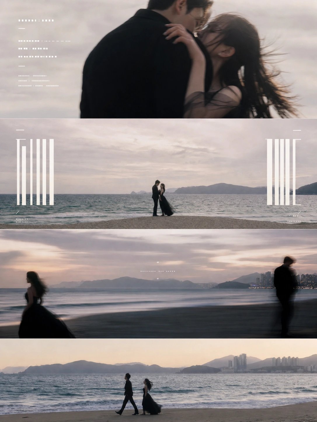
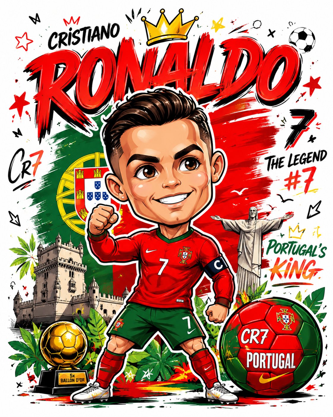
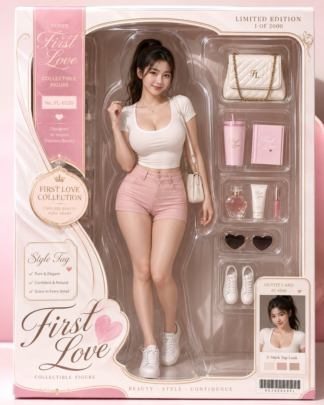
- 如果你的目标也落在 海报、截图、角色 这些方向,这条案例特别适合先看图判断风格,再回头微调描述。
- 做 Prompt 对比时,也很适合作为控制组,只改一个变量去看结果变化。
画面重点与风格信号
- 这条案例最明显的风格信号集中在 海报、截图、角色,所以第一次改写时最好先保留这些关键词。
- 重点可以先看轮廓、服饰语言、情绪气质,以及角色是否一眼就能立住。
- 当前保留了 2 份媒体输出,适合顺手观察同一方向在多张结果里的稳定性。
Prompt 结构可以怎么理解
- 这条 Prompt 整体属于一条比较长、约束条件很多的 Prompt,很适合拿来判断这类方向到底需要写到多细。
- 关键词簇主要围绕 海报、截图、角色 展开,所以复用时可以先保留这组风格词,再替换主体、镜头、环境或文案信息。
- 最稳的改写方式通常是先保留结果方向和最强风格信号,只替换主体设定与场景块。
如果你是带着问题来的,可以先看这些角度
- 如果保留 海报、截图、角色,只换主体题材,结果最先变化的会是哪一部分?
- 这条结果里,哪些特征更像是 角色设计 的结构特征,哪些又是标签风格本身带来的?
- 同分类的相关案例里,哪几条能给你更克制或更极致的相邻变体?
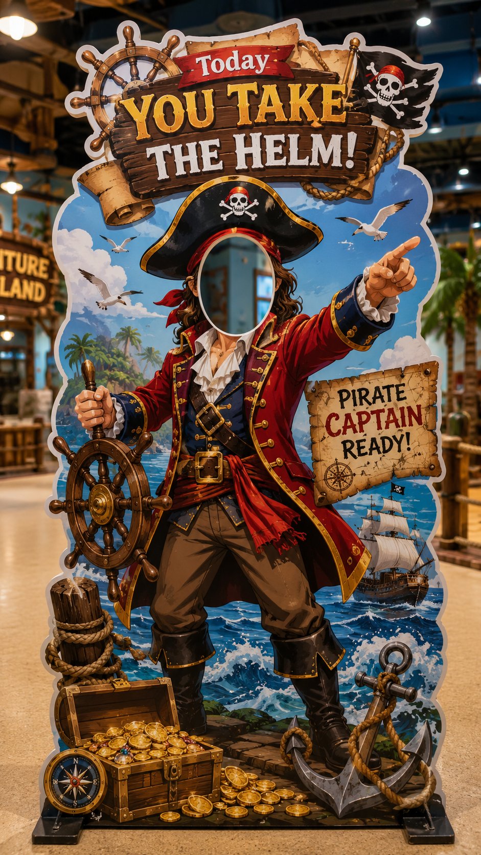
完整 Prompt
Create a vertical 9:16 “interactive face-in-hole die-cut photo standee” for a real store, theme space, pop-up event or family-friendly venue. Theme: [theme, e.g. little astronaut / dessert chef / pet groomer / pirate captain / firefighter / explorer / princess / zookeeper] Venue type: [kids’ playground / dessert shop / pet store / theme park / mall event / family restaurant / pop-up booth] Role concept: [what the visitor becomes after putting their face into the cutout] Main slogan: [short fun slogan, e.g. “Today you go to the moon!” / “You’re the dessert chef!” / “You take the helm!”] Color palette: [main colors] Visual style: [cute / dreamy / adventurous / playful / premium / cartoon-realistic / family-friendly] Design requirements: * The image must show one full vertical 9:16 interactive standee. * The standee must have a clear face cutout / head hole where a real person can place their face for photos. * The face cutout should be in the upper-middle area, clean and unobstructed. * Design a complete role-play body under the cutout so the visitor looks like they become the character. * Use a bold die-cut outline, thick white border, and realistic printed standee material. * Add oversized props and themed elements around the body to make the standee fun and photogenic. * The overall shape should be irregular and playful, not a simple rectangle. * Include a strong top slogan, a few small decorative labels, and themed visual details, but avoid overcrowding. * The standee should feel like a real photo-op installation placed inside a store or event space. * Show the full standee standing on the floor with a stable base. * Background should be a simple real venue scene, softly blurred, not distracting. * Make it bright, clear, colorful, polished and highly shareable. * The final result should look like a real interactive photo booth prop that people would want to pose with and post on social media. Avoid: ordinary poster design, flat banner layout, no face cutout, messy text, overly crowded information, dark lighting, unrealistic structure, hidden standee base.