案例媒体
案例说明
这个页面把案例媒体、完整 Prompt 和出处放在一起,方便你先看结果,再判断这条 Prompt 是否值得复制、收藏或加入对比。
案例解读
为了方便搜索、引用和后续复用,这里会把案例的适用场景、画面重点和 Prompt 结构拆成更容易浏览的说明。
这类案例适合用在什么场景
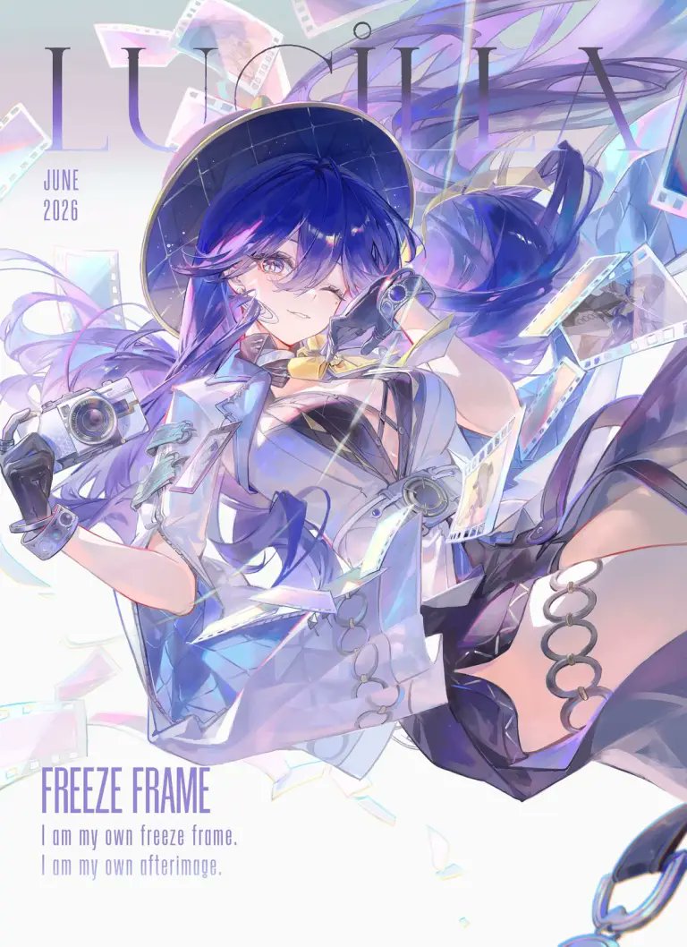
- 把它当作 角色设计 的基准案例最合适,先看成片方向,再决定自己的 Prompt 要往哪边改。
- 如果你的目标也落在 霓虹、人像、时尚 这些方向,这条案例特别适合先看图判断风格,再回头微调描述。
- 做 Prompt 对比时,也很适合作为控制组,只改一个变量去看结果变化。
画面重点与风格信号
- 这条案例最明显的风格信号集中在 霓虹、人像、时尚,所以第一次改写时最好先保留这些关键词。
- 重点可以先看轮廓、服饰语言、情绪气质,以及角色是否一眼就能立住。
- 当前保留了 2 份媒体输出,适合顺手观察同一方向在多张结果里的稳定性。
Prompt 结构可以怎么理解
- 这条 Prompt 整体属于一条比较长、约束条件很多的 Prompt,很适合拿来判断这类方向到底需要写到多细。
- 关键词簇主要围绕 霓虹、人像、时尚 展开,所以复用时可以先保留这组风格词,再替换主体、镜头、环境或文案信息。
- 最稳的改写方式通常是先保留结果方向和最强风格信号,只替换主体设定与场景块。
如果你是带着问题来的,可以先看这些角度
- 如果保留 霓虹、人像、时尚,只换主体题材,结果最先变化的会是哪一部分?
- 这条结果里,哪些特征更像是 角色设计 的结构特征,哪些又是标签风格本身带来的?
- 同分类的相关案例里,哪几条能给你更克制或更极致的相邻变体?
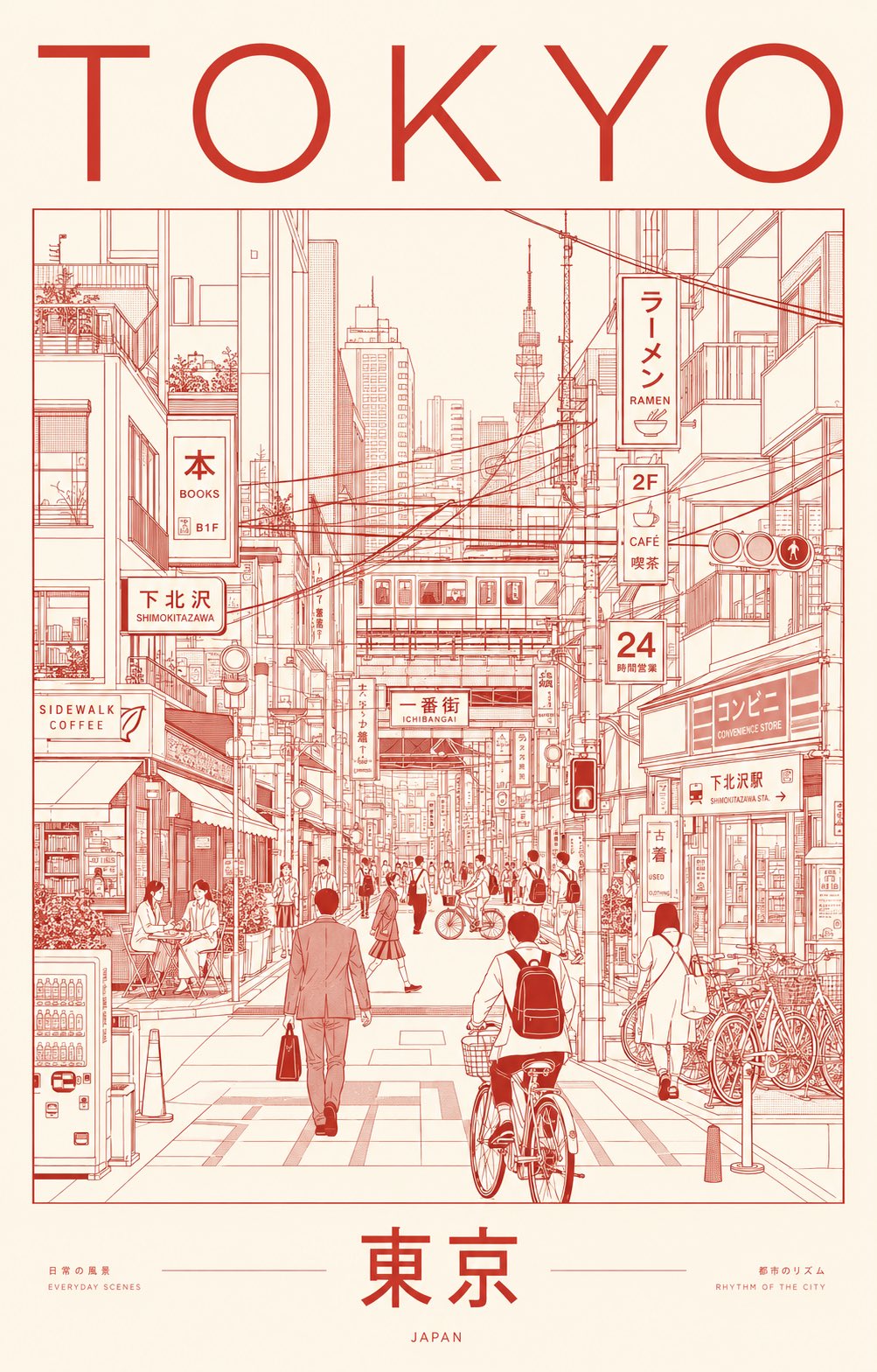
完整 Prompt
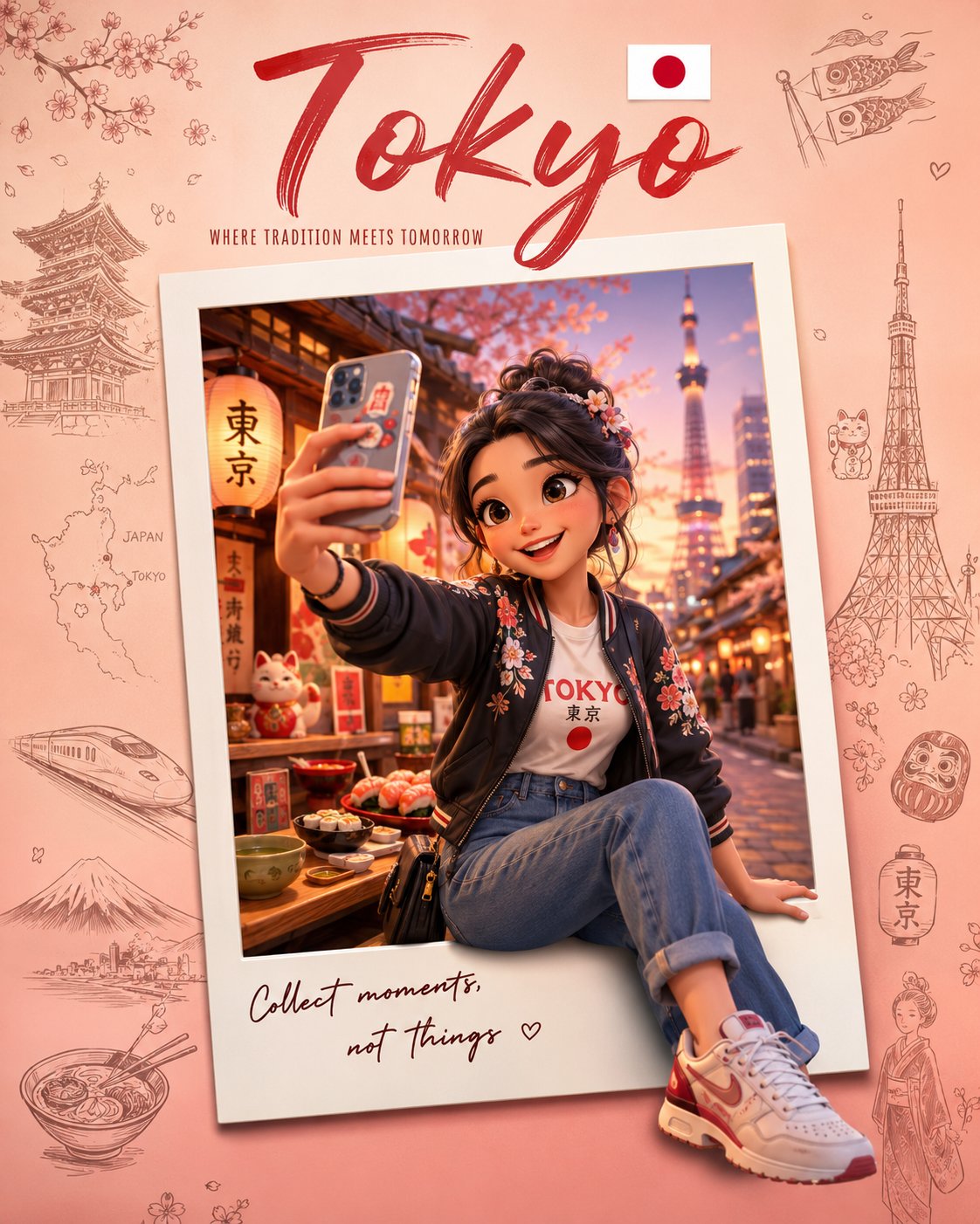
Create an ultra-premium minimalist city portrait poster of TOKYO, capturing the quiet sophistication and organized chaos of everyday urban life through an architectural line-art illustration. Instead of highlighting famous landmarks, portray a lived-in neighborhood scene where daily routines define the city’s identity. Feature a dense yet elegant streetscape inspired by areas such as Shimokitazawa, Nakameguro, Kichijoji, Koenji, or a contemporary Tokyo side street filled with local character. SCENE The composition centers on a bustling pedestrian corridor lined with compact cafés, ramen counters, bookstores, convenience stores, bicycle parking, vending machines, rail infrastructure, utility poles, narrow storefronts, and layered Japanese signage. Residents naturally inhabit the scene: Office workers commuting Students crossing intersections Cyclists weaving through streets Café patrons sitting outdoors Shoppers carrying bags Locals waiting at crossings or transit stops The atmosphere should feel authentically Tokyo—efficient, stylish, human-scaled, and deeply urban. Large landmark structures may appear only as distant silhouettes integrated into the skyline, never as focal points. VISUAL STYLE Contemporary editorial illustration Precision architectural drawing Minimalist monoline artwork Swiss International Style poster design Japanese graphic design influence Museum-quality city branding aesthetic Clean vector rendering Geometric perspective construction Strong use of negative space Sophisticated visual hierarchy LINEWORK Extremely fine monoline strokes Technical illustration precision No sketchiness Dense urban detailing Organized rhythm of windows, cables, signs, bicycles, storefronts, railings, and street furniture Intricate composition that remains visually calm and readable COLOR CONCEPT Use a restrained two-color silkscreen system: One carefully selected ink color One contrasting paper/background color Choose colors that evoke Tokyo’s refined urban energy and contemporary design culture. Suggested palette: Deep vermilion ink on warm rice-paper ivory OR charcoal black ink on pale cream paper OR midnight indigo ink on soft off-white stock Avoid gradients, neon effects, multiple accent colors, or photographic lighting. TYPOGRAPHY Top: TOKYO Bottom: 東京 Typography should feel like a luxury design publication or cultural exhibition poster. Perfect kerning Clean editorial layout Modern sans-serif typography Authentic Japanese signage throughout the illustration No distorted or unreadable text MOOD Not a tourist destination. Not a postcard. A visual celebration of Tokyo’s everyday elegance, urban rhythm, design culture, and human-scale density. The poster should feel like it belongs in a contemporary art museum, premium travel journal, or international design exhibition. OUTPUT Vertical composition (4:5 or 2:3 ratio) Ultra-high-resolution 8K Print-ready poster design Crisp vector-quality rendering Exceptional detail retention Luxury city-brand campaign aesthetic