案例媒体
案例说明
这个页面把案例媒体、完整 Prompt 和出处放在一起,方便你先看结果,再判断这条 Prompt 是否值得复制、收藏或加入对比。
案例解读
为了方便搜索、引用和后续复用,这里会把案例的适用场景、画面重点和 Prompt 结构拆成更容易浏览的说明。
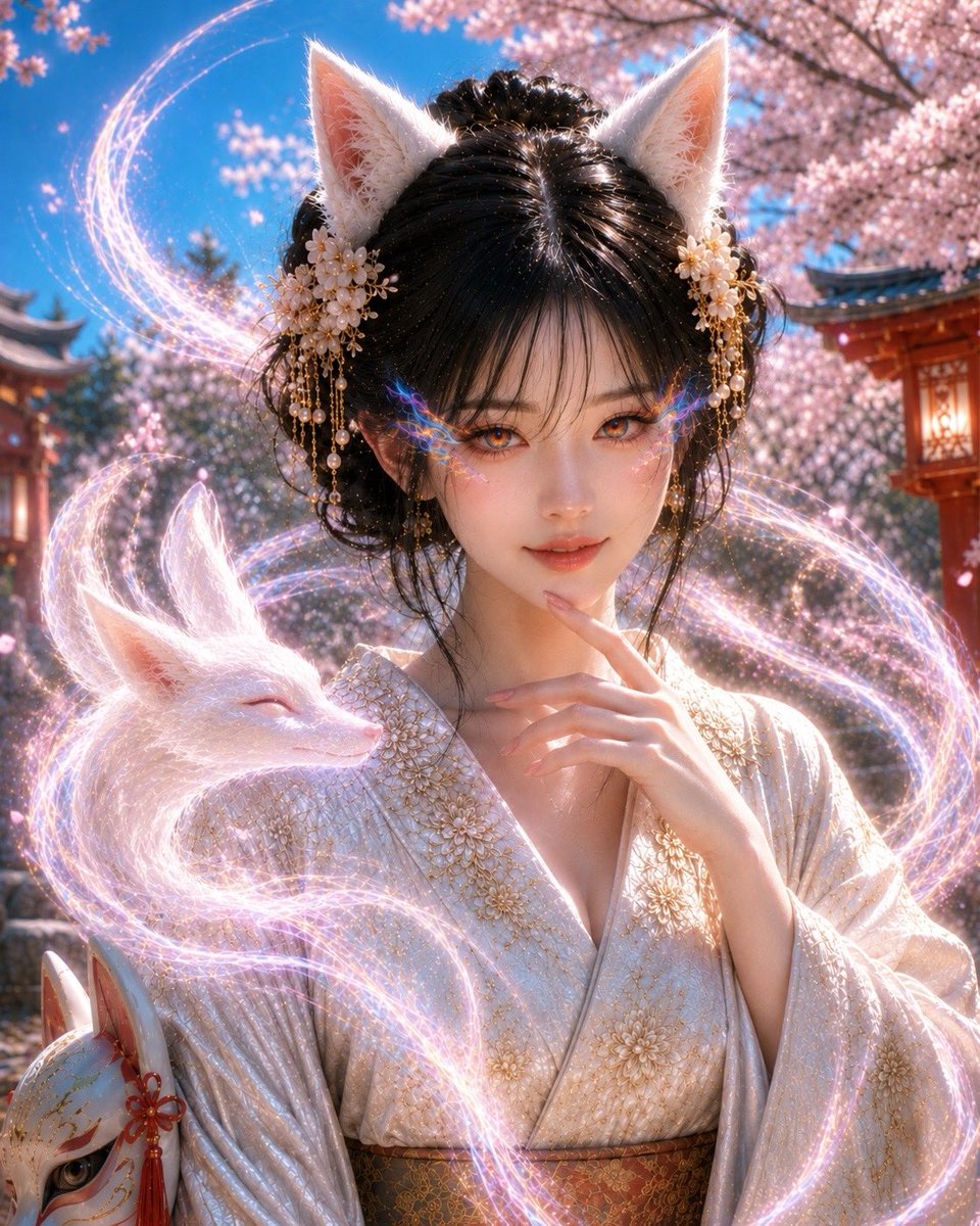
这类案例适合用在什么场景
- 把它当作 角色设计 的基准案例最合适,先看成片方向,再决定自己的 Prompt 要往哪边改。
- 如果你的目标也落在 角色、二次元、产品图 这些方向,这条案例特别适合先看图判断风格,再回头微调描述。
- 做 Prompt 对比时,也很适合作为控制组,只改一个变量去看结果变化。
画面重点与风格信号
- 这条案例最明显的风格信号集中在 角色、二次元、产品图,所以第一次改写时最好先保留这些关键词。
- 重点可以先看轮廓、服饰语言、情绪气质,以及角色是否一眼就能立住。
- 当前只有一张主图,所以第一张结果图就是最核心的参考基准。
Prompt 结构可以怎么理解
- 这条 Prompt 整体属于一条比较长、约束条件很多的 Prompt,很适合拿来判断这类方向到底需要写到多细。
- 关键词簇主要围绕 角色、二次元、产品图 展开,所以复用时可以先保留这组风格词,再替换主体、镜头、环境或文案信息。
- 最稳的改写方式通常是先保留结果方向和最强风格信号,只替换主体设定与场景块。
如果你是带着问题来的,可以先看这些角度
- 如果保留 角色、二次元、产品图,只换主体题材,结果最先变化的会是哪一部分?
- 这条结果里,哪些特征更像是 角色设计 的结构特征,哪些又是标签风格本身带来的?
- 同分类的相关案例里,哪几条能给你更克制或更极致的相邻变体?
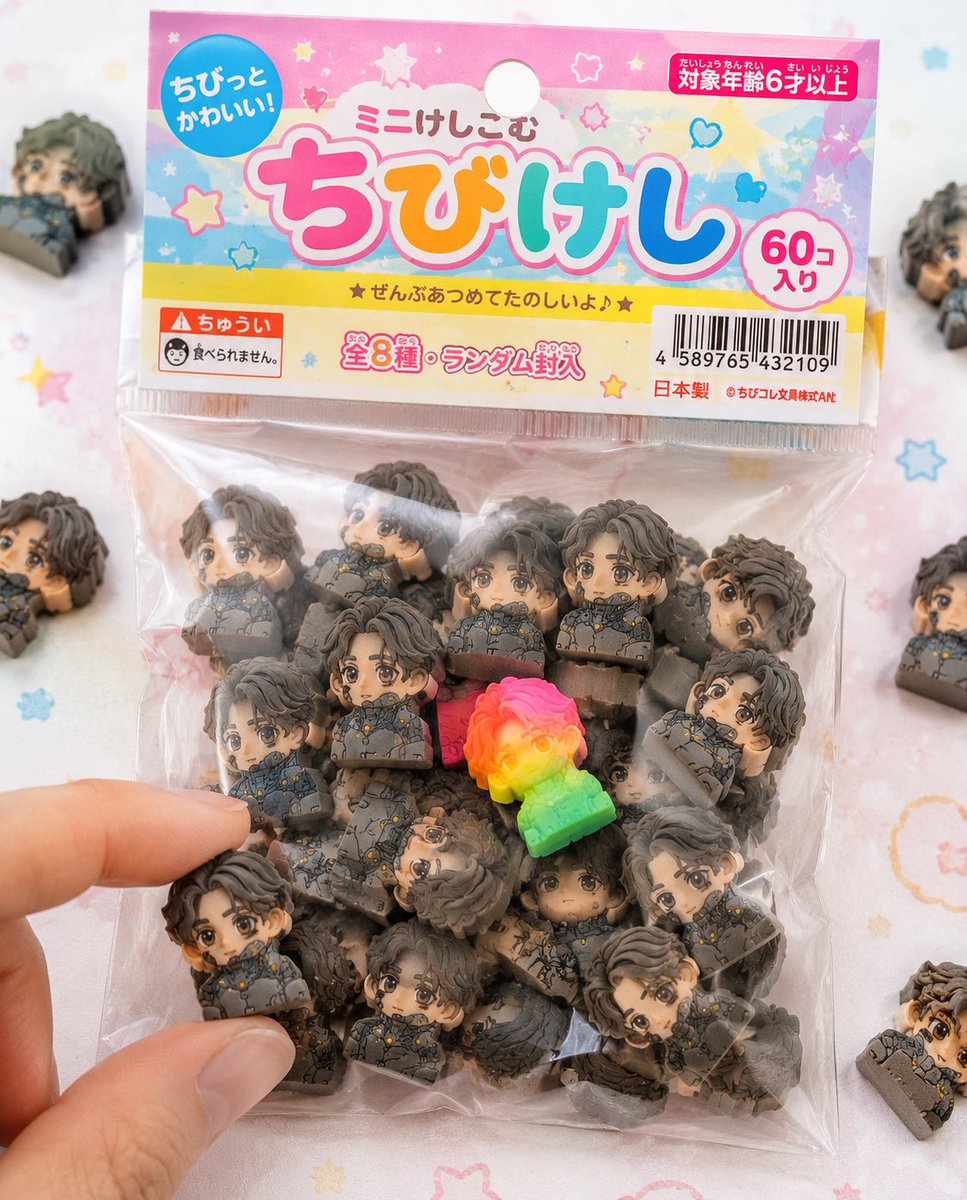
完整 Prompt
Use the attached character sheet as a STRICT design reference. Do not change the face, hairstyle, eye shape, or proportions under any circumstances. ■ Purpose: To fully commercialize the character as a Japanese "{argument name="product name" default="chibi eraser product"}" and create realistic packaged product photos like those sold in stationery stores or gashapon machines. ■ Concept: "Bagged chibi eraser products sold in 100-yen shops and stationery stores." ■ Eraser Main Body: (Maintain exact same specs as before) - Strongly deformed chibi character - Thick block shape - Fully matte rubber material - Fine particles/powder/chips/wear present - Print misalignment/color variations - Random configuration of 50+ items. ■ Packaging (CRITICAL): - Small transparent plastic bag (OPP bag) - Paper header at the top (with hanging hole) - Slightly cheap printing on the header (slight misalignment/ink unevenness) - Wrinkled vinyl, slightly cloudy, sticking to contents due to static - Some air inside causing bulging - Light warping on the sealed section. ■ Graphic Design: - Japanese children's stationery style - Pop and colorful ({argument name="color theme" default="pink, yellow, light blue"} base) - Handwritten-style or rounded fonts - Product logo (original okay) - Text like 'Mini-Keshi' or 'Chibi-Keshi' - Stars, hearts, sparkle decorations. ■ Informational Elements (Enhanced Realism): - JAN code (barcode) - 'Ages 6 and up' - 'Not edible' warning - 'Total X types' or 'Randomly included' - Small company name (fictional) - MADE IN JAPAN or CHINA markings. ■ Composition: - Packaging is main in center of frame - A few spilled erasers around - 1 or 2 out of the bag - A fingertip picking one up for effect - Natural feel with some frame-out. ■ Rare Element: - Mix in one special individual with fluorescent color or gradient - Place in a prominent position to guide the viewer's gaze. ■ Lighting: - Bright natural light (slightly high-key) - Soft shadows - Cleanliness like a product catalog photo. ■ Camera: - Macro-leaning - Shallow depth of field - Sharp center. ■ Background: - White to pastel table - Subtle dots or pop patterns - Simple and clean. ■ Prohibited: - Plastic feel - glossy expression - Overly high-end texture (cheapness is correct) - Overly perfect printing. ■ Output: - A level indistinguishable from real products - Reality like items found in convenience stores or 100-yen shops - Quality that makes people on SNS say 'I want this.'