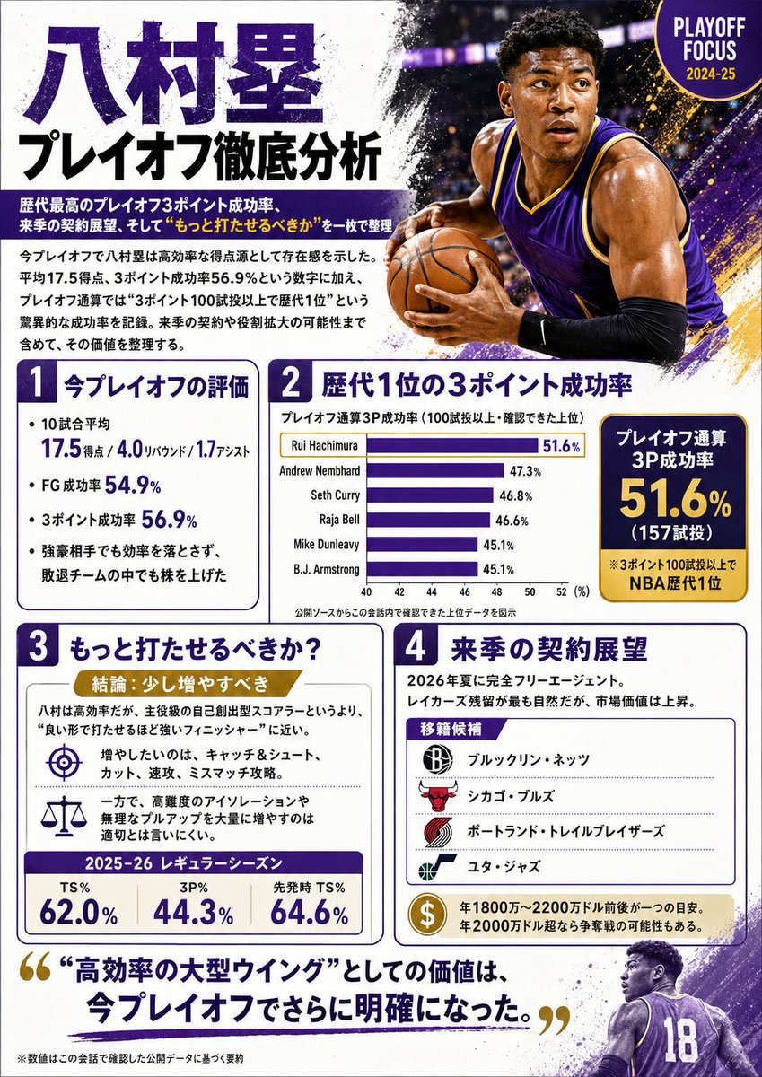
Case Media
Case Notes
This page keeps the media, full prompt, and original source together so you can inspect the result first and decide whether the prompt is worth copying, saving, or comparing.
Case Insights
To make this page easier to search, cite, and reuse later, the case is also broken down into practical guidance about usage, visual cues, and prompt structure.
Best Fit Scenarios
- Use this as a ui & social screens benchmark when you need a fast style baseline before rewriting your own prompt.
- It is especially helpful if your target overlaps with Portrait, Fashion, Poster and you want to judge the image result before tuning wording.
- Keep it as a control sample when you compare nearby prompt variants one variable at a time.
Visual Signals To Notice
- The clearest style signals here are Portrait, Fashion, Poster, so those should usually stay in your first rewrite.
- The important layer is usually interface density, card hierarchy, and how the screen tells the story before you read small text.
- This case keeps 3 media outputs, which makes it easier to check whether the style remains stable across multiple results.
How The Prompt Is Structured
- The prompt reads as a long, highly specified prompt, which is useful when you want to judge how much specificity this direction needs.
- Its keyword cluster is centered on Portrait, Fashion, Poster, so you can usually keep that cluster while swapping subject, camera, layout, or copy details.
- A practical rewrite path is: keep the outcome, keep the strongest style cues, then replace only the subject and environment blocks.
Good Follow-up Questions
- What changes first if you keep Portrait, Fashion, Poster but switch the subject matter?
- Which part of the result comes from section-level structure (UI & Social Screens) versus tag-level style cues?
- Which related cases in the same section give you a cleaner or more extreme variation of the same direction?
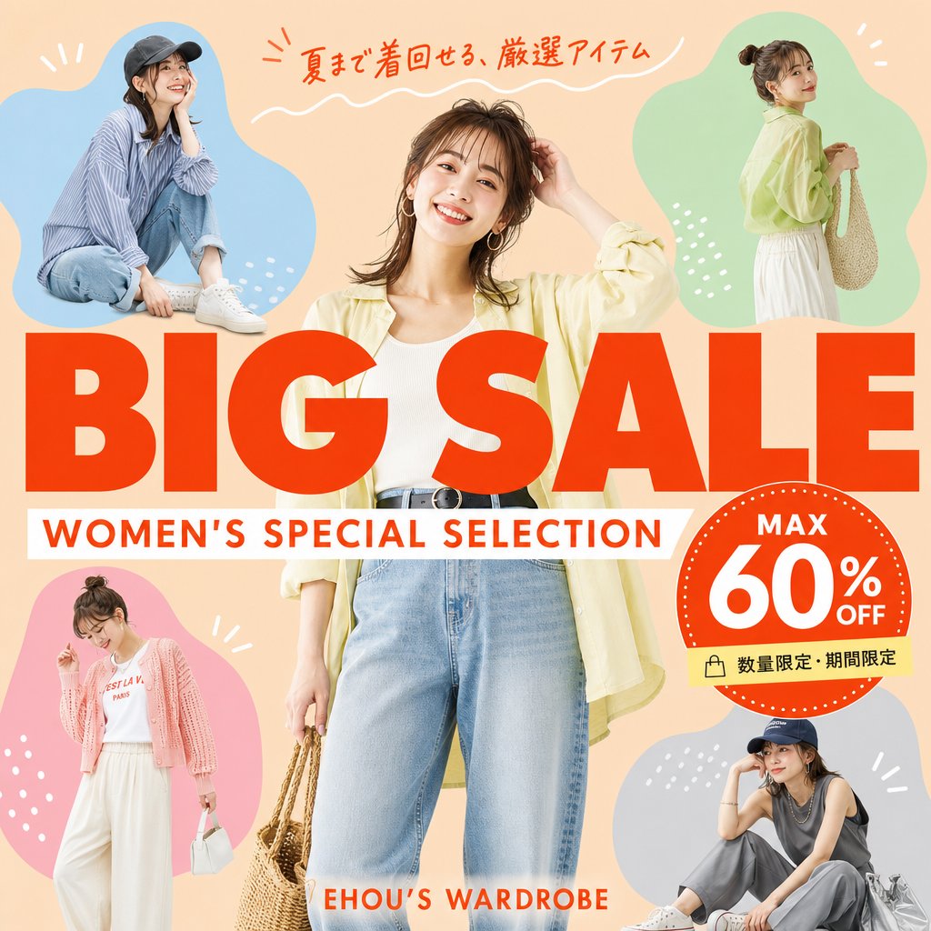
Full Prompt
Goal: Create a square fashion e-commerce sale banner for a women's summer clothing promotion, with accurate Japanese text and a cheerful catalog-ad look. Canvas: 1:1 square social media graphic, peach-beige background, bright summer palette, clean commercial layout, no border or watermark. Layout: Place one large central full-body female fashion model in front, cropped slightly at the top and bottom, wearing {argument name="central outfit" default="a pale yellow open shirt, white ribbed tank top, high-waisted light blue jeans, black belt, hoop earrings, and holding a woven straw bag"}. Surround her with exactly 4 smaller fashion model cutouts inside soft organic color blobs: top-left blue blob with a seated casual model in a striped shirt, jeans, white sneakers, and dark cap; top-right green blob with a standing side-view model in a pale yellow blouse, white skirt, and woven shoulder bag; bottom-left pink blob with a standing model in a pink cardigan, white graphic tee, wide white pants, and small white handbag; bottom-right gray-blue blob with a seated model in a dark sleeveless top, gray pants, white sneakers, cap, and silver tote bag. Use simple white decorative doodles around the blobs: short rays, dots, and small curved strokes. Main text: Huge bold red-orange uppercase headline across the center reading {argument name="main title" default="BIG SALE"}, overlapping the central model slightly. Directly underneath, add a white horizontal banner with red-orange uppercase subtitle reading {argument name="subtitle" default="WOMEN'S SPECIAL SELECTION"}. At the very top, add handwritten red-orange Japanese copy reading {argument name="top Japanese copy" default="夏まで着回せる、厳選アイテム"} with a white wavy underline. Near the bottom center, add small red-orange brand text reading {argument name="brand text" default="EHOU’S WARDROBE"}. Discount badge: On the right side overlapping the headline, create one large red-orange circular badge with a dotted white rim. Inside it, include exactly 3 text elements: “MAX” at the top, very large “60%” in the center, and “OFF” to the right/bottom of the percent. Attach a small pale yellow label strip below the badge with a shopping bag icon and Japanese text reading {argument name="limited offer text" default="数量限定・期間限定"}. Visual style: Photorealistic fashion models composited with bold flat graphic shapes, magazine-sale flyer aesthetic, warm lighting, saturated red-orange typography, crisp cutout edges, playful but polished Japanese retail advertising design. Constraints: Include exactly 5 women total: 1 central model plus 4 smaller surrounding models. Include exactly 4 colored blob backgrounds: blue, green, pink, and gray-blue. Keep all text sharp, correctly spelled, and readable. Do not add extra models, extra badges, extra logos, or unnecessary text.