Case Media
Case Notes
This page keeps the media, full prompt, and original source together so you can inspect the result first and decide whether the prompt is worth copying, saving, or comparing.
Case Insights
To make this page easier to search, cite, and reuse later, the case is also broken down into practical guidance about usage, visual cues, and prompt structure.
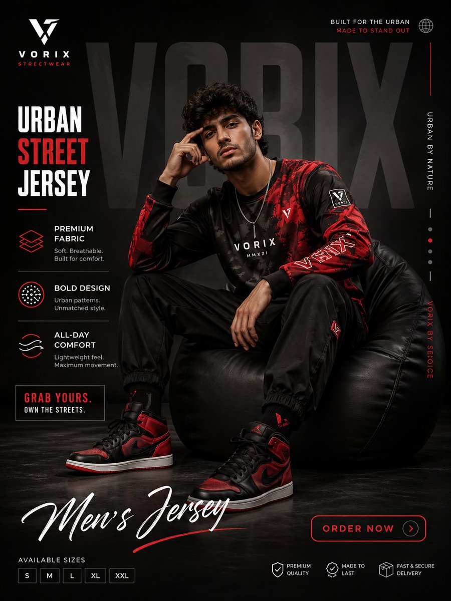
Best Fit Scenarios
- Use this as a ui & social screens benchmark when you need a fast style baseline before rewriting your own prompt.
- It is especially helpful if your target overlaps with Fashion, Poster, UI and you want to judge the image result before tuning wording.
- Keep it as a control sample when you compare nearby prompt variants one variable at a time.
Visual Signals To Notice
- The clearest style signals here are Fashion, Poster, UI, so those should usually stay in your first rewrite.
- The important layer is usually interface density, card hierarchy, and how the screen tells the story before you read small text.
- This case keeps one primary output, so the first image should be treated as the main visual reference.
How The Prompt Is Structured
- The prompt reads as a long, highly specified prompt, which is useful when you want to judge how much specificity this direction needs.
- Its keyword cluster is centered on Fashion, Poster, UI, so you can usually keep that cluster while swapping subject, camera, layout, or copy details.
- A practical rewrite path is: keep the outcome, keep the strongest style cues, then replace only the subject and environment blocks.
Good Follow-up Questions
- What changes first if you keep Fashion, Poster, UI but switch the subject matter?
- Which part of the result comes from section-level structure (UI & Social Screens) versus tag-level style cues?
- Which related cases in the same section give you a cleaner or more extreme variation of the same direction?
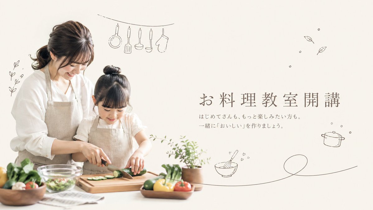
Full Prompt
A soft, airy promotional hero image for a {argument name="class theme" default="Japanese home cooking class"} on a warm off-white background, styled like a minimalist lifestyle flyer. On the left half, show 2 people: an adult woman and a young girl cooking together at a white kitchen counter, both with calm, natural poses and gentle body language. The woman stands slightly behind and to the left of the child, leaning in supportively while helping guide the girl's hands as she slices a cucumber on a wooden cutting board with a kitchen knife. Their faces are intentionally obscured with soft rectangular blur blocks. The woman has dark brown hair tied in a low ponytail and wears a loose white blouse with a natural linen apron. The girl has dark hair in a high bun and wears a light short-sleeve top with a matching beige linen apron. On the counter, include a clear glass mixing bowl with salad, a folded striped kitchen towel, a wooden bowl of vegetables on the far left, a small wooden tray or plate with colorful vegetables in front, and a small potted green herb plant near the center-right edge of the cooking area. Visible produce should include sliced cucumber on the board and whole vegetables such as tomatoes, leafy greens, mushrooms, lemons or yellow citrus, and green peppers or cucumbers, arranged in a fresh, wholesome way. On the right half, leave generous negative space and place elegant Japanese headline text in a refined serif style: {argument name="headline text" default="お料理教室開講"}. Beneath it, add 2 lines of smaller Japanese body text: {argument name="subtext" default="はじめてさんも、もっと楽しみたい方も。 一緒に『おいしい』を作りましょう。"}. Surround the composition with 7 delicate hand-drawn dark gray doodle elements: 1 small leafy sprig on the far left, 1 hanging line at the upper left with 5 kitchen tools suspended from it (a frying pan, a spatula, a ladle, a peeler or slim utensil, and an oven mitt), 1 cluster of 2 floating leaves in the upper right, 1 small cooking pot icon on the right, 1 whisking bowl icon with tiny hearts near the lower middle-right, and 1 long single-line flourish sweeping across the lower right. Use soft natural daylight, muted beige and cream tones, shallow depth of field, clean editorial photography, gentle shadows, and a calm family-friendly premium aesthetic suitable for a cooking class landing page or poster.