Case Media
Case Notes
This page keeps the media, full prompt, and original source together so you can inspect the result first and decide whether the prompt is worth copying, saving, or comparing.
Case Insights
To make this page easier to search, cite, and reuse later, the case is also broken down into practical guidance about usage, visual cues, and prompt structure.
Best Fit Scenarios
- Use this as a ui & social screens benchmark when you need a fast style baseline before rewriting your own prompt.
- It is especially helpful if your target overlaps with Neon, Portrait, Illustration and you want to judge the image result before tuning wording.
- Keep it as a control sample when you compare nearby prompt variants one variable at a time.
Visual Signals To Notice
- The clearest style signals here are Neon, Portrait, Illustration, so those should usually stay in your first rewrite.
- The important layer is usually interface density, card hierarchy, and how the screen tells the story before you read small text.
- This case keeps one primary output, so the first image should be treated as the main visual reference.
How The Prompt Is Structured
- The prompt reads as a long, highly specified prompt, which is useful when you want to judge how much specificity this direction needs.
- Its keyword cluster is centered on Neon, Portrait, Illustration, so you can usually keep that cluster while swapping subject, camera, layout, or copy details.
- A practical rewrite path is: keep the outcome, keep the strongest style cues, then replace only the subject and environment blocks.
Good Follow-up Questions
- What changes first if you keep Neon, Portrait, Illustration but switch the subject matter?
- Which part of the result comes from section-level structure (UI & Social Screens) versus tag-level style cues?
- Which related cases in the same section give you a cleaner or more extreme variation of the same direction?
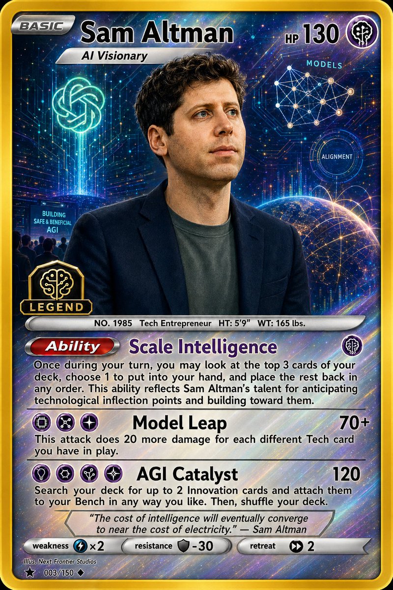
Full Prompt
A highly detailed collectible trading card illustration in the style of a premium holographic monster card, vertical 2.5:3 layout with a thick metallic gold border and glossy foil finish. The card features {argument name="character name" default="Sam Altman"} as the central figure, shown from the chest up in a dark navy blazer over a muted charcoal t-shirt, with short curly dark brown hair, standing against a luminous futuristic cosmic-tech background. The face is intentionally obscured by a large soft-edged rectangular blur centered over the face. At the top left, a silver badge reads BASIC. Across the top center, the large title text reads {argument name="headline text" default="Sam Altman"}, with a smaller silver ribbon subtitle below reading {argument name="subtitle" default="AI Visionary"}. At the top right, display HP 130 and a small circular tech-energy icon. The background is dense with glowing blue, violet, and gold circuitry, stars, and data-like light trails. On the upper left behind the character, include a bright neon emblem resembling an AI knot logo floating above a vertical beam of light. In the upper right, include a white network diagram with connected nodes labeled MODELS, and slightly lower a circular interface ring labeled ALIGNMENT. Near the lower right of the portrait area, show the curved horizon of Earth with glowing interconnected lines across the planet. On the lower left of the portrait area, include a dark teal billboard-like panel with the text BUILDING SAFE & BENEFICIAL AGI and tiny silhouetted figures below it. Also on the lower left overlapping the portrait frame, place a black-and-gold badge with a brain-chip emblem and the word LEGEND. Beneath the portrait, add a silver info bar reading NO. 1985 Tech Entrepreneur HT: 5'9” WT: 165 lbs. The lower half of the card contains 3 gameplay text sections. First section: a red metallic capsule header labeled Ability, followed by the purple title Scale Intelligence and a small tech-energy icon on the right; below it, a paragraph of black rules text describing a strategic deck-search ability. Second section: an attack row with 3 small circular energy icons on the left, the bold attack name Model Leap, and damage 70+ aligned right; below it, a short explanatory sentence in black text. Third section: another attack row with 4 small circular energy icons on the left, the bold attack name AGI Catalyst, and damage 120 aligned right; below it, another explanatory sentence in black text. Under those, add an italic quote box with a beveled silver frame containing {argument name="quote" default="The cost of intelligence will eventually converge to near the cost of electricity." — Sam Altman}. At the very bottom, include a stats strip with 3 labeled components: weakness with a blue lightning icon and ×2, resistance with a gray shield icon and -30, and retreat with 2 black arrow-energy symbols. In the lower left footer, add tiny illustrator credit text and card numbering: Illus. Next Frontier Studios and 003/150. Overall look: polished premium trading card, holographic rainbow sheen, sharp typography, embossed metallic UI, sci-fi prestige aesthetic, deep blue and purple palette with gold highlights, high contrast, collectible card game design.