Case Media
Case Notes
This page keeps the media, full prompt, and original source together so you can inspect the result first and decide whether the prompt is worth copying, saving, or comparing.
Case Insights
To make this page easier to search, cite, and reuse later, the case is also broken down into practical guidance about usage, visual cues, and prompt structure.
Best Fit Scenarios
- Use this as a ui & social screens benchmark when you need a fast style baseline before rewriting your own prompt.
- It is especially helpful if your target overlaps with Illustration, UI, Screenshot and you want to judge the image result before tuning wording.
- Keep it as a control sample when you compare nearby prompt variants one variable at a time.
Visual Signals To Notice
- The clearest style signals here are Illustration, UI, Screenshot, so those should usually stay in your first rewrite.
- The important layer is usually interface density, card hierarchy, and how the screen tells the story before you read small text.
- This case keeps one primary output, so the first image should be treated as the main visual reference.
How The Prompt Is Structured
- The prompt reads as a long, highly specified prompt, which is useful when you want to judge how much specificity this direction needs.
- Its keyword cluster is centered on Illustration, UI, Screenshot, so you can usually keep that cluster while swapping subject, camera, layout, or copy details.
- A practical rewrite path is: keep the outcome, keep the strongest style cues, then replace only the subject and environment blocks.
Good Follow-up Questions
- What changes first if you keep Illustration, UI, Screenshot but switch the subject matter?
- Which part of the result comes from section-level structure (UI & Social Screens) versus tag-level style cues?
- Which related cases in the same section give you a cleaner or more extreme variation of the same direction?
Full Prompt
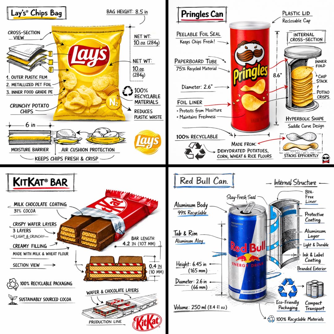
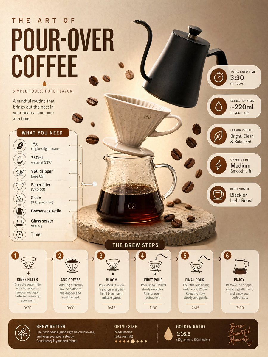
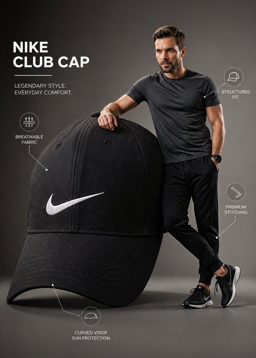
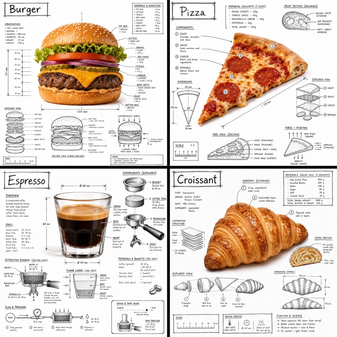
Create an infographic image of [FOOD], combining a realistic photograph or photoreal render of the object with technical annotation overlays placed directly on top. Use black ink–style line drawings and text (technical pen / architectural sketch look) on a pure white studio background, including: •Key component labels •Internal cutaway or exploded-view outlines •Measurements, dimensions, and scale markers •Material callouts and quantities •Arrows indicating function, force, or flow (air, sound, power, pressure) •Simple schematic or sectional diagrams where relevant Place the title “FOOD” inside a hand-drawn technical annotation box in one corner. Style & layout rules: •The real object remains clearly visible beneath the annotations •Annotations feel sketched, technical, and architectural •Clean composition with balanced negative space •Educational, museum-exhibit / engineering-manual vibe Visual style: Minimal technical illustration aesthetic, black linework over realistic imagery, precise but slightly hand-drawn feel. Color palette: White background, black annotation lines and text only. No colors. Output: 1080×1080, ultra-crisp, social-feed optimized, no watermark.