Case Media
Case Notes
This page keeps the media, full prompt, and original source together so you can inspect the result first and decide whether the prompt is worth copying, saving, or comparing.
Case Insights
To make this page easier to search, cite, and reuse later, the case is also broken down into practical guidance about usage, visual cues, and prompt structure.
Best Fit Scenarios
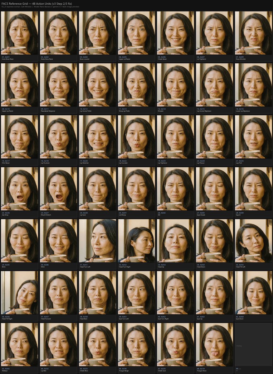
- Use this as a ui & social screens benchmark when you need a fast style baseline before rewriting your own prompt.
- It is especially helpful if your target overlaps with Poster, UI, Screenshot and you want to judge the image result before tuning wording.
- Keep it as a control sample when you compare nearby prompt variants one variable at a time.
Visual Signals To Notice
- The clearest style signals here are Poster, UI, Screenshot, so those should usually stay in your first rewrite.
- The important layer is usually interface density, card hierarchy, and how the screen tells the story before you read small text.
- This case keeps one primary output, so the first image should be treated as the main visual reference.
How The Prompt Is Structured
- The prompt reads as a long, highly specified prompt, which is useful when you want to judge how much specificity this direction needs.
- Its keyword cluster is centered on Poster, UI, Screenshot, so you can usually keep that cluster while swapping subject, camera, layout, or copy details.
- A practical rewrite path is: keep the outcome, keep the strongest style cues, then replace only the subject and environment blocks.
Good Follow-up Questions
- What changes first if you keep Poster, UI, Screenshot but switch the subject matter?
- Which part of the result comes from section-level structure (UI & Social Screens) versus tag-level style cues?
- Which related cases in the same section give you a cleaner or more extreme variation of the same direction?
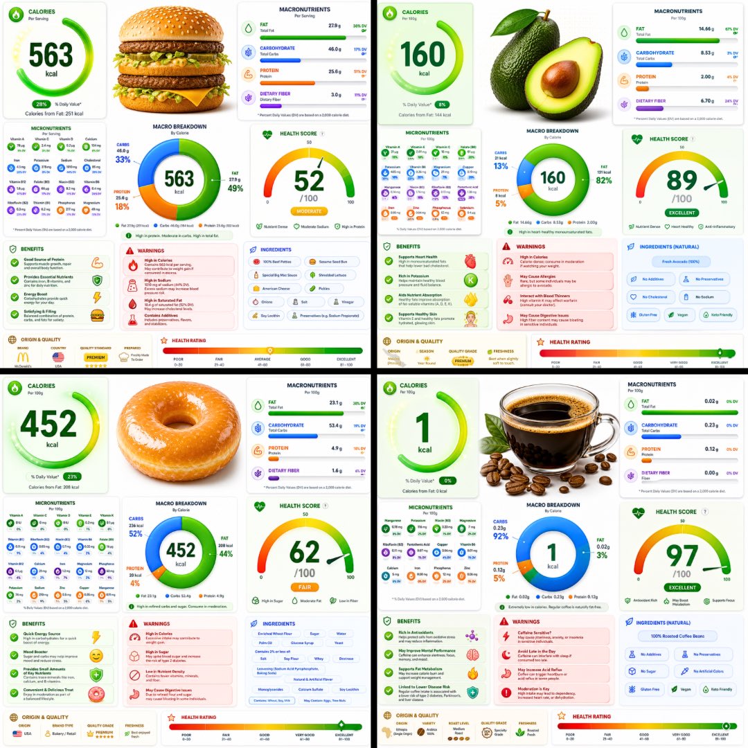
Full Prompt
A ultra-detailed nutrition facts infographic poster of [FOOD], designed in a modern premium health app UI style. Bright white background with vibrant colored glassmorphism cards — electric green, coral red, vivid blue, and golden amber section panels with soft rounded corners and subtle drop shadows. The [FOOD] is shown as a large hyper-realistic 3D render at the top center. Below it: a bold circular donut macro chart (carbs/protein/fat) with bright gradient fills. Sections laid out in a clean asymmetric grid: Calories displayed as a giant bold number with a glowing ring indicator, Macronutrients with smooth gradient progress bars in bright colors, Micronutrients in a compact icon-grid layout with colored badge indicators, Health Score as a large arc gauge meter with a bold number, Benefits panel with bright green animated checkmark cards, Warnings panel in coral red alert cards, Ingredients list in a clean pill-tag style, Origin & Quality badges, and a Health Rating gradient bar at the bottom from red through amber to bright green. Typography is sharp, modern, ultra-clean — large bold headers, thin data text, tight tracking. Small nutrition icons next to every data point. Subtle grain texture overlay. No title bar, no tagline. Aspect ratio 1:1. Premium health app aesthetic, print-quality, ultra-detailed, bright and vibrant.