Case Media
Case Notes
This page keeps the media, full prompt, and original source together so you can inspect the result first and decide whether the prompt is worth copying, saving, or comparing.
Case Insights
To make this page easier to search, cite, and reuse later, the case is also broken down into practical guidance about usage, visual cues, and prompt structure.
Best Fit Scenarios
- Use this as a ui & social screens benchmark when you need a fast style baseline before rewriting your own prompt.
- It is especially helpful if your target overlaps with UI, Screenshot, Minimal and you want to judge the image result before tuning wording.
- Keep it as a control sample when you compare nearby prompt variants one variable at a time.
Visual Signals To Notice
- The clearest style signals here are UI, Screenshot, Minimal, so those should usually stay in your first rewrite.
- The important layer is usually interface density, card hierarchy, and how the screen tells the story before you read small text.
- This case keeps one primary output, so the first image should be treated as the main visual reference.
How The Prompt Is Structured
- The prompt reads as a long, highly specified prompt, which is useful when you want to judge how much specificity this direction needs.
- Its keyword cluster is centered on UI, Screenshot, Minimal, so you can usually keep that cluster while swapping subject, camera, layout, or copy details.
- A practical rewrite path is: keep the outcome, keep the strongest style cues, then replace only the subject and environment blocks.
Good Follow-up Questions
- What changes first if you keep UI, Screenshot, Minimal but switch the subject matter?
- Which part of the result comes from section-level structure (UI & Social Screens) versus tag-level style cues?
- Which related cases in the same section give you a cleaner or more extreme variation of the same direction?
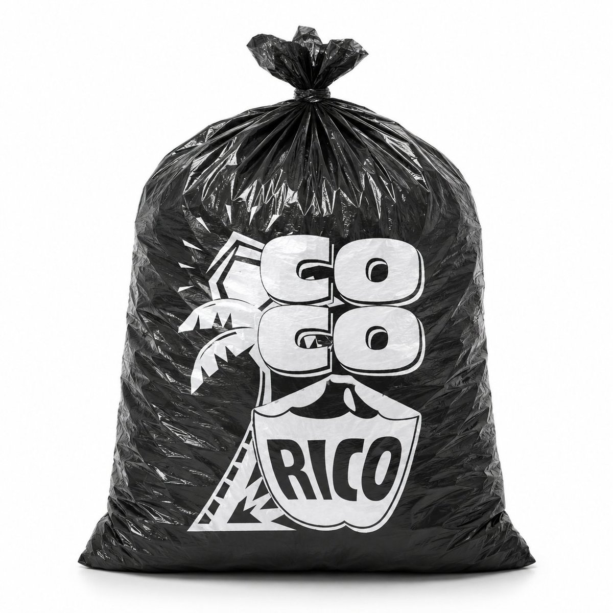
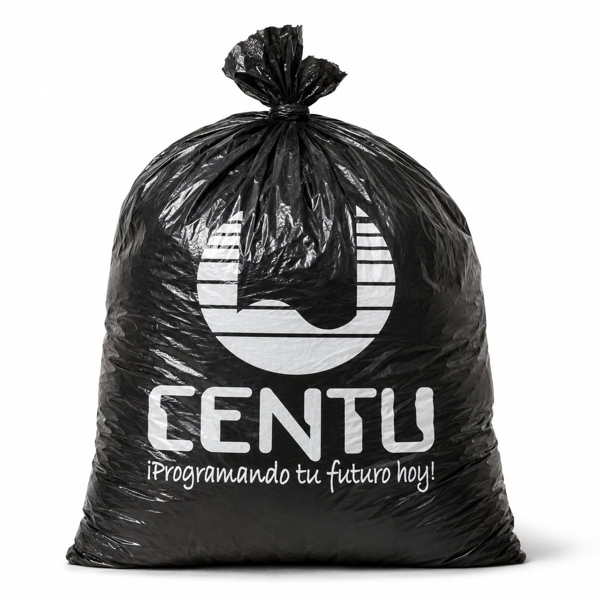
Full Prompt
Create a realistic studio product mockup of a single large black plastic garbage bag standing upright on a clean white background. The bag is full and rounded with a squared base, glossy crinkled polyethylene texture, visible wrinkles, folds, highlights, and a tied knot at the top with gathered plastic flaring upward. Center the bag in the frame with soft, even lighting and a subtle gray shadow beneath it. Print a white custom company design on the front of the bag, consisting of exactly 3 visible printed elements: a large abstract circular logo at the upper center, the bold rounded uppercase brand name {argument name="brand name" default="CENTU"} below it, and a handwritten-style Spanish slogan {argument name="slogan text" default="¡Programando tu futuro hoy!"} underneath. Use high-contrast white ink that follows the creases and distortions of the plastic surface, making the print look physically applied to the bag rather than floating. Photorealistic commercial mockup, front-facing composition, minimal background, sharp details, natural reflections, premium branded packaging presentation.