Case Media
Case Notes
This page keeps the media, full prompt, and original source together so you can inspect the result first and decide whether the prompt is worth copying, saving, or comparing.
Case Insights
To make this page easier to search, cite, and reuse later, the case is also broken down into practical guidance about usage, visual cues, and prompt structure.
Best Fit Scenarios
- Use this as a ui & social screens benchmark when you need a fast style baseline before rewriting your own prompt.
- It is especially helpful if your target overlaps with Poster, UI, Screenshot and you want to judge the image result before tuning wording.
- Keep it as a control sample when you compare nearby prompt variants one variable at a time.
Visual Signals To Notice
- The clearest style signals here are Poster, UI, Screenshot, so those should usually stay in your first rewrite.
- The important layer is usually interface density, card hierarchy, and how the screen tells the story before you read small text.
- This case keeps one primary output, so the first image should be treated as the main visual reference.
How The Prompt Is Structured
- The prompt reads as a long, highly specified prompt, which is useful when you want to judge how much specificity this direction needs.
- Its keyword cluster is centered on Poster, UI, Screenshot, so you can usually keep that cluster while swapping subject, camera, layout, or copy details.
- A practical rewrite path is: keep the outcome, keep the strongest style cues, then replace only the subject and environment blocks.
Good Follow-up Questions
- What changes first if you keep Poster, UI, Screenshot but switch the subject matter?
- Which part of the result comes from section-level structure (UI & Social Screens) versus tag-level style cues?
- Which related cases in the same section give you a cleaner or more extreme variation of the same direction?
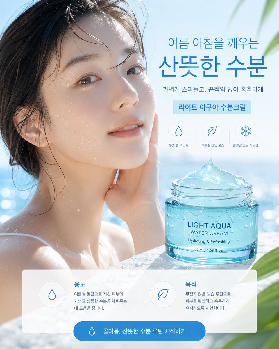
Full Prompt
{"type":"Korean skincare advertising poster","format":"single vertical social media ad, 4:5 aspect ratio","style":"premium photorealistic summer beauty commercial, bright airy blue-and-white palette, clean Korean cosmetics layout, glossy water reflections, soft sunlight, shallow depth of field","scene":{"background":"sunlit outdoor pool or seaside spa setting with sparkling blue water bokeh, pale sky, soft green tropical leaves entering from the upper-right and lower-right corners","model":"young woman with wet dark hair and bare shoulders in water, positioned on the left half, hand touching cheek, dewy skin with water droplets, face covered by a large semi-opaque square privacy placeholder in muted beige-gray gradient, placeholder centered over the face and upper neck","mood":"cool, refreshing, hydrated, calm summer morning"},"product":{"item":"transparent turquoise cosmetic jar filled with aqua gel cream","position":"lower-right foreground on a wet stone or pool ledge","label text":"{argument name=\"product label text\" default=\"LIGHT AQUA\\nWATER CREAM\\nHydrating & Refreshing\\n50 ml / 1.69 fl. oz.\"}","appearance":"open glass jar with screw-top rim, blue-tinted water cream mounded into a glossy icy peak, condensation droplets on the jar, realistic refractions and highlights"},"typography":{"language":"Korean","font style":"modern clean sans serif, large bold blue headline with lighter supporting text","main headline":"{argument name=\"headline text\" default=\"여름 아침을 깨우는\\n산뜻한 수분\"}","subheadline":"{argument name=\"subheadline text\" default=\"가볍게 스며들고, 끈적임 없이 촉촉하게\"}","product ribbon":"{argument name=\"product ribbon text\" default=\"라이트 아쿠아 수분크림\"}"},"layout":{"top-right text block":"headline at upper right, subheadline below, light blue rectangular ribbon beneath","benefit icons":{"count":3,"position":"center-right above product jar","style":"thin blue line icons inside faint circles","items":[{"icon":"water droplet","label":"투명 젤 텍스처"},{"icon":"leaf","label":"여름철 산뜻 보습"},{"icon":"snowflake","label":"쿨링감 있는 사용감"}]},"bottom information panel":{"count":2,"position":"bottom third, translucent white rounded rectangle spanning almost full width","cards":[{"title":"용도","icon":"water droplet","body":"여름철 열감으로 지친 피부에 가볍고 산뜻한 수분을 채워주는데 도움을 줍니다."},{"title":"목적","icon":"leaf","body":"무겁지 않은 보습 루틴으로 피부를 편안하고 촉촉하게 유지하도록 제안합니다."}]},"call to action":{"position":"centered at very bottom inside blue rounded pill button","icon":"small water droplet","text":"{argument name=\"button text\" default=\"올여름, 산뜻한 수분 루틴 시작하기\"}"}},"composition":"model fills left side, product jar anchors lower right, headline occupies upper right, UI panel overlays bottom, all elements aligned with generous whitespace and polished ecommerce ad hierarchy","lighting":"high-key natural daylight, cool blue highlights, glossy reflections, realistic moisture and glass caustics","quality":"ultra-realistic advertising photography with crisp product rendering, readable Korean text, no extra logos, no clutter"}