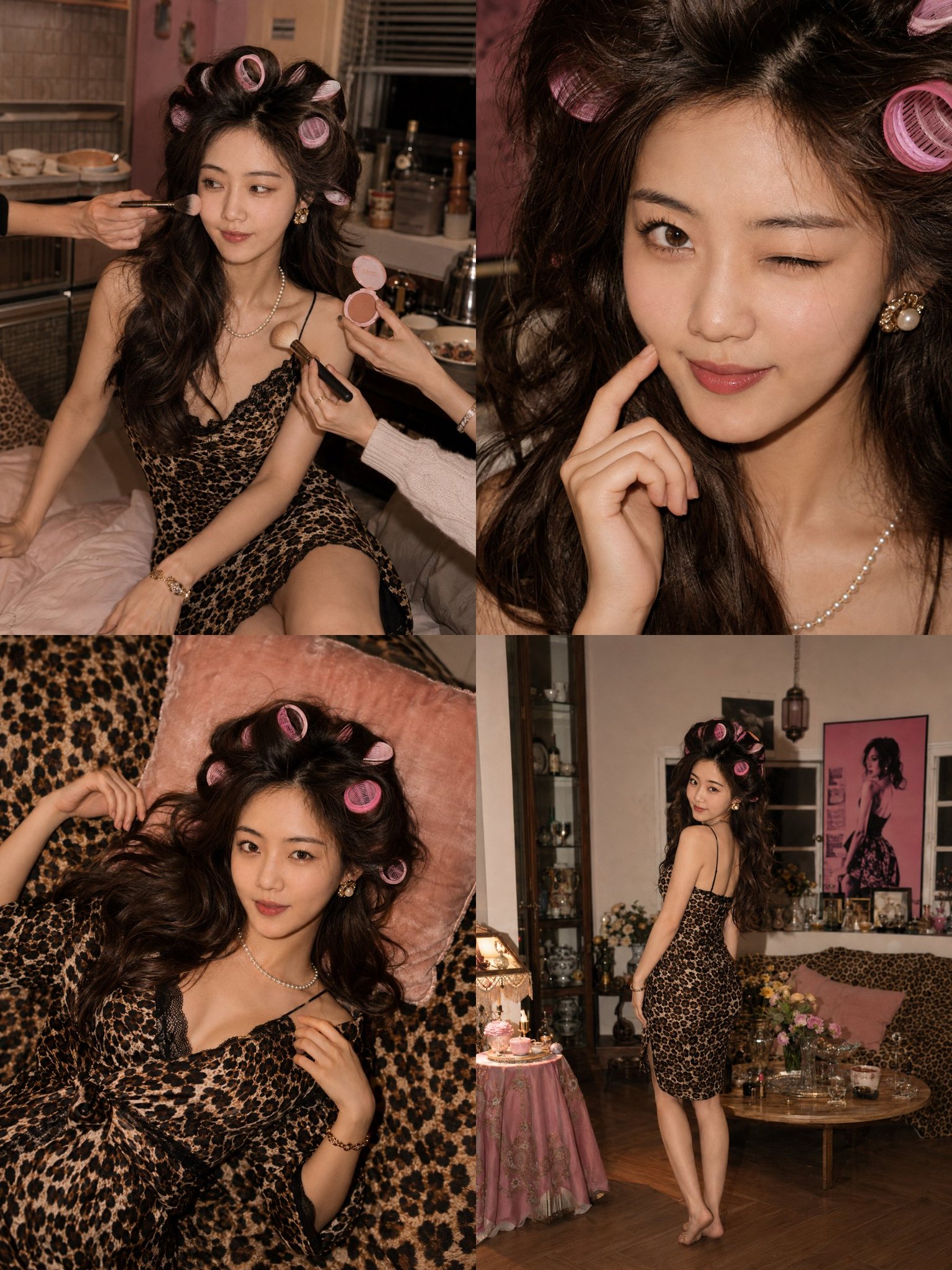
Case Media
Case Notes
This page keeps the media, full prompt, and original source together so you can inspect the result first and decide whether the prompt is worth copying, saving, or comparing.
Case Insights
To make this page easier to search, cite, and reuse later, the case is also broken down into practical guidance about usage, visual cues, and prompt structure.
Best Fit Scenarios
- Use this as a ui & social screens benchmark when you need a fast style baseline before rewriting your own prompt.
- It is especially helpful if your target overlaps with 35mm, Portrait, Fashion and you want to judge the image result before tuning wording.
- Keep it as a control sample when you compare nearby prompt variants one variable at a time.
Visual Signals To Notice
- The clearest style signals here are 35mm, Portrait, Fashion, so those should usually stay in your first rewrite.
- The important layer is usually interface density, card hierarchy, and how the screen tells the story before you read small text.
- This case keeps one primary output, so the first image should be treated as the main visual reference.
How The Prompt Is Structured
- The prompt reads as a long, highly specified prompt, which is useful when you want to judge how much specificity this direction needs.
- Its keyword cluster is centered on 35mm, Portrait, Fashion, so you can usually keep that cluster while swapping subject, camera, layout, or copy details.
- A practical rewrite path is: keep the outcome, keep the strongest style cues, then replace only the subject and environment blocks.
Good Follow-up Questions
- What changes first if you keep 35mm, Portrait, Fashion but switch the subject matter?
- Which part of the result comes from section-level structure (UI & Social Screens) versus tag-level style cues?
- Which related cases in the same section give you a cleaner or more extreme variation of the same direction?
Full Prompt
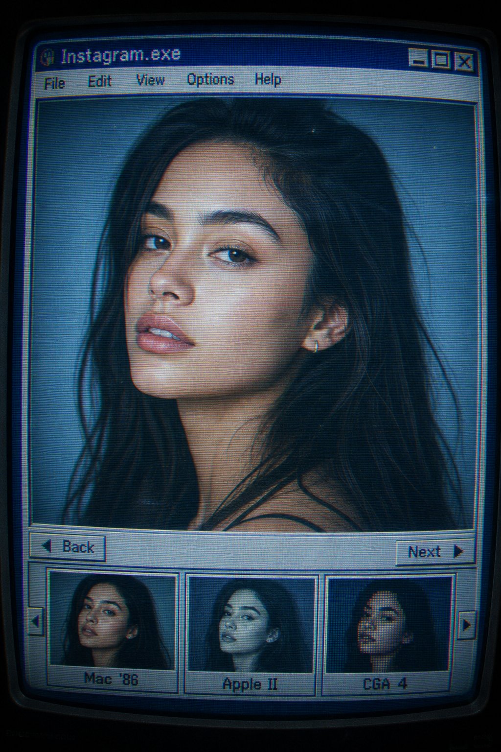
Ultra-realistic editorial portrait using the uploaded face reference, preserving exact facial features, skin tone, and proportions. Displayed inside a retro 1990s CRT computer interface titled “Instagram.exe”. Classic grey-blue OS window with pixel fonts, menu bar (“File • Edit • View • Options • Help”), and “Back” / “Next” buttons. Bottom filmstrip thumbnails labeled “Mac ’86”, “Apple II”, and “CGA 4”, showing alternate portraits of the same subject. Main image: shoulders-up beauty portrait, 85mm lens look, shallow depth of field, three-quarter pose, slight head tilt, calm gaze just past camera, neutral parted lips, natural editorial expression. Soft studio lighting from front-left with subtle fill light and cool ambient glow. CRT monitor aesthetic with curved screen distortion, scanlines, screen glare, chromatic aberration, cyan-blue digital tint, mild desaturation, film grain, digital noise, compression artifacts, soft vignette, and blurred UI edges. Hyper-realistic fashion photography embedded in a nostalgic vintage photo-viewing program, resembling a scanned CRT monitor screenshot from a professional model database.