Case Media
Case Notes
This page keeps the media, full prompt, and original source together so you can inspect the result first and decide whether the prompt is worth copying, saving, or comparing.
Case Insights
To make this page easier to search, cite, and reuse later, the case is also broken down into practical guidance about usage, visual cues, and prompt structure.
Best Fit Scenarios
- Use this as a ui & social screens benchmark when you need a fast style baseline before rewriting your own prompt.
- It is especially helpful if your target overlaps with Illustration, UI, Screenshot and you want to judge the image result before tuning wording.
- Keep it as a control sample when you compare nearby prompt variants one variable at a time.
Visual Signals To Notice
- The clearest style signals here are Illustration, UI, Screenshot, so those should usually stay in your first rewrite.
- The important layer is usually interface density, card hierarchy, and how the screen tells the story before you read small text.
- This case keeps one primary output, so the first image should be treated as the main visual reference.
How The Prompt Is Structured
- The prompt reads as a long, highly specified prompt, which is useful when you want to judge how much specificity this direction needs.
- Its keyword cluster is centered on Illustration, UI, Screenshot, so you can usually keep that cluster while swapping subject, camera, layout, or copy details.
- A practical rewrite path is: keep the outcome, keep the strongest style cues, then replace only the subject and environment blocks.
Good Follow-up Questions
- What changes first if you keep Illustration, UI, Screenshot but switch the subject matter?
- Which part of the result comes from section-level structure (UI & Social Screens) versus tag-level style cues?
- Which related cases in the same section give you a cleaner or more extreme variation of the same direction?
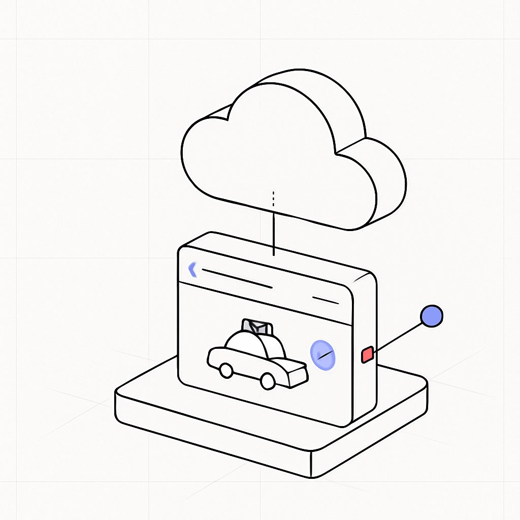
Full Prompt
Create a clean minimalist isometric line-art illustration on an off-white background with faint light-gray perspective grid lines. Show a rounded rectangular web browser window standing upright on a thick rounded rectangular platform base, drawn with thin black outlines and mostly white fill. Above the browser, a large outlined cloud icon floats, connected to the browser by a thin vertical black line with a short dotted segment near the cloud, suggesting cloud connectivity. Inside the browser window, include a simple outlined delivery car icon carrying a small package on its roof, centered in the lower area. The browser top bar has a small blue back chevron on the left, a long horizontal black address line, and a shorter horizontal line on the right. On the right side of the browser face, place a translucent blue circular button containing a short diagonal black slash. Extending from the right edge of the browser is a thin black connector line leading to a small solid periwinkle-blue circular node, with a tiny red rounded square port at the browser edge. Use sparse accent colors only: {argument name="accent blue" default="periwinkle blue"} for the node and UI highlights, {argument name="accent red" default="soft red"} for the small port, and black outlines. Keep the composition centered, airy, technical, and modern, with no text, no shadows except subtle depth from the isometric outlines, and a vector-icon style suitable for a SaaS cloud logistics concept.