Case Media
Case Notes
This page keeps the media, full prompt, and original source together so you can inspect the result first and decide whether the prompt is worth copying, saving, or comparing.
Case Insights
To make this page easier to search, cite, and reuse later, the case is also broken down into practical guidance about usage, visual cues, and prompt structure.
Best Fit Scenarios
- Use this as a ui & social screens benchmark when you need a fast style baseline before rewriting your own prompt.
- It is especially helpful if your target overlaps with Poster, Illustration, UI and you want to judge the image result before tuning wording.
- Keep it as a control sample when you compare nearby prompt variants one variable at a time.
Visual Signals To Notice
- The clearest style signals here are Poster, Illustration, UI, so those should usually stay in your first rewrite.
- The important layer is usually interface density, card hierarchy, and how the screen tells the story before you read small text.
- This case keeps 2 media outputs, which makes it easier to check whether the style remains stable across multiple results.
How The Prompt Is Structured
- The prompt reads as a long, highly specified prompt, which is useful when you want to judge how much specificity this direction needs.
- Its keyword cluster is centered on Poster, Illustration, UI, so you can usually keep that cluster while swapping subject, camera, layout, or copy details.
- A practical rewrite path is: keep the outcome, keep the strongest style cues, then replace only the subject and environment blocks.
Good Follow-up Questions
- What changes first if you keep Poster, Illustration, UI but switch the subject matter?
- Which part of the result comes from section-level structure (UI & Social Screens) versus tag-level style cues?
- Which related cases in the same section give you a cleaner or more extreme variation of the same direction?
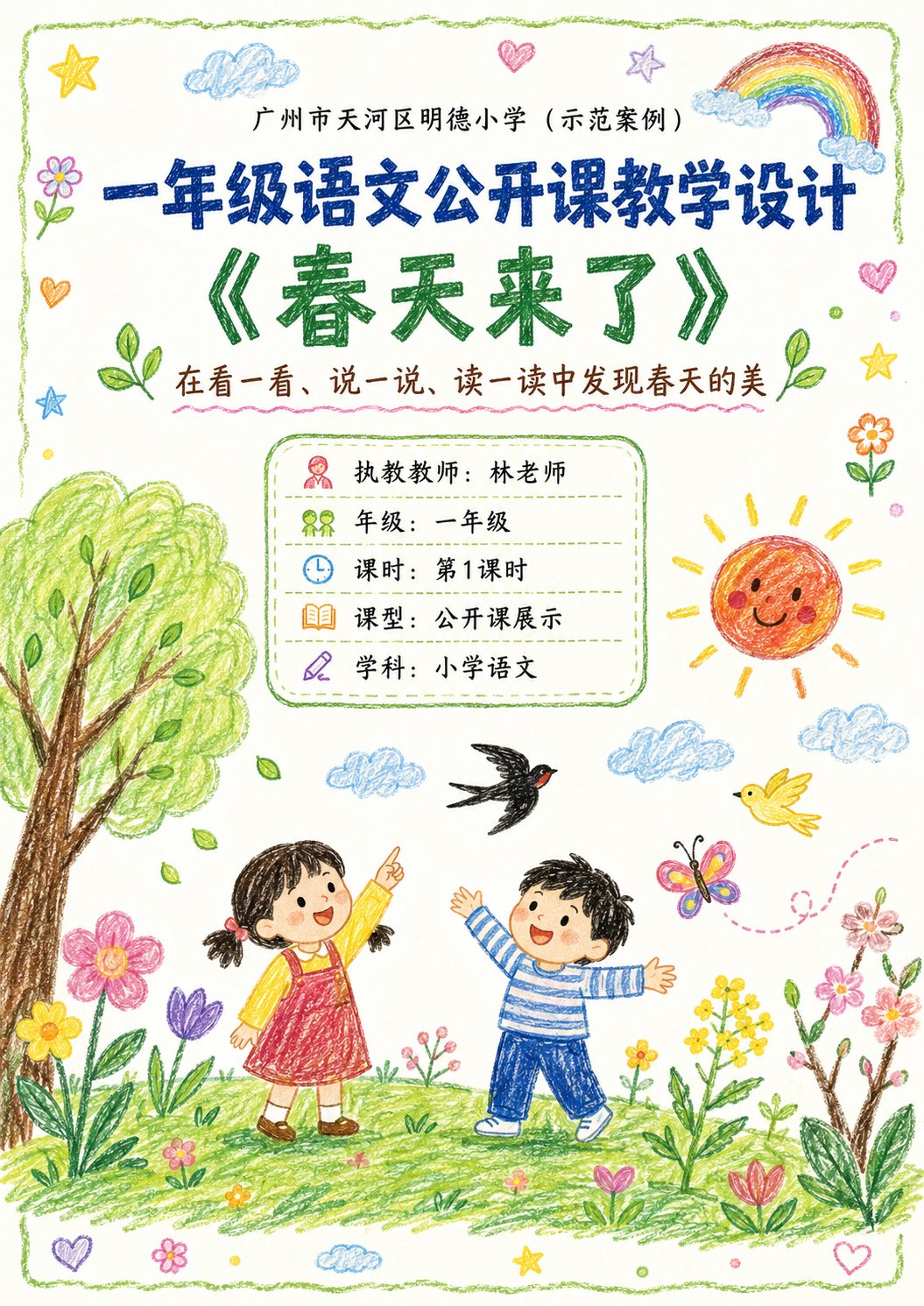
Full Prompt
Please generate a set of 'Crayon-style Visual Lesson Plan' images based on the lesson theme, teaching information, and page content provided by the user. 【Task Goal】 Generate a set of lesson plan page images with unified style, suitable for public class displays. Output each image independently, do not stitch into a long image. Overall usage: Primary school lower grade Chinese public class display, parent observation, family committee observation, principal/director review, and also suitable as printable display lesson plan pages. 【Applicable Scenarios】 - Primary school lower grades (Year 1, Year 2 preferred) - Public class / Demonstration class / Teaching display - Subject priority: Primary school Chinese (can extend to Math, English, etc.) - Style is not childish scribbles, nor rigid official documents, but 'Children's crayon visuals + clear teaching logic + public class display sense'. ━━━━━━━━━━━━━━━━━━ I. Input Methods (Supports two modes) ━━━━━━━━━━━━━━━━━━ 【Mode A: User manually fills in content】 If the user directly provides school, topic, teacher, teaching goals, teaching flow, etc., please strictly organize according to the content provided by the user. 【Mode B: User uploads existing lesson plan / document / text content】 If the user uploads existing lesson plan content or pastes the full lesson plan text, please first understand and extract the content, then automatically organize it into a version suitable for multi-page display. Requirements: 1. Retain core teaching logic of the original lesson plan 2. Compress wordy text, enhance visualization and display feel 3. Prioritize extracting: Topic, goals, student situation, key points/difficulties, flow, blackboard design, after-class extension, home-school cooperation tips 4. Do not mechanically copy original text, convert into presentation language suitable for display pages. ━━━━━━━━━━━━━━━━━━ II. Output Quantity Rules (Important) ━━━━━━━━━━━━━━━━━━ 【Default Output Quantity】 Default generate 4 images. 【Customizable Quantity】 If the user explicitly specifies the number, execute according to the user-specified number. For example: - 1 image: Single page condensed version - 2 images: Cover + core content - 3 images: Cover + analysis page + flow page - 4 images: Cover + analysis page + flow (part 1) + flow (part 2) (Recommended default) - 5 images or more: Further split into more detailed content pages while maintaining unified style. 【Automatic Allocation Principle】 If the user specified number does not perfectly match the content volume, please automatically and reasonably split content, requirements: 1. Content allocation balanced 2. Do not have too much space at the front and crowding at the back 3. Each image should have a clear theme 4. Cover page priority retained 5. When fewer pages, appropriately merge content 6. When more pages, appropriately subdivide teaching flow, blackboard design, home-school cooperation, highlights modules, etc. ━━━━━━━━━━━━━━━━━━ III. Fixed Visual Rules ━━━━━━━━━━━━━━━━━━ 【Aspect Ratio】 Vertical, close to A4 paper ratio. Suggested ratio: 1000:1414 or similar. 【Overall Style】 10-year-old child's crayon hand-drawn style / Colorful crayon style / Child hand-drawn public class lesson plan style. Requirements: - White or warm white paper background - Obvious crayon strokes, child hand-drawn texture - Lines natural, slightly naive, but overall neat and clear - Colors bright and warm, dominated by soft crayon colors like red, yellow, blue, green, pink, orange - Overall like 'earnest yet childlike elementary public class display pages' - Cannot be too flashy, nor too rudimentary - Must have readability, display feel, layering - Do not make into kindergarten posters, nor ordinary Word screenshots. 【Layout Requirements】 - Each page must have a clear title - Cover page can use big title - Internal pages should not repeat oversized cover-style titles - Internal page tops only keep small headers or current page titles, do not overly occupy main text space - Main text content area should be sufficient, highlighting information volume and teaching logic - Module division clear - Information hierarchy clear - Text readability strong - White space moderate - Decorative elements serve content, not overshadow - Suitable for printing and display. 【Decorative Elements】 Appropriately use children's crayon-style decorative elements: - Flowers, clouds, sun, rainbows, stars, leaves, birds, butterflies, grass, hearts - Can add small illustrations related to the course theme - Decoration should be moderate, distributed naturally, do not fill the whole page. 【Font Presentation】 - Chinese titles can be made into crayon handwriting/child brushstroke feel - Body text must be clear and readable - Do not use too fancy or hard-to-recognize fonts - Do not use large areas of dense long paragraphs. ━━━━━━━━━━━━━━━━━━ IV. Page Structure Suggestions (Default 4P, adjustable by quantity) ━━━━━━━━━━━━━━━━━━ 【When 4 images, suggested structure】 P1 Cover Page P2 Teaching Analysis and Goal Design P3 Teaching Flow (Part 1) P4 Teaching Flow (Part 2) + Blackboard Design + Extension 【If user customizes quantity, adjust according to logic:】 1 image: Condensed overview page (Cover info + teaching goals + core flow + highlights) 2 images: 1. Cover + teaching goals/student situation/difficulty; 2. Teaching flow + blackboard design + extension 3 images: 1. Cover; 2. Teaching analysis and goal design; 3. Teaching flow + summary extension 4 images (Default): 1. Cover; 2. Analysis and goals; 3. Flow (part 1); 4. Flow (part 2) + blackboard design + home-school + highlights 5+ images: Further split into: Cover, Analysis, Goals/Difficulties, Flow (part 1), Flow (part 2), Blackboard design, Home-school, Highlights/Summary. ━━━━━━━━━━━━━━━━━━ V. Page Content Requirements ━━━━━━━━━━━━━━━━━━ 【Cover Page】 Include: School name, Course type, Topic name, Subtitle/Instructional blurb, Teacher, Grade, Class hour, Lesson type, Subject. Visual requirements: - Fullest visual, catchy - Can add child crayon scene illustrations related to topic - Warm, childlike, spring vibe (or matching topic) - Looks like lesson plan cover and display page. 【Teaching Analysis Pages】 Can include: Student analysis, teaching goals, focus, difficulties, preparation, assessment. Visual requirements: - Use independent rounded boxes/hand-drawn borders for modules - Simple icons for each module - Clear logic, not too crowded. 【Teaching Flow Pages】 Can include: Link name, time, teacher activity, student activity, design intent, observation points. Visual requirements: - Use vertical flow/segmented cards/timeline layout - Independent module for each link - Small illustrations for understanding - Rhythmic page. 【Summary/Extension Pages】 Can include: Summary, extension, blackboard design, home-school tips, highlights. Visual requirements: - Layout with main and secondary focus - Blackboard design can be on the right side - Home-school and highlights as auxiliary - Informative but clean. ━━━━━━━━━━━━━━━━━━ VI. Content Formatting Principles ━━━━━━━━━━━━━━━━━━ 1. Compress long content into readable text. 2. Retain professional teaching tone, avoid overly administrative language. 3. Language suitable for lower grade public class scenarios. 4. Accessible to teachers, parents, and principals. 5. Balance child affinity with professional credibility. 6. Not pure illustration posters, but 'visual lesson plans'. 7. Rich info but not messy. 8. Unified style. 9. Auto-balance content when page count varies. ━━━━━━━━━━━━━━━━━━ VII. If user doesn't provide full content, fill according to this template ━━━━━━━━━━━━━━━━━━ Please generate based on: - Quantity (Default 4) - School - Grade - Subject - Topic - Teacher - Class Hour - Lesson Type - Subtitle - Teaching Goals - Student Analysis - Key Points - Difficulties - Preparation - Flow - Blackboard Design - Summary - Extension - Home-school tips - Highlights. If not filled, auto-complete reasonably but keep real and compliant with lower grade logic. ━━━━━━━━━━━━━━━━━━ VIII. Output Summary ━━━━━━━━━━━━━━━━━━ Final Output: - Default 4 independent vertical A4 crayon-style lesson plan images (unless specified otherwise) - Unified style - Real content - Clear layout - Suitable for public class display - Suitable for parent/principal viewing - Not over-decorated - Not too simple - Not ordinary document screenshots - Balance of 'Children's crayon style + professional teaching design'.