Case Media
Case Notes
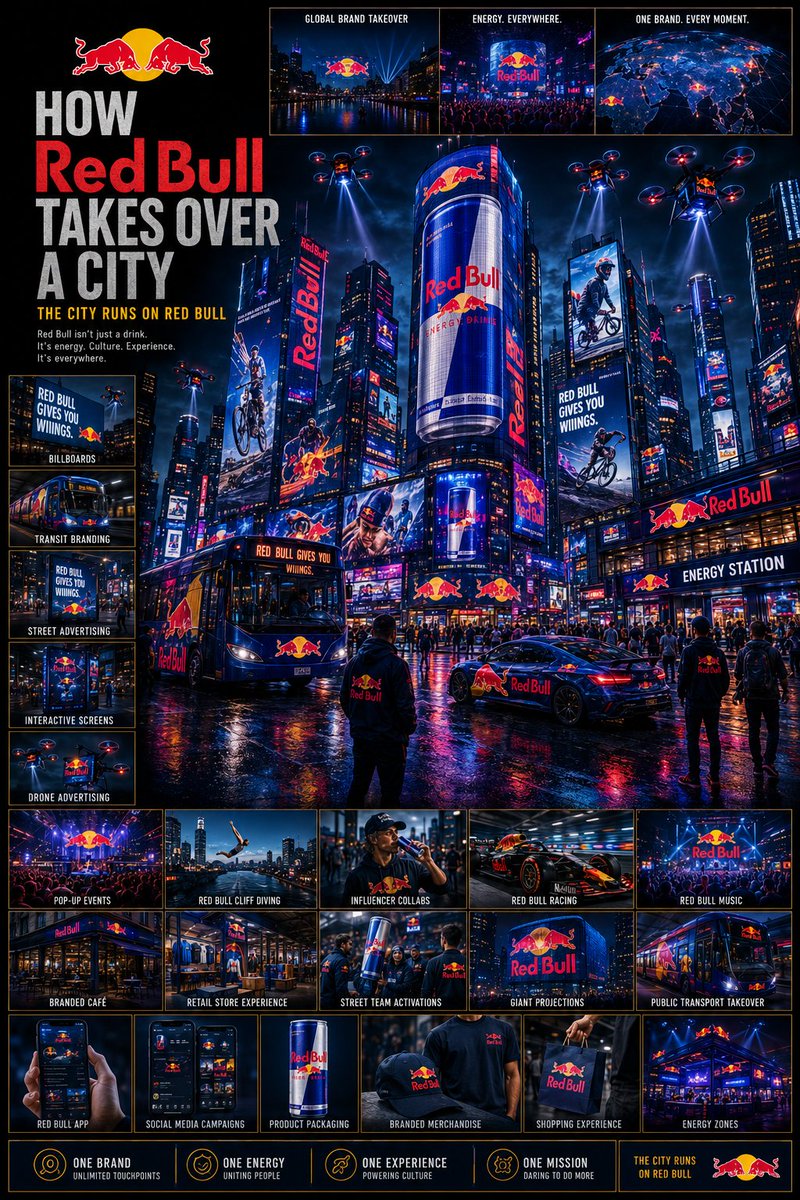
This page keeps the media, full prompt, and original source together so you can inspect the result first and decide whether the prompt is worth copying, saving, or comparing.
Case Insights
To make this page easier to search, cite, and reuse later, the case is also broken down into practical guidance about usage, visual cues, and prompt structure.
Best Fit Scenarios
- Use this as a ui & social screens benchmark when you need a fast style baseline before rewriting your own prompt.
- It is especially helpful if your target overlaps with Cinematic, Fashion, Poster and you want to judge the image result before tuning wording.
- Keep it as a control sample when you compare nearby prompt variants one variable at a time.
Visual Signals To Notice
- The clearest style signals here are Cinematic, Fashion, Poster, so those should usually stay in your first rewrite.
- The important layer is usually interface density, card hierarchy, and how the screen tells the story before you read small text.
- This case keeps 4 media outputs, which makes it easier to check whether the style remains stable across multiple results.
How The Prompt Is Structured
- The prompt reads as a long, highly specified prompt, which is useful when you want to judge how much specificity this direction needs.
- Its keyword cluster is centered on Cinematic, Fashion, Poster, so you can usually keep that cluster while swapping subject, camera, layout, or copy details.
- A practical rewrite path is: keep the outcome, keep the strongest style cues, then replace only the subject and environment blocks.
Good Follow-up Questions
- What changes first if you keep Cinematic, Fashion, Poster but switch the subject matter?
- Which part of the result comes from section-level structure (UI & Social Screens) versus tag-level style cues?
- Which related cases in the same section give you a cleaner or more extreme variation of the same direction?
Full Prompt
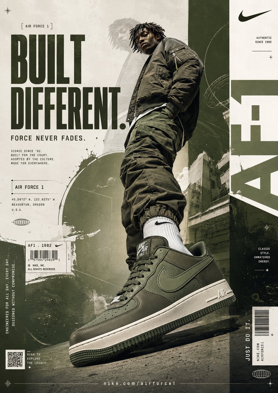
Using the {argument name="brand name" default="[BRAND NAME]"}, create a highly detailed cinematic poster: “HOW {argument name="brand name" default="[BRAND NAME]"} TAKES OVER A CITY” GOAL: Show the brand expanding across an entire city ecosystem until it becomes impossible to ignore. This must feel like: global campaign rollout + futuristic city domination + luxury advertising ecosystem. The brand should appear integrated naturally into the city, not random logo placement. CORE RULE: Everything must be visually inspired by the brand identity of “{argument name="brand name" default="[BRAND NAME]"}”: brand colors typography style design language visual energy aesthetic mood The city itself should begin to feel transformed by the brand identity. MAIN STRUCTURE: Vertical 4:5 poster Dense multi layered composition Huge cinematic city scene mixed with many smaller detail panels TOP SECTION: Include: “{argument name="brand name" default="[BRAND NAME]"}” logo or wordmark Campaign title Short {argument name="slogan" default="slogan (max 5 words)"} MAIN HERO SCENE: Show a massive cinematic city environment where “{argument name="brand name" default="[BRAND NAME]"}” has become dominant. Include: giant digital billboards skyscraper LED screens branded taxis buses train wraps storefronts public transport stations branded cafés interactive street ads branded drones or futuristic media systems The city should feel alive and overloaded with coordinated branding. CITY ENVIRONMENT: Create: realistic streets crowds of people traffic nightlife urban lighting weather atmosphere The branding should blend naturally into the environment. MICRO SCENES: Around the main scene, include many smaller panels showing: people using branded products social media campaign visuals branded pop up events digital ads on phones branded shopping bags influencer campaigns café branding event installations giant building projections ADVERTISEMENT SYSTEM: OUTDOOR: billboards LED towers transit ads street posters DIGITAL: mobile ads social media ads app UI interactive screens PHYSICAL: packaging shopping bags uniforms vehicles VISUAL DETAILS: Add: glowing reflections rain reflections on streets holographic screens animated signage crowds interacting with ads city lights matching the brand palette COLOR SYSTEM: Strictly derived from the brand identity colors. Use: lighting reflections atmosphere ad screens to reinforce the brand identity. STYLE: cinematic urban realism futuristic advertising aesthetic dense but readable luxury campaign presentation Inspired by: Tokyo/Shibuya LED overload Times Square campaigns cyberpunk city advertising luxury fashion campaign rollouts DEPTH: 40 to 80 visual elements layered foreground/midground/background multiple scales of detail IMPORTANT RULES: no random logo spam branding must feel intelligently integrated every ad placement should feel int