Case Media
Case Notes
This page keeps the media, full prompt, and original source together so you can inspect the result first and decide whether the prompt is worth copying, saving, or comparing.
Case Insights
To make this page easier to search, cite, and reuse later, the case is also broken down into practical guidance about usage, visual cues, and prompt structure.
Best Fit Scenarios
- Use this as a ui & social screens benchmark when you need a fast style baseline before rewriting your own prompt.
- It is especially helpful if your target overlaps with UI, Screenshot, Minimal and you want to judge the image result before tuning wording.
- Keep it as a control sample when you compare nearby prompt variants one variable at a time.
Visual Signals To Notice
- The clearest style signals here are UI, Screenshot, Minimal, so those should usually stay in your first rewrite.
- The important layer is usually interface density, card hierarchy, and how the screen tells the story before you read small text.
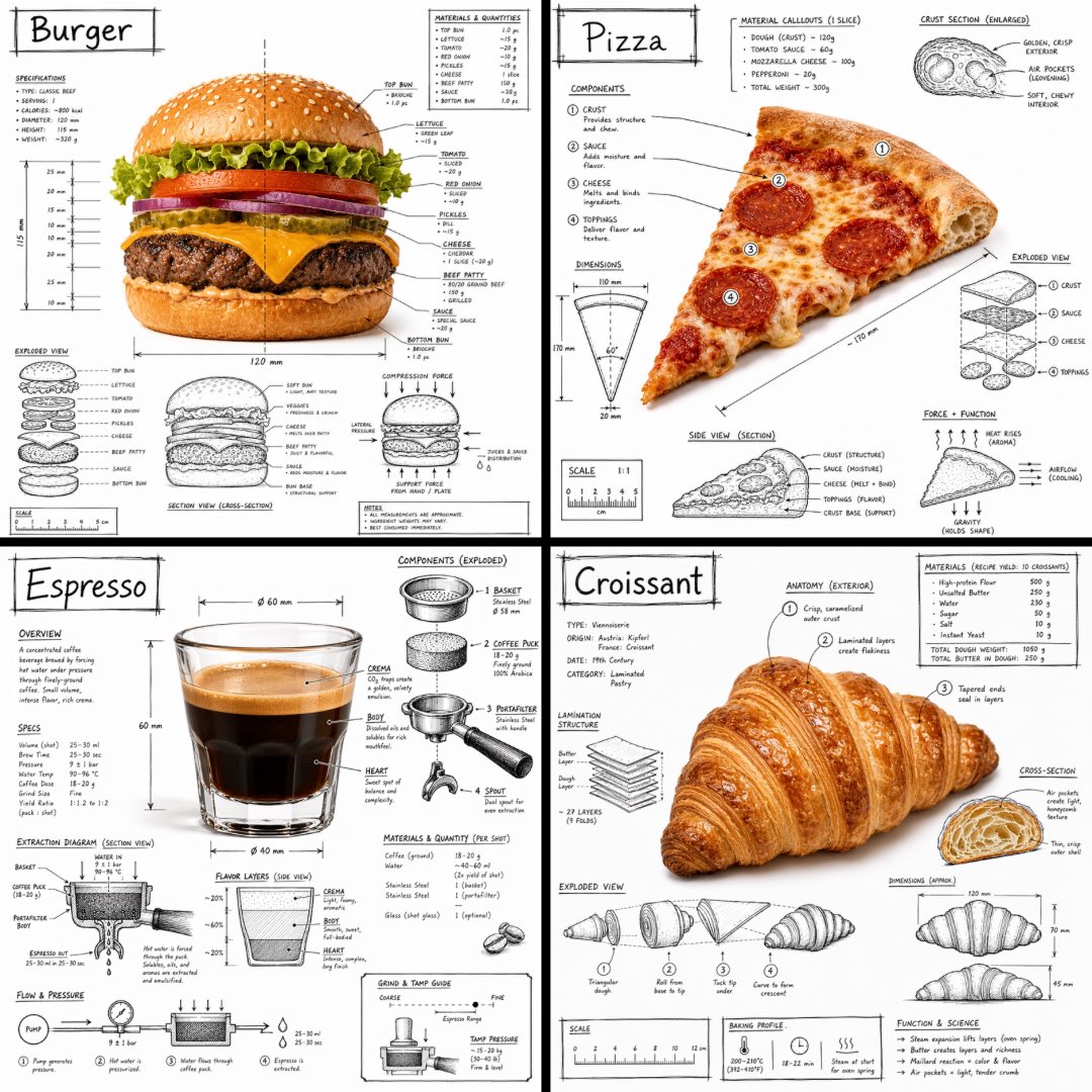
- This case keeps one primary output, so the first image should be treated as the main visual reference.
How The Prompt Is Structured
- The prompt reads as a long, highly specified prompt, which is useful when you want to judge how much specificity this direction needs.
- Its keyword cluster is centered on UI, Screenshot, Minimal, so you can usually keep that cluster while swapping subject, camera, layout, or copy details.
- A practical rewrite path is: keep the outcome, keep the strongest style cues, then replace only the subject and environment blocks.
Good Follow-up Questions
- What changes first if you keep UI, Screenshot, Minimal but switch the subject matter?
- Which part of the result comes from section-level structure (UI & Social Screens) versus tag-level style cues?
- Which related cases in the same section give you a cleaner or more extreme variation of the same direction?
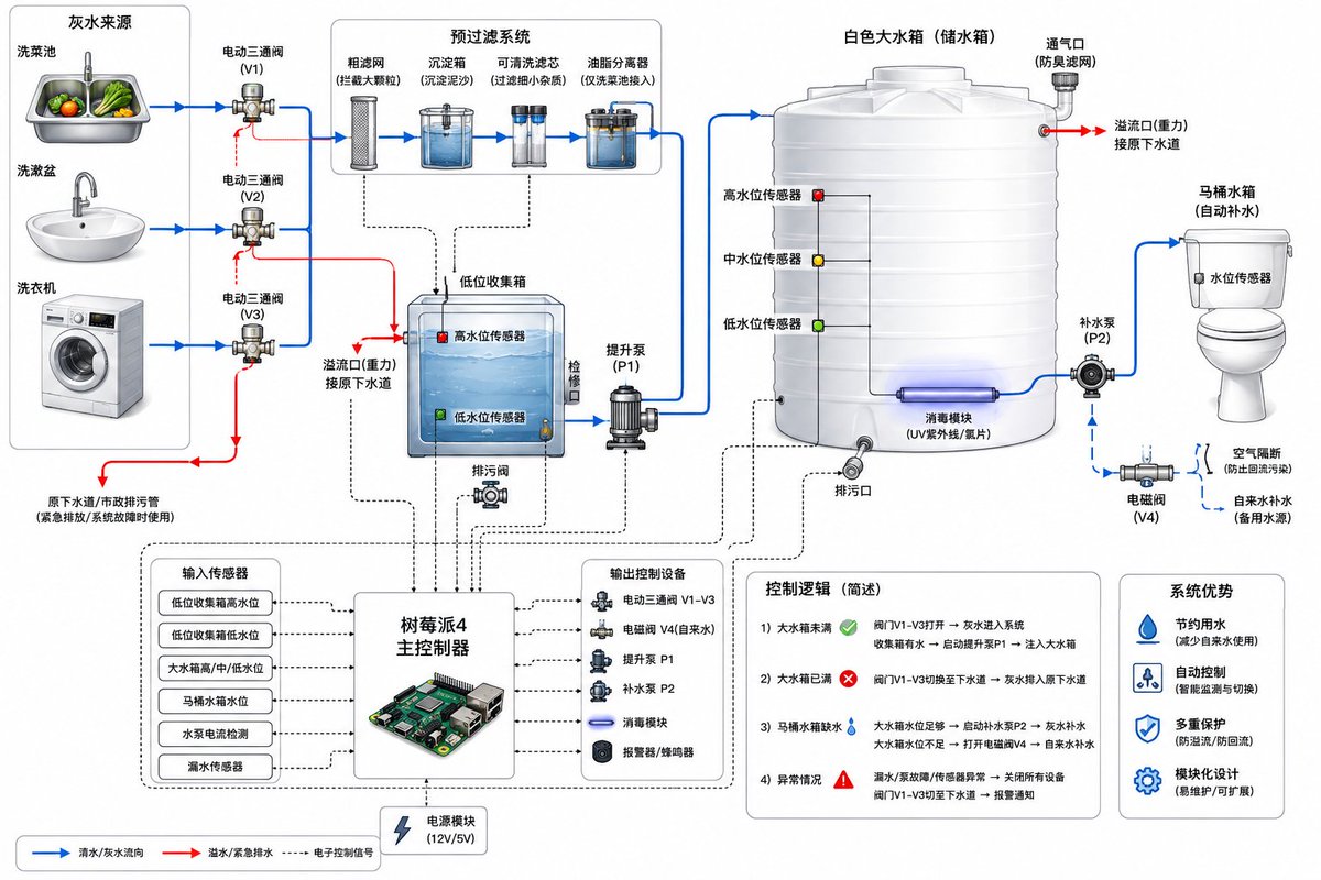
Full Prompt
Create a clean technical system diagram of a residential {argument name="system type" default="greywater recycling system"} for toilet flushing. Show {argument name="sources" default="three water sources"} on the left: kitchen vegetable washing sink, bathroom wash basin, and washing machine. Each source connects through a diverter valve to either the original sewer drain or the greywater recycling line. The greywater line goes into a pre-filter module with coarse mesh filter, sediment trap, washable cartridge filter, and grease separator for kitchen water. Then show a low-level greywater collection tank with overflow pipe to sewer, high and low water level sensors, and inspection cover. From this tank, show a greywater transfer pump sending water upward into a large white plastic storage tank. The large tank has low, middle, and high water level sensors, overflow to sewer, drain outlet, optional UV disinfection module, and ventilation. From the storage tank, show a pump or gravity outlet feeding the toilet cistern. Include a backup clean water supply with air gap and backflow prevention to the toilet cistern. Show a {argument name="controller" default="Raspberry Pi 4 controller"} connected with signal lines to sensors, solenoid valves, pumps, leak sensor, and alarm. Use blue arrows for water flow, red arrows for overflow/emergency drain, dotted black lines for electronic control. Style: modern engineering schematic, white background, labeled components, clear arrows, minimal but detailed.