Case Media
Case Notes
This page keeps the media, full prompt, and original source together so you can inspect the result first and decide whether the prompt is worth copying, saving, or comparing.
Case Insights
To make this page easier to search, cite, and reuse later, the case is also broken down into practical guidance about usage, visual cues, and prompt structure.
Best Fit Scenarios
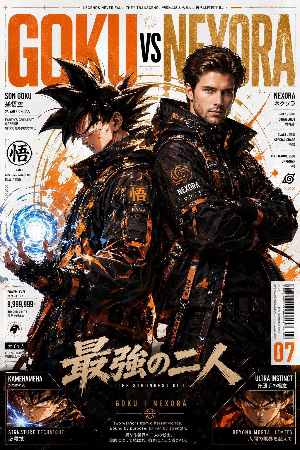
- Use this as a ui & social screens benchmark when you need a fast style baseline before rewriting your own prompt.
- It is especially helpful if your target overlaps with Cinematic, Fashion, Poster and you want to judge the image result before tuning wording.
- Keep it as a control sample when you compare nearby prompt variants one variable at a time.
Visual Signals To Notice
- The clearest style signals here are Cinematic, Fashion, Poster, so those should usually stay in your first rewrite.
- The important layer is usually interface density, card hierarchy, and how the screen tells the story before you read small text.
- This case keeps 2 media outputs, which makes it easier to check whether the style remains stable across multiple results.
How The Prompt Is Structured
- The prompt reads as a long, highly specified prompt, which is useful when you want to judge how much specificity this direction needs.
- Its keyword cluster is centered on Cinematic, Fashion, Poster, so you can usually keep that cluster while swapping subject, camera, layout, or copy details.
- A practical rewrite path is: keep the outcome, keep the strongest style cues, then replace only the subject and environment blocks.
Good Follow-up Questions
- What changes first if you keep Cinematic, Fashion, Poster but switch the subject matter?
- Which part of the result comes from section-level structure (UI & Social Screens) versus tag-level style cues?
- Which related cases in the same section give you a cleaner or more extreme variation of the same direction?
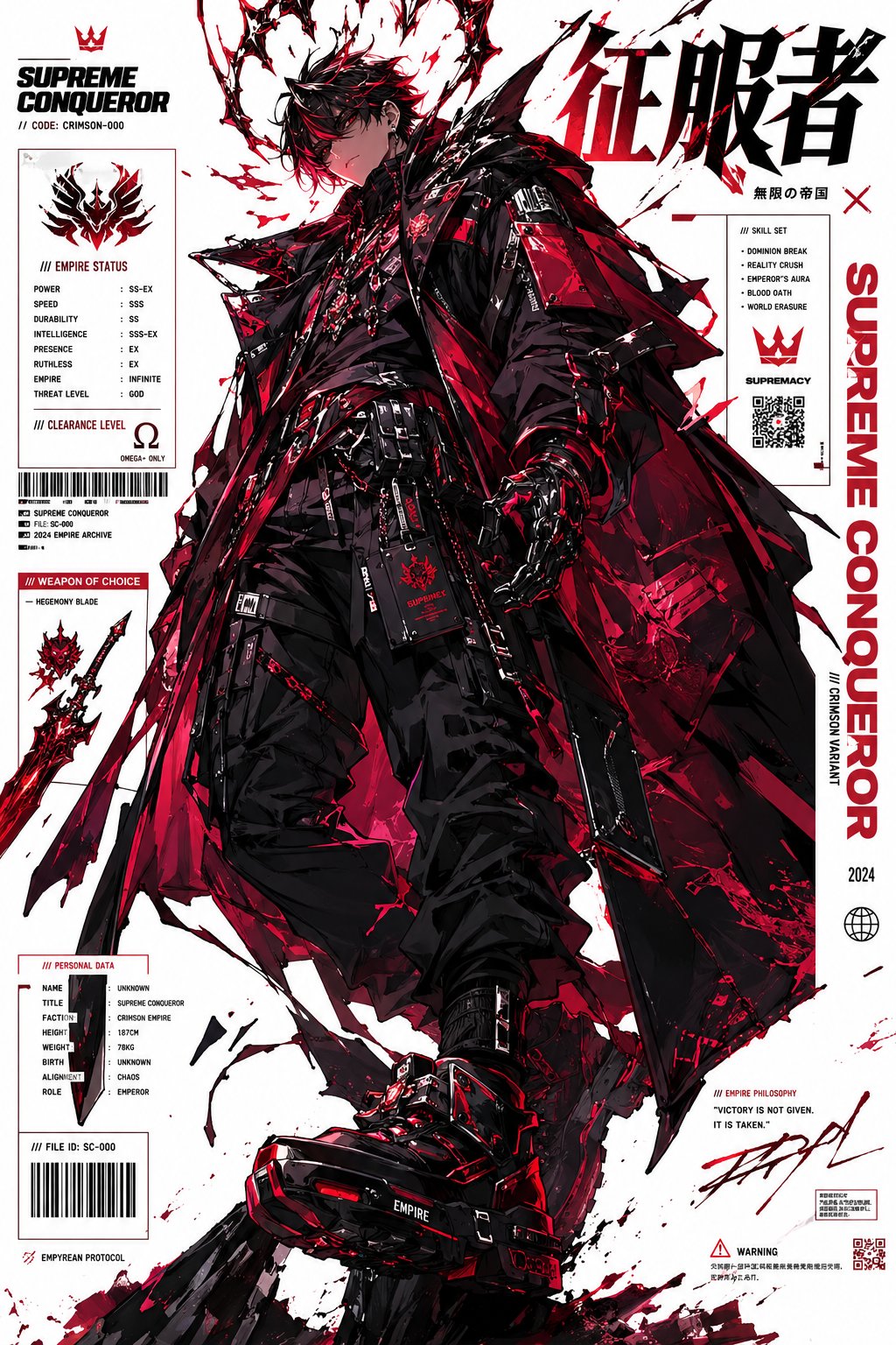
Full Prompt
A VIRAL ultra-premium anime x luxury fashion crossover poster featuring [ANIME CHARACTER NAME] together with the uploaded person as iconic partners inside a futuristic Japanese cyber-streetwear universe. The artwork must look like an official million-dollar anime collaboration campaign created by MAPPA, Ufotable, Hypebeast, and a luxury fashion brand together. NOT a simple anime illustration. The composition must feel like: a luxury Japanese streetwear advertisement, a cinematic Blu-ray cover, an elite fashion editorial, and a viral TikTok anime poster. [ANIME CHARACTER NAME] keeps all iconic visual traits, hairstyle, eyes, outfit elements, powers, aura, energy effects, symbols, and personality recognizable to fans. The uploaded person is transformed into a hyper-realistic anime-fashion hybrid while PERFECTLY preserving: facial identity, jawline, hairstyle, skin tone, eyes, expression, and overall likeness from the uploaded image. FASHION STYLING IS THE HIGHEST PRIORITY. Both characters wear insanely detailed futuristic luxury techwear inspired by the anime universe: oversized couture tactical jackets, reflective nylon fabrics, layered streetwear, combat harnesses, utility straps, buckles, cargo pants, tactical gloves, high-fashion sneakers, cyberpunk accessories, metal hardware, fashion-tech armor details. The outfits must look EXPENSIVE, collectible, and editorial-level stylish. POSE & CAMERA: Dynamic asymmetrical duo composition. One character standing confidently. The other crouched or seated in a powerful cinematic pose. Aggressive low-angle perspective. Natural chemistry. Luxury fashion body language. Cinematic silhouette flow. VISUAL STYLE: Ultra detailed anime rendering. Premium cel shading. Luxury fashion photography lighting. Soft global illumination. Cinematic shadows. Depth-heavy composition. Hyper-clean rendering. Complex layered graphics. Magazine-quality layout. AAA promotional artwork quality. BACKGROUND: Minimal white background with controlled graphic chaos. Add: massive typography, Japanese kanji, editorial grids, barcode graphics, technical UI overlays, paint streaks, ink splashes, holographic elements, manga textures, anime symbols, warning labels, small lore text, fashion branding graphics. Typography should feel integrated into the composition like a luxury magazine cover. Use ONLY the anime character’s signature color palette for: lighting, graphics, energy, clothing accents, and atmosphere. The final result must look: luxurious, cinematic, fashion-forward, official, high-budget, ultra-viral, and visually addictive. It should feel like the internet’s next viral anime poster trend. 8K masterpiece. Insane detail. 4:5 ratio.