Case Media
Case Notes
This page keeps the media, full prompt, and original source together so you can inspect the result first and decide whether the prompt is worth copying, saving, or comparing.
Case Insights
To make this page easier to search, cite, and reuse later, the case is also broken down into practical guidance about usage, visual cues, and prompt structure.
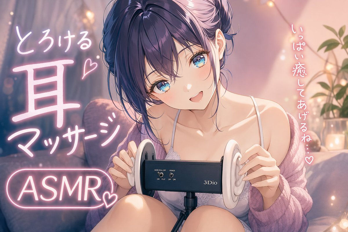
Best Fit Scenarios
- Use this as a ui & social screens benchmark when you need a fast style baseline before rewriting your own prompt.
- It is especially helpful if your target overlaps with Neon, Poster, UI and you want to judge the image result before tuning wording.
- Keep it as a control sample when you compare nearby prompt variants one variable at a time.
Visual Signals To Notice
- The clearest style signals here are Neon, Poster, UI, so those should usually stay in your first rewrite.
- The important layer is usually interface density, card hierarchy, and how the screen tells the story before you read small text.
- This case keeps one primary output, so the first image should be treated as the main visual reference.
How The Prompt Is Structured
- The prompt reads as a long, highly specified prompt, which is useful when you want to judge how much specificity this direction needs.
- Its keyword cluster is centered on Neon, Poster, UI, so you can usually keep that cluster while swapping subject, camera, layout, or copy details.
- A practical rewrite path is: keep the outcome, keep the strongest style cues, then replace only the subject and environment blocks.
Good Follow-up Questions
- What changes first if you keep Neon, Poster, UI but switch the subject matter?
- Which part of the result comes from section-level structure (UI & Social Screens) versus tag-level style cues?
- Which related cases in the same section give you a cleaner or more extreme variation of the same direction?
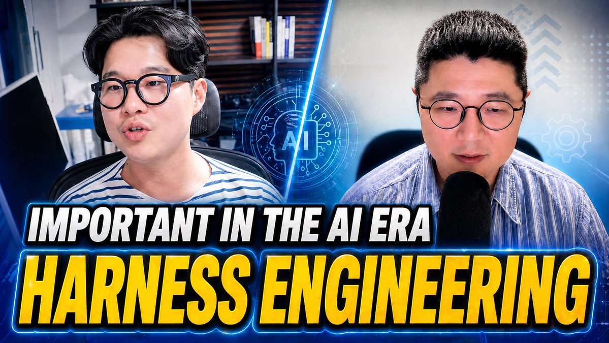
Full Prompt
A high-impact YouTube thumbnail about {argument name="topic text" default="HARNESS ENGINEERING"} in the AI age, 16:9 format, split-screen composition with 2 male presenters shown from the chest up, one on the left and one on the right, both facing forward in office or studio settings. The left presenter has dark hair, wears glasses and a white-and-blue striped shirt, seated in a desk chair with shelves and books blurred in the background. The right presenter has short dark hair, wears glasses and a light blue striped button-up shirt, speaking into a large black microphone, with a softly lit tech-themed background. A glowing electric-blue diagonal slash divides the two halves. In the center, overlay a futuristic circular AI icon with the letters “AI” inside a microchip-like interface, glowing neon blue. Add subtle HUD graphics on the right side: 3 upward chevrons near the top right, 1 gear icon at mid-right, and a faint grid of dots. Across the lower half, place 2 stacked headline lines in huge bold condensed uppercase text with heavy black outline, white outer stroke, and bright blue neon glow: top line smaller, white text reading {argument name="top headline" default="IMPORTANT IN THE AI ERA"}; bottom line much larger, yellow-to-gold gradient text reading {argument name="main headline" default="HARNESS ENGINEERING"}. Use dramatic contrast, cool blue color grading, glossy thumbnail polish, strong rim lighting, mild background blur, and an energetic tech-business aesthetic designed for maximum click-through rate.