Case Media
Case Notes
This page keeps the media, full prompt, and original source together so you can inspect the result first and decide whether the prompt is worth copying, saving, or comparing.
Case Insights
To make this page easier to search, cite, and reuse later, the case is also broken down into practical guidance about usage, visual cues, and prompt structure.
Best Fit Scenarios
- Use this as a ui & social screens benchmark when you need a fast style baseline before rewriting your own prompt.
- It is especially helpful if your target overlaps with Portrait, Poster, UI and you want to judge the image result before tuning wording.
- Keep it as a control sample when you compare nearby prompt variants one variable at a time.
Visual Signals To Notice
- The clearest style signals here are Portrait, Poster, UI, so those should usually stay in your first rewrite.
- The important layer is usually interface density, card hierarchy, and how the screen tells the story before you read small text.
- This case keeps one primary output, so the first image should be treated as the main visual reference.
How The Prompt Is Structured
- The prompt reads as a long, highly specified prompt, which is useful when you want to judge how much specificity this direction needs.
- Its keyword cluster is centered on Portrait, Poster, UI, so you can usually keep that cluster while swapping subject, camera, layout, or copy details.
- A practical rewrite path is: keep the outcome, keep the strongest style cues, then replace only the subject and environment blocks.
Good Follow-up Questions
- What changes first if you keep Portrait, Poster, UI but switch the subject matter?
- Which part of the result comes from section-level structure (UI & Social Screens) versus tag-level style cues?
- Which related cases in the same section give you a cleaner or more extreme variation of the same direction?
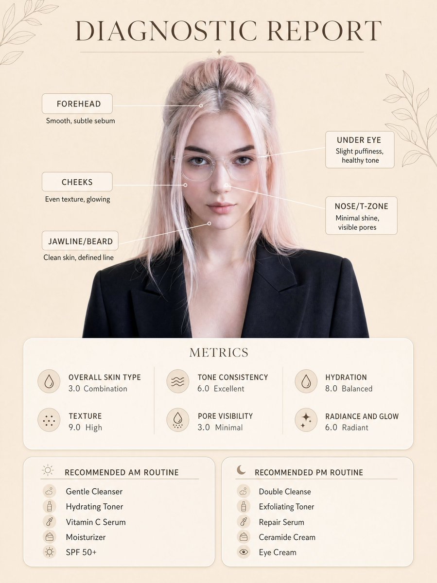
Full Prompt
Create a clean, minimal skincare diagnostic report poster using my uploaded photo as the exact face reference, preserving my real facial features, proportions, and natural skin tone. The subject is centered in a professional portrait style, wearing a smart blazer and clear glasses, neutral expression, soft confident look. Background is a warm beige minimal aesthetic with subtle botanical line art decorations in corners. Add infographic-style facial markers with small circular points connected by thin lines to labeled skin analysis text: Forehead: Smooth, subtle sebum Under Eye: Slight puffiness, healthy tone Cheeks: Even texture, glowing Nose/T-zone: Minimal shine, visible pores Jawline/Beard: Clean skin, defined line At the top, include elegant serif title text: “DIAGNOSTIC REPORT”. Below the portrait, add a rounded soft card labeled “METRICS” with clean modern typography showing: Overall Skin Type: 3.0 Combination Texture: 9.0 High Tone Consistency: 6.0 Excellent Pore Visibility: 3.0 Minimal Hydration: 8.0 Balanced Radiance and Glow: 6.0 Radiant At the bottom, create two rounded panels: Left panel title: “RECOMMENDED AM ROUTINE” Gentle Cleanser Hydrating Toner Vitamin C Serum Moisturizer SPF 50+ Right panel title: “RECOMMENDED PM ROUTINE” Double Cleanse Exfoliating Toner Repair Serum Ceramide Cream Eye Cream Style: ultra-clean dermatology infographic, soft neutral tones, premium skincare brand aesthetic, minimal shadows, soft diffused lighting, high resolution, sharp text clarity, perfectly aligned layout, balanced spacing, modern UI card design, realistic skin texture, no distortion. Ensure layout, typography placement, spacing, and composition exactly match the reference image, only replacing the face with my uploaded photo.