Case Media
Case Notes
This page keeps the media, full prompt, and original source together so you can inspect the result first and decide whether the prompt is worth copying, saving, or comparing.
Case Insights
To make this page easier to search, cite, and reuse later, the case is also broken down into practical guidance about usage, visual cues, and prompt structure.
Best Fit Scenarios
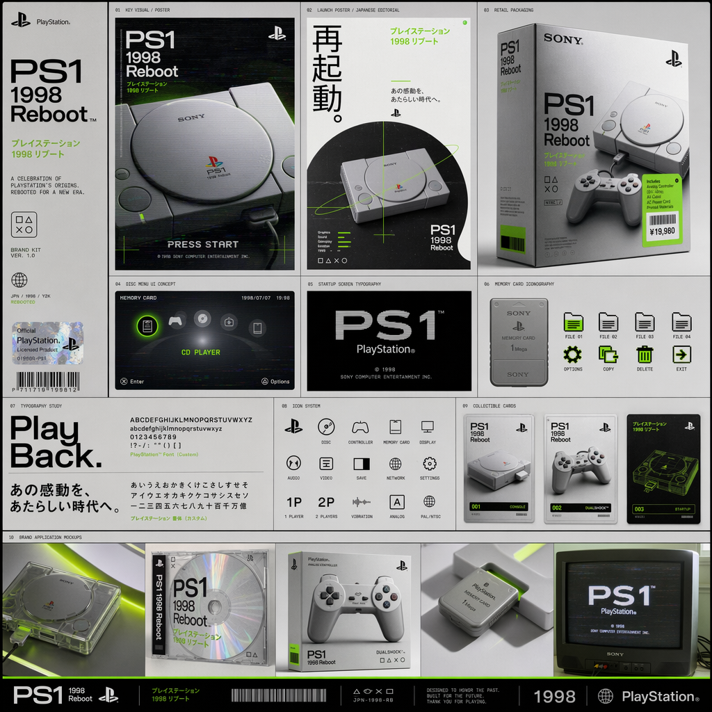
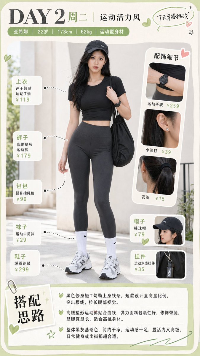
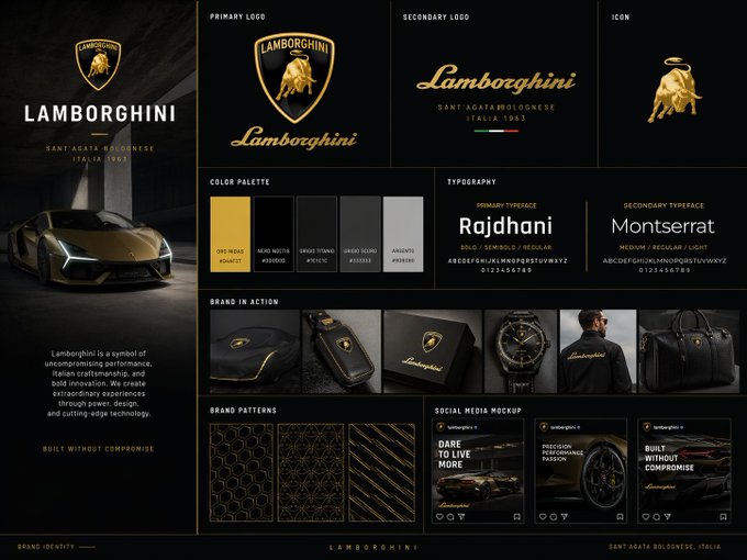
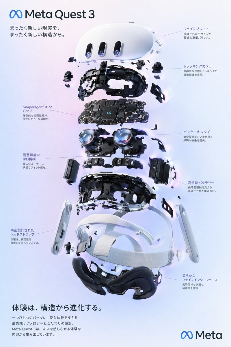
- Use this as a ui & social screens benchmark when you need a fast style baseline before rewriting your own prompt.
- It is especially helpful if your target overlaps with Fashion, Poster, UI and you want to judge the image result before tuning wording.
- Keep it as a control sample when you compare nearby prompt variants one variable at a time.
Visual Signals To Notice
- The clearest style signals here are Fashion, Poster, UI, so those should usually stay in your first rewrite.
- The important layer is usually interface density, card hierarchy, and how the screen tells the story before you read small text.
- This case keeps one primary output, so the first image should be treated as the main visual reference.
How The Prompt Is Structured
- The prompt reads as a long, highly specified prompt, which is useful when you want to judge how much specificity this direction needs.
- Its keyword cluster is centered on Fashion, Poster, UI, so you can usually keep that cluster while swapping subject, camera, layout, or copy details.
- A practical rewrite path is: keep the outcome, keep the strongest style cues, then replace only the subject and environment blocks.
Good Follow-up Questions
- What changes first if you keep Fashion, Poster, UI but switch the subject matter?
- Which part of the result comes from section-level structure (UI & Social Screens) versus tag-level style cues?
- Which related cases in the same section give you a cleaner or more extreme variation of the same direction?
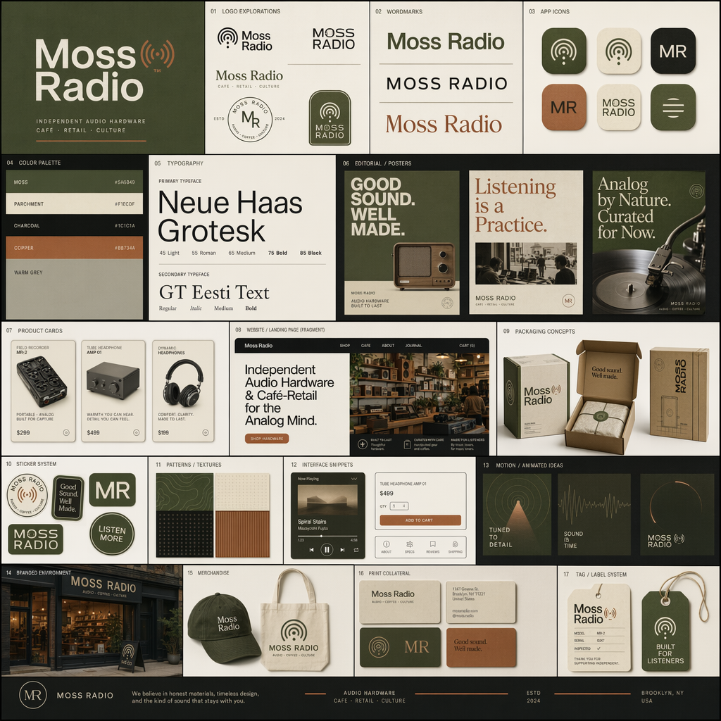
Full Prompt
Create a square high-end brand identity showcase board for a fictional brand called "Moss Radio". The brand should feel analog, cultured, warm, tactile, and design-forward. It operates in independent audio hardware and café-retail and should appeal to creative professionals and music obsessives. The overall mood should be nostalgic but modern. Design a polished modular grid of multiple tiles, each showing a different application of one cohesive visual identity system. Include logo explorations, wordmarks, app icon variations, editorial posters, product cards, landing page fragments, packaging concepts, typography specimens, interface snippets, color palette presentations, sticker systems, patterns, branded mockups, and small motion-inspired compositions. Use Swiss-inspired typography, rounded industrial shapes, and a moss green / parchment / charcoal / copper palette. Dense but elegant layout, sharp alignment, strong hierarchy, premium case-study presentation.