Case Media
Case Notes
This page keeps the media, full prompt, and original source together so you can inspect the result first and decide whether the prompt is worth copying, saving, or comparing.
Case Insights
To make this page easier to search, cite, and reuse later, the case is also broken down into practical guidance about usage, visual cues, and prompt structure.
Best Fit Scenarios
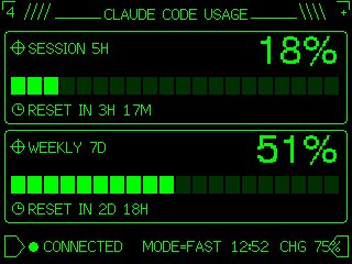
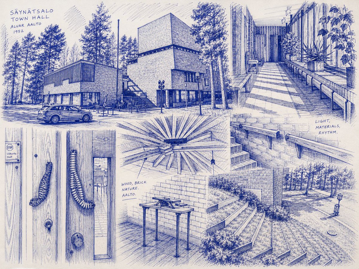
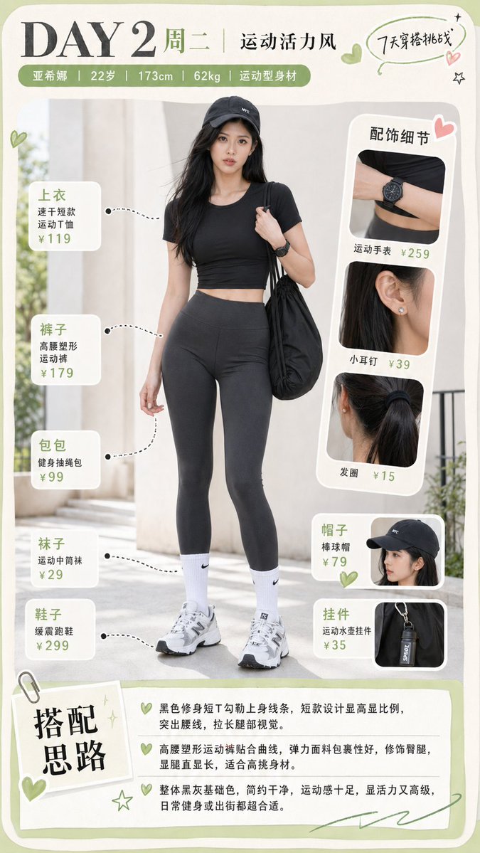
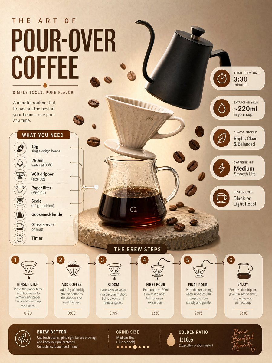
- Use this as a ui & social screens benchmark when you need a fast style baseline before rewriting your own prompt.
- It is especially helpful if your target overlaps with UI, Screenshot, Typography and you want to judge the image result before tuning wording.
- Keep it as a control sample when you compare nearby prompt variants one variable at a time.
Visual Signals To Notice
- The clearest style signals here are UI, Screenshot, Typography, so those should usually stay in your first rewrite.
- The important layer is usually interface density, card hierarchy, and how the screen tells the story before you read small text.
- This case keeps one primary output, so the first image should be treated as the main visual reference.
How The Prompt Is Structured
- The prompt reads as a long, highly specified prompt, which is useful when you want to judge how much specificity this direction needs.
- Its keyword cluster is centered on UI, Screenshot, Typography, so you can usually keep that cluster while swapping subject, camera, layout, or copy details.
- A practical rewrite path is: keep the outcome, keep the strongest style cues, then replace only the subject and environment blocks.
Good Follow-up Questions
- What changes first if you keep UI, Screenshot, Typography but switch the subject matter?
- Which part of the result comes from section-level structure (UI & Social Screens) versus tag-level style cues?
- Which related cases in the same section give you a cleaner or more extreme variation of the same direction?
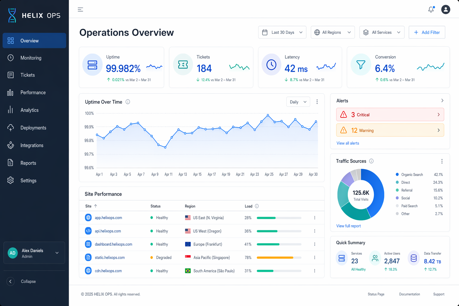
Full Prompt
Create a high-end desktop SaaS analytics dashboard mockup for a fictional platform named HELIX OPS, displayed on a 16:10 monitor canvas at 1600x1000. Use a cool palette of slate, cobalt blue, teal, pale gray, and white, with subtle glass panels and tight grid alignment. The layout should include a left sidebar, top filter bar, KPI cards, line charts, data table, and alert panel. Use crisp typography and correct labels. Include in-image text: "HELIX OPS", "Operations Overview", "Last 30 Days", "Uptime 99.982%", "Tickets 184", "Latency 42 ms", and "Conversion 6.4%". Show a line chart labeled "Apr 1" through "Apr 30", a donut chart titled "Traffic Sources", and a table with columns "Site", "Status", "Region", and "Load". Add alert pills reading "3 Critical" and "12 Warning". Composition should feel realistic and presentation-ready, with clean hierarchy, precise spacing, balanced negative space, and ultra-sharp dashboard UI rendering.