Case Media
Case Notes
This page keeps the media, full prompt, and original source together so you can inspect the result first and decide whether the prompt is worth copying, saving, or comparing.
Case Insights
To make this page easier to search, cite, and reuse later, the case is also broken down into practical guidance about usage, visual cues, and prompt structure.
Best Fit Scenarios
- Use this as a ui & social screens benchmark when you need a fast style baseline before rewriting your own prompt.
- It is especially helpful if your target overlaps with Cinematic, Fashion, Poster and you want to judge the image result before tuning wording.
- Keep it as a control sample when you compare nearby prompt variants one variable at a time.
Visual Signals To Notice
- The clearest style signals here are Cinematic, Fashion, Poster, so those should usually stay in your first rewrite.
- The important layer is usually interface density, card hierarchy, and how the screen tells the story before you read small text.
- This case keeps one primary output, so the first image should be treated as the main visual reference.
How The Prompt Is Structured
- The prompt reads as a long, highly specified prompt, which is useful when you want to judge how much specificity this direction needs.
- Its keyword cluster is centered on Cinematic, Fashion, Poster, so you can usually keep that cluster while swapping subject, camera, layout, or copy details.
- A practical rewrite path is: keep the outcome, keep the strongest style cues, then replace only the subject and environment blocks.
Good Follow-up Questions
- What changes first if you keep Cinematic, Fashion, Poster but switch the subject matter?
- Which part of the result comes from section-level structure (UI & Social Screens) versus tag-level style cues?
- Which related cases in the same section give you a cleaner or more extreme variation of the same direction?
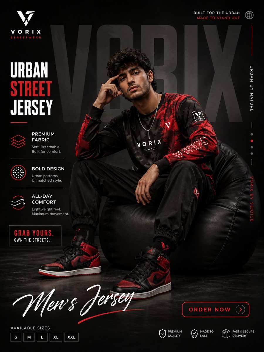
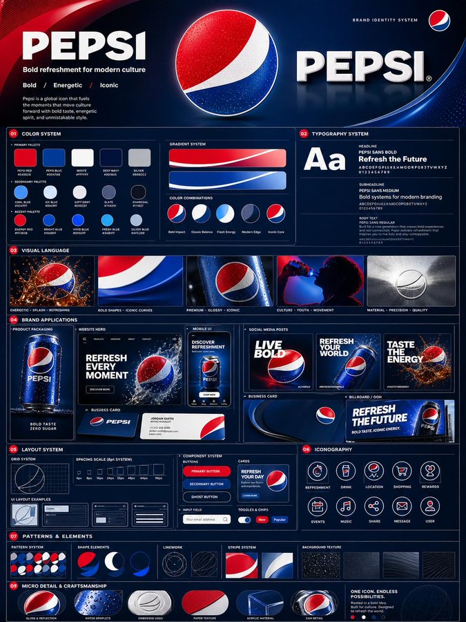
Full Prompt
Using the uploaded logo, generate a highly detailed, premium brand identity system poster. GOAL: Create a complete, visually rich brand kit that looks like it was made by a top design agency. This must feel like a real professional brand guideline board, not a simple mockup. --- CORE RULE: Everything must be derived from the uploaded logo: - colors - style - tone - personality No generic outputs. --- STRUCTURE (VERY IMPORTANT): Vertical 4:5 poster Multi-layered grid system Dense but clean composition --- TOP SECTION: - Brand name (clean typography) - Short brand statement (max 6 words) - 3-word brand identity (e.g. “Modern / Bold / Minimal”) --- COLOR SYSTEM (ADVANCED): - Primary palette (3–5 colors) - Secondary palette (3–5 colors) - Accent colors For each: - large color blocks - HEX codes (short) - usage indicators (primary / highlight / background) Add: - gradient examples - color combinations --- TYPOGRAPHY SYSTEM: - Headline font style - Subheadline style - Body text style Show: - real text examples (short phrases) - hierarchy clearly visible --- VISUAL LANGUAGE: Define: - image style (editorial, cinematic, minimal, etc.) - lighting direction - texture / material inspiration Show: - 3–5 visual tiles (image-style previews) --- BRAND APPLICATIONS (VERY IMPORTANT): Show multiple realistic mockups: - product packaging - website hero section - mobile UI screen - social media posts (3 variations) - business card - billboard or ad Each must feel consistent with the brand. --- LAYOUT SYSTEM: - UI blocks - card components - spacing system Show: - buttons, cards, layout examples --- ICONOGRAPHY: - 6–10 icons in brand style - consistent line / fill style --- PATTERNS & ELEMENTS: - background patterns - decorative shapes - visual motifs derived from logo --- MICRO DETAILS (TO SHOW POWER): - shadows - material textures - reflections - depth layers --- VISUAL STYLE (CRITICAL): - modern editorial + tech design hybrid - extremely clean but information-rich - layered composition - strong hierarchy Typography: - bold titles - clean supporting text --- DEPTH: - 30–50 visual elements total - mix of large + small components - dense but organized --- IMPORTANT RULES: - no empty space - no generic placeholders - everything must feel intentional - all elements must visually connect --- FINAL FEEL: Like: - a Behance top project - a real agency brand guideline board - something clients would pay for NOT: - basic - minimal - template-like