Case Media
Case Notes
This page keeps the media, full prompt, and original source together so you can inspect the result first and decide whether the prompt is worth copying, saving, or comparing.
Case Insights
To make this page easier to search, cite, and reuse later, the case is also broken down into practical guidance about usage, visual cues, and prompt structure.
Best Fit Scenarios
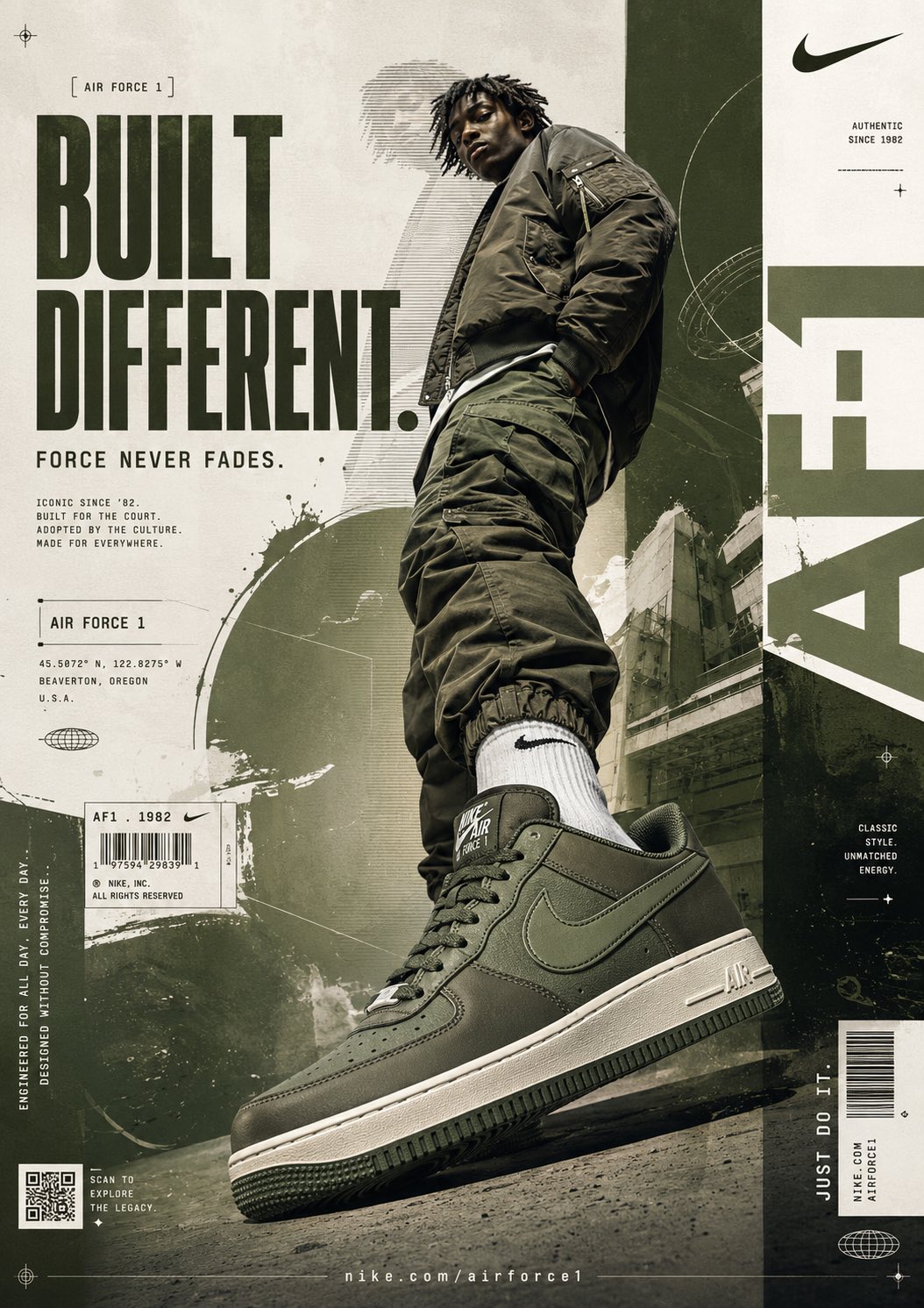
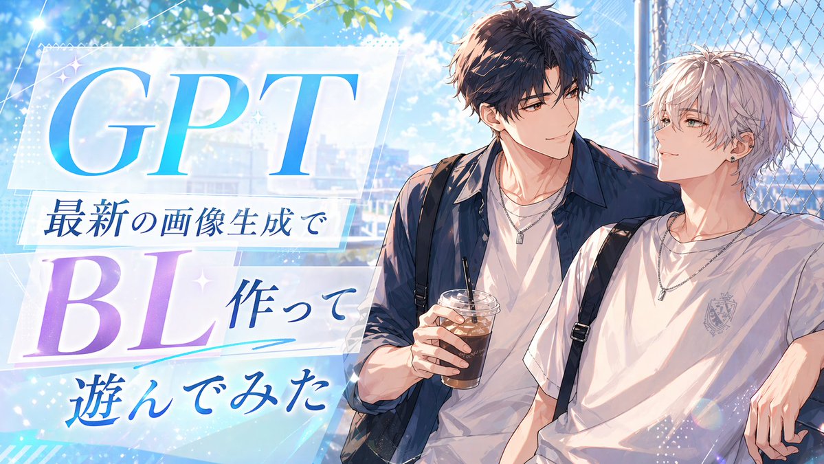
- Use this as a ui & social screens benchmark when you need a fast style baseline before rewriting your own prompt.
- It is especially helpful if your target overlaps with Fashion, Poster, UI and you want to judge the image result before tuning wording.
- Keep it as a control sample when you compare nearby prompt variants one variable at a time.
Visual Signals To Notice
- The clearest style signals here are Fashion, Poster, UI, so those should usually stay in your first rewrite.
- The important layer is usually interface density, card hierarchy, and how the screen tells the story before you read small text.
- This case keeps 2 media outputs, which makes it easier to check whether the style remains stable across multiple results.
How The Prompt Is Structured
- The prompt reads as a long, highly specified prompt, which is useful when you want to judge how much specificity this direction needs.
- Its keyword cluster is centered on Fashion, Poster, UI, so you can usually keep that cluster while swapping subject, camera, layout, or copy details.
- A practical rewrite path is: keep the outcome, keep the strongest style cues, then replace only the subject and environment blocks.
Good Follow-up Questions
- What changes first if you keep Fashion, Poster, UI but switch the subject matter?
- Which part of the result comes from section-level structure (UI & Social Screens) versus tag-level style cues?
- Which related cases in the same section give you a cleaner or more extreme variation of the same direction?
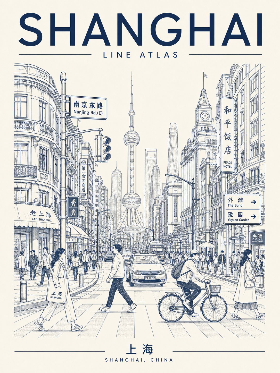
Full Prompt
Generate a high-fidelity "Urban Line Atlas Poster." The design is based on the visual language of a monochrome urban line-drawing travel poster, featuring a visual framework consisting of a top title, middle streetscape depth, core landmarks, flanking buildings, foreground figures, and a bottom footer. [Theme City Details] - City Name: [Insert Name] - Main English Title: [e.g., TOKYO RHYTHM / SHIBUYA PULSE / URBAN LINE ATLAS] - Local Language Title: [Chinese or native name] - Country/Region: [Location] - Core Landmark: [Representative landmark] - Street Scene: [Specific neighborhood or atmosphere] - Mood Theme: [Commuter morning / Rainy street / Weekend afternoon / Sunset cycling / Twilight walk] - Color Palette: [Vermilion / Black-gray / Deep indigo / Dark green / Umber / Burgundy] - Aspect Ratio: [3:4 or 2:3 vertical] [Positioning] This is a hybrid of a travel memorial, urban visual atlas, architectural manuscript, and editorial cover. It should feel like a high-end urban archive rather than a generic tourist brochure—combining city recognition with authentic street-life vitality. [Composition] 1. Top Title Area: Bold and striking English titles, potentially including city codes, series numbers, coordinates, or subheadings. 2. Middle Streetscape: Deep perspective view. The angle can be centered, slightly tilted, or a high-angle view to ensure a unique composition. 3. Visual Anchor: Core landmarks should be recognizable in the mid or background, integrated naturally into the daily street scene. 4. High-Density Details: Flanking buildings should feature local facades, shops, road signs, traffic lights, subway entrances, and wires. 5. Human Elements: Include natural foreground elements like commuters, cyclists, tourists, coffee cups, or taxis to add a sense of life. 6. Footer: A standalone area designed like a city tag, travel receipt, or archive index. [Typography & Style] Text must be crisp and integrated into the design system. Use monochrome or minimal duotone line-drawing style on paper textures (cream/light gray). Lines should be precise and restrained, resembling architectural pen sketches or screen prints. [Innovation & Constraints] Please innovate in title placement, street perspective, and information modules. Avoid: Watercolors, thick painting, cartoon/chibi styles, cyberpunk, large color blocks, or cheap souvenir aesthetics. Generate a high-definition, clean-lined, collectible vertical urban poster.