Case Media
Case Notes
This page keeps the media, full prompt, and original source together so you can inspect the result first and decide whether the prompt is worth copying, saving, or comparing.
Case Insights
To make this page easier to search, cite, and reuse later, the case is also broken down into practical guidance about usage, visual cues, and prompt structure.
Best Fit Scenarios
- Use this as a ui & social screens benchmark when you need a fast style baseline before rewriting your own prompt.
- It is especially helpful if your target overlaps with Neon, UI, Screenshot and you want to judge the image result before tuning wording.
- Keep it as a control sample when you compare nearby prompt variants one variable at a time.
Visual Signals To Notice
- The clearest style signals here are Neon, UI, Screenshot, so those should usually stay in your first rewrite.
- The important layer is usually interface density, card hierarchy, and how the screen tells the story before you read small text.
- This case keeps one primary output, so the first image should be treated as the main visual reference.
How The Prompt Is Structured
- The prompt reads as a long, highly specified prompt, which is useful when you want to judge how much specificity this direction needs.
- Its keyword cluster is centered on Neon, UI, Screenshot, so you can usually keep that cluster while swapping subject, camera, layout, or copy details.
- A practical rewrite path is: keep the outcome, keep the strongest style cues, then replace only the subject and environment blocks.
Good Follow-up Questions
- What changes first if you keep Neon, UI, Screenshot but switch the subject matter?
- Which part of the result comes from section-level structure (UI & Social Screens) versus tag-level style cues?
- Which related cases in the same section give you a cleaner or more extreme variation of the same direction?
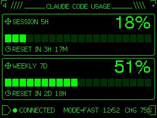
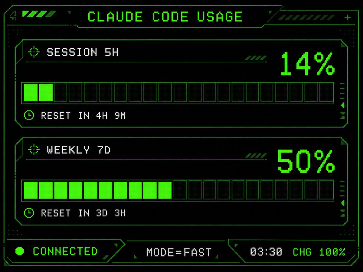
Full Prompt
Using the provided reference image as the UI/data source, redesign it into a polished retro-futuristic monochrome green terminal HUD for an M5Stack-style display. Keep the same information and values unchanged: title {argument name="title text" default="CLAUDE CODE USAGE"}, two usage sections labeled {argument name="session label" default="SESSION 5H"} and {argument name="weekly label" default="WEEKLY 7D"}, percentages 14% and 50%, reset messages "RESET IN 4H 9M" and "RESET IN 3D 3H", and footer statuses "CONNECTED", "MODE=FAST", "03:30", "CHG 100%". Replace the plain bars with chunky pixelated segmented gauges: exactly 2 horizontal gauge panels, each with 20 rectangular segments, with the first showing 2 filled neon-green segments and the second showing 10 filled neon-green segments. Add a detailed sci-fi frame with angular borders, thin circuit-like linework, corner brackets, dotted texture, small arrow/target/clock icons, diagonal hazard stripes, and subtle CRT/pixel-grid glow. Use a black background, bright neon green outlines and fills, and white-green pixel text. Arrange the footer as exactly 3 bottom modules: left "CONNECTED" with a green status dot, center "MODE=FAST", and right "03:30 CHG 100%". Make it sharper, more stylish, and more production-ready than the reference while preserving the same dashboard function and data.