Case Media
Case Notes
This page keeps the media, full prompt, and original source together so you can inspect the result first and decide whether the prompt is worth copying, saving, or comparing.
Case Insights
To make this page easier to search, cite, and reuse later, the case is also broken down into practical guidance about usage, visual cues, and prompt structure.
Best Fit Scenarios
- Use this as a ui & social screens benchmark when you need a fast style baseline before rewriting your own prompt.
- It is especially helpful if your target overlaps with Cinematic, Illustration, UI and you want to judge the image result before tuning wording.
- Keep it as a control sample when you compare nearby prompt variants one variable at a time.
Visual Signals To Notice
- The clearest style signals here are Cinematic, Illustration, UI, so those should usually stay in your first rewrite.
- The important layer is usually interface density, card hierarchy, and how the screen tells the story before you read small text.
- This case keeps one primary output, so the first image should be treated as the main visual reference.
How The Prompt Is Structured
- The prompt reads as a long, highly specified prompt, which is useful when you want to judge how much specificity this direction needs.
- Its keyword cluster is centered on Cinematic, Illustration, UI, so you can usually keep that cluster while swapping subject, camera, layout, or copy details.
- A practical rewrite path is: keep the outcome, keep the strongest style cues, then replace only the subject and environment blocks.
Good Follow-up Questions
- What changes first if you keep Cinematic, Illustration, UI but switch the subject matter?
- Which part of the result comes from section-level structure (UI & Social Screens) versus tag-level style cues?
- Which related cases in the same section give you a cleaner or more extreme variation of the same direction?
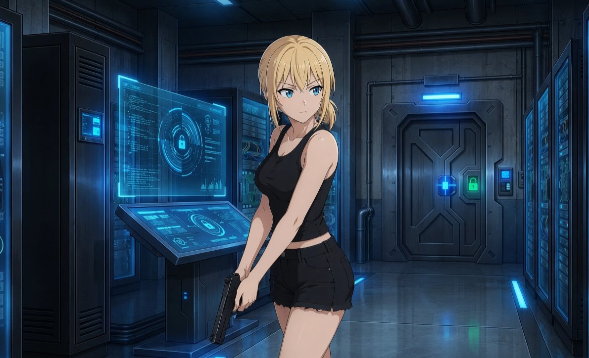
Full Prompt
Create a polished anime-style sci-fi thriller scene in a dark futuristic server room. Show one young adult woman with {argument name="hair color" default="blonde"} hair tied in a loose low side ponytail, standing in the foreground slightly right of center, body turned three-quarters toward the viewer, her face intentionally featureless and softly blurred with no eyes, nose, or mouth. She wears {argument name="outfit" default="a black sleeveless tank top and black frayed short shorts"}, with bare arms and a tense, stealthy posture. She holds one {argument name="weapon" default="black semi-automatic pistol"} low in both hands near her thighs, angled downward as if infiltrating a secure facility. The background is {argument name="setting" default="a high-security cybernetic data center corridor"}: count 4 major equipment zones, including one tall dark server cabinet on the far left, one central server rack behind the console, one large secure metal door at the back, and one bank of server racks along the right wall. Include exactly 2 prominent cyan holographic interface displays on the left-center console: one upright transparent screen filled with code, circular lock graphics, charts, and tiny UI marks, and one slanted touchscreen console with matching lock icons and system diagrams. Add blue access lights, glowing cyan panels, a green lock indicator on the heavy door, exposed pipes, industrial wall panels, reflective metal flooring, and cool cinematic rim lighting. Use {argument name="lighting style" default="dark blue cyberpunk lighting with luminous cyan holograms"}, sharp clean line art, high-detail anime rendering, moody shadows, realistic perspective, and a widescreen 16:9 composition.