Case Media
Case Notes
This page keeps the media, full prompt, and original source together so you can inspect the result first and decide whether the prompt is worth copying, saving, or comparing.
Case Insights
To make this page easier to search, cite, and reuse later, the case is also broken down into practical guidance about usage, visual cues, and prompt structure.
Best Fit Scenarios
- Use this as a poster & illustration benchmark when you need a fast style baseline before rewriting your own prompt.
- It is especially helpful if your target overlaps with Poster, Illustration, Screenshot and you want to judge the image result before tuning wording.
- Keep it as a control sample when you compare nearby prompt variants one variable at a time.
Visual Signals To Notice
- The clearest style signals here are Poster, Illustration, Screenshot, so those should usually stay in your first rewrite.
- Pay close attention to layout rhythm, headline hierarchy, illustration texture, and how information is staged in the frame.
- This case keeps one primary output, so the first image should be treated as the main visual reference.
How The Prompt Is Structured
- The prompt reads as a long, highly specified prompt, which is useful when you want to judge how much specificity this direction needs.
- Its keyword cluster is centered on Poster, Illustration, Screenshot, so you can usually keep that cluster while swapping subject, camera, layout, or copy details.
- A practical rewrite path is: keep the outcome, keep the strongest style cues, then replace only the subject and environment blocks.
Good Follow-up Questions
- What changes first if you keep Poster, Illustration, Screenshot but switch the subject matter?
- Which part of the result comes from section-level structure (Poster & Illustration) versus tag-level style cues?
- Which related cases in the same section give you a cleaner or more extreme variation of the same direction?
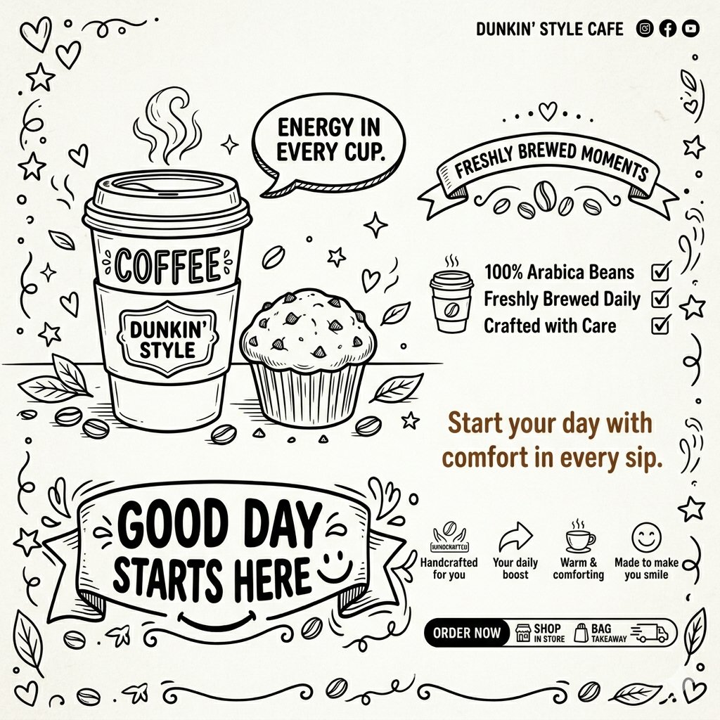
Full Prompt
A clean, black-and-white line-art advertisement for a cozy coffee shop inspired by Dunkin’. The design uses a hand-drawn doodle style that feels warm, friendly, and sketchbook-like, similar to a chalkboard illustration. Key Visual Elements: A large Dunkin’ coffee cup in minimalist line-art style with steam rising from the lid. A chocolate chip muffin placed beside the cup. Scattered coffee beans around the base for decoration. Typography & Messaging: Main headline: “GOOD DAY STARTS HERE” in bold, playful hand-lettered font. Ribbon banner above: “FRESHLY BREWED MOMENTS” Tagline: “Start your day with comfort in every sip.” Speech bubble: “ENERGY IN EVERY CUP.” Branding: Minimal Dunkin’-inspired café branding text in the top corner (no real logo duplication). “ORDER NOW” button with: IN STORE • TAKEAWAY • DELIVERY Features & Icons: Checklist with icons: 100% Arabica Beans Freshly Brewed Daily Crafted with Care.