Case Media
Case Notes
This page keeps the media, full prompt, and original source together so you can inspect the result first and decide whether the prompt is worth copying, saving, or comparing.
Case Insights
To make this page easier to search, cite, and reuse later, the case is also broken down into practical guidance about usage, visual cues, and prompt structure.
Best Fit Scenarios
- Use this as a poster & illustration benchmark when you need a fast style baseline before rewriting your own prompt.
- It is especially helpful if your target overlaps with Poster, Illustration, Minimal and you want to judge the image result before tuning wording.
- Keep it as a control sample when you compare nearby prompt variants one variable at a time.
Visual Signals To Notice
- The clearest style signals here are Poster, Illustration, Minimal, so those should usually stay in your first rewrite.
- Pay close attention to layout rhythm, headline hierarchy, illustration texture, and how information is staged in the frame.
- This case keeps one primary output, so the first image should be treated as the main visual reference.
How The Prompt Is Structured
- The prompt reads as a long, highly specified prompt, which is useful when you want to judge how much specificity this direction needs.
- Its keyword cluster is centered on Poster, Illustration, Minimal, so you can usually keep that cluster while swapping subject, camera, layout, or copy details.
- A practical rewrite path is: keep the outcome, keep the strongest style cues, then replace only the subject and environment blocks.
Good Follow-up Questions
- What changes first if you keep Poster, Illustration, Minimal but switch the subject matter?
- Which part of the result comes from section-level structure (Poster & Illustration) versus tag-level style cues?
- Which related cases in the same section give you a cleaner or more extreme variation of the same direction?
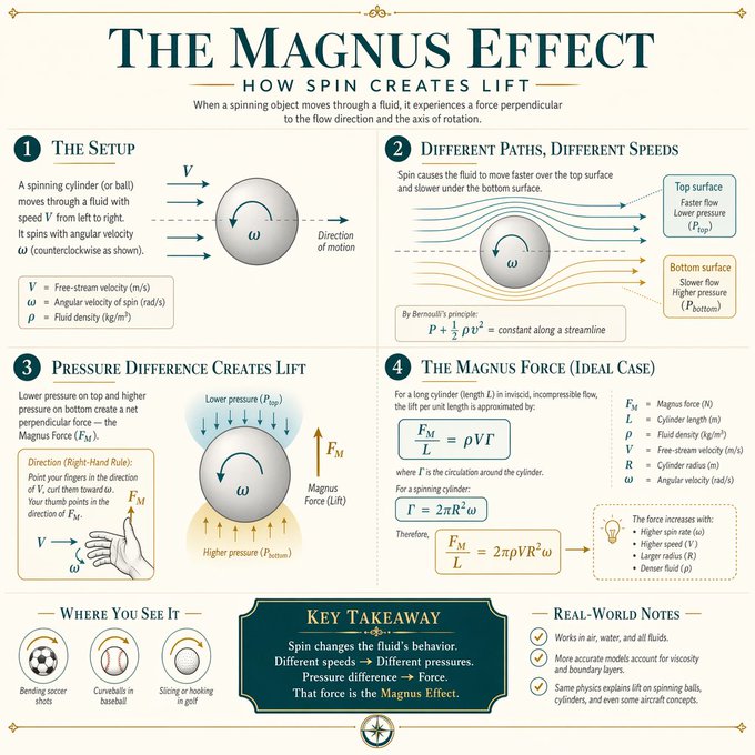
Full Prompt
Create a visually stunning educational infographic explaining Magnus Effect in a clean, modern academic style. Use a soft neutral background (cream or light beige), elegant serif typography for titles, and minimalist sans-serif for body text. Structure the layout into clearly separated numbered sections (e.g., 1, 2, 3, 4), each with a concise heading and short explanation. Include subtle dividing lines and balanced spacing. Incorporate mathematical notation, symbols, and step-by-step visual diagrams (like grids, arrows, highlights, or boxed elements) to illustrate the concept clearly. Use a limited color palette (teal, gold accents, dark gray text) with soft highlights for emphasis. Add visual cues like arrows, dotted lines, or highlighted boxes to guide the viewer’s eye through the logic. Maintain symmetry, alignment, and a polished “textbook meets modern design” aesthetic. The final design should feel like a premium educational poster - minimal, elegant, highly readable, and intellectually satisfying.