Case Media
Case Notes
This page keeps the media, full prompt, and original source together so you can inspect the result first and decide whether the prompt is worth copying, saving, or comparing.
Case Insights
To make this page easier to search, cite, and reuse later, the case is also broken down into practical guidance about usage, visual cues, and prompt structure.
Best Fit Scenarios
- Use this as a poster & illustration benchmark when you need a fast style baseline before rewriting your own prompt.
- It is especially helpful if your target overlaps with Poster, Illustration, Poster & Illustration and you want to judge the image result before tuning wording.
- Keep it as a control sample when you compare nearby prompt variants one variable at a time.
Visual Signals To Notice
- The clearest style signals here are Poster, Illustration, Poster & Illustration, so those should usually stay in your first rewrite.
- Pay close attention to layout rhythm, headline hierarchy, illustration texture, and how information is staged in the frame.
- This case keeps one primary output, so the first image should be treated as the main visual reference.
How The Prompt Is Structured
- The prompt reads as a long, highly specified prompt, which is useful when you want to judge how much specificity this direction needs.
- Its keyword cluster is centered on Poster, Illustration, Poster & Illustration, so you can usually keep that cluster while swapping subject, camera, layout, or copy details.
- A practical rewrite path is: keep the outcome, keep the strongest style cues, then replace only the subject and environment blocks.
Good Follow-up Questions
- What changes first if you keep Poster, Illustration, Poster & Illustration but switch the subject matter?
- Which part of the result comes from section-level structure (Poster & Illustration) versus tag-level style cues?
- Which related cases in the same section give you a cleaner or more extreme variation of the same direction?
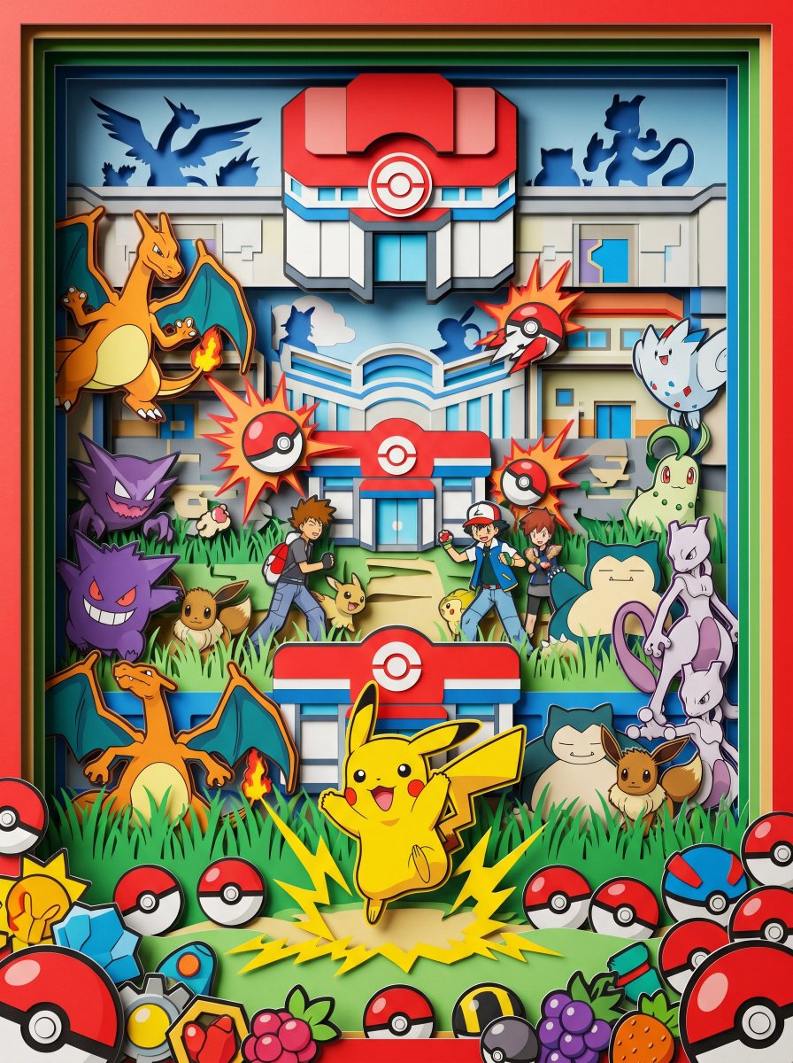
Full Prompt
Eye-level straight-on view, looking directly into a hyper-vibrant 3D layered paper cut-out diorama. Pokéball red and white, Pikachu yellow, sky blue and grass green accents, extremely high saturation, PHYSICAL PAPER LAYERS clearly visible with hard cut edges and thick paper cross-sections at every depth plane. Maximalist composition, crowded Pokémon world scene — layered Pokémon Center and gym architecture receding through all depth planes, Pikachu as central figure mid-thunderbolt on foreground layer, dozens of iconic Pokémon — Charizard, Gengar, Eevee, Snorlax, Mewtwo — each inhabiting separate depth planes, trainer Ash and rivals threading between battle layers, Pokéball burst effects frozen mid-release across all planes, tall grass and route pathways between habitat layers, legendary Pokémon silhouettes in remote background layers, scattered Pokéballs, badges and berry items crowding the vibrant foreground. Soft single-direction studio lighting creating deep drop shadows between every physical paper layer, matte paper texture throughout, NO glow, NO soft edges, NO volumetric lighting, octane render, 8k, clean details --ar 3:4