Case Media
Case Notes
This page keeps the media, full prompt, and original source together so you can inspect the result first and decide whether the prompt is worth copying, saving, or comparing.
Case Insights
To make this page easier to search, cite, and reuse later, the case is also broken down into practical guidance about usage, visual cues, and prompt structure.
Best Fit Scenarios
- Use this as a poster & illustration benchmark when you need a fast style baseline before rewriting your own prompt.
- It is especially helpful if your target overlaps with Poster, Illustration, Minimal and you want to judge the image result before tuning wording.
- Keep it as a control sample when you compare nearby prompt variants one variable at a time.
Visual Signals To Notice
- The clearest style signals here are Poster, Illustration, Minimal, so those should usually stay in your first rewrite.
- Pay close attention to layout rhythm, headline hierarchy, illustration texture, and how information is staged in the frame.
- This case keeps 3 media outputs, which makes it easier to check whether the style remains stable across multiple results.
How The Prompt Is Structured
- The prompt reads as a long, highly specified prompt, which is useful when you want to judge how much specificity this direction needs.
- Its keyword cluster is centered on Poster, Illustration, Minimal, so you can usually keep that cluster while swapping subject, camera, layout, or copy details.
- A practical rewrite path is: keep the outcome, keep the strongest style cues, then replace only the subject and environment blocks.
Good Follow-up Questions
- What changes first if you keep Poster, Illustration, Minimal but switch the subject matter?
- Which part of the result comes from section-level structure (Poster & Illustration) versus tag-level style cues?
- Which related cases in the same section give you a cleaner or more extreme variation of the same direction?
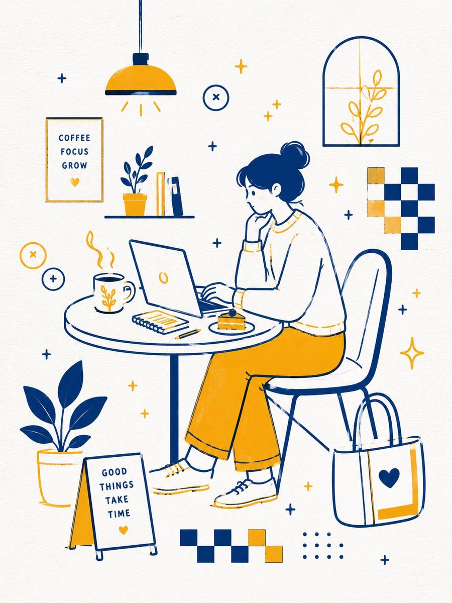
Full Prompt
Minimal flat vector illustration, Scandinavian aesthetic, retro café branding style, mid-century modern graphics, clean monoline drawing, emotional bookstore café poster mood. Use only 2 colors: {argument name="primary color" default="Deep navy blue"} {argument name="secondary color" default="Warm golden yellow"} White textured paper background. No gradients. Composition: A spacious asymmetric layout with lots of negative space. Keep objects minimal and simple. Maintain a visual flow from the upper left to the lower right. Create an airy sense of space with floating compositions. Avoid clutter and complexity. Objects: {argument name="subjects" default="Interior/exterior of a bookstore café, Round tables, Coffee and bakery items, Bookshelves, Windows, Plants"} Rendering Style: Uniform medium-thickness monoline strokes. Rounded vector shapes. Slight hand-drawn feeling. Simple geometric forms. Flat rendering. Matte printed texture. Subtle paper texture. Key Point: “Create atmosphere through minimal objects and generous empty space.” “Prioritize simple silhouettes and emotional balance over intricate details.”