Case Media
Case Notes
This page keeps the media, full prompt, and original source together so you can inspect the result first and decide whether the prompt is worth copying, saving, or comparing.
Case Insights
To make this page easier to search, cite, and reuse later, the case is also broken down into practical guidance about usage, visual cues, and prompt structure.
Best Fit Scenarios
- Use this as a poster & illustration benchmark when you need a fast style baseline before rewriting your own prompt.
- It is especially helpful if your target overlaps with Poster, Illustration, Poster & Illustration and you want to judge the image result before tuning wording.
- Keep it as a control sample when you compare nearby prompt variants one variable at a time.
Visual Signals To Notice
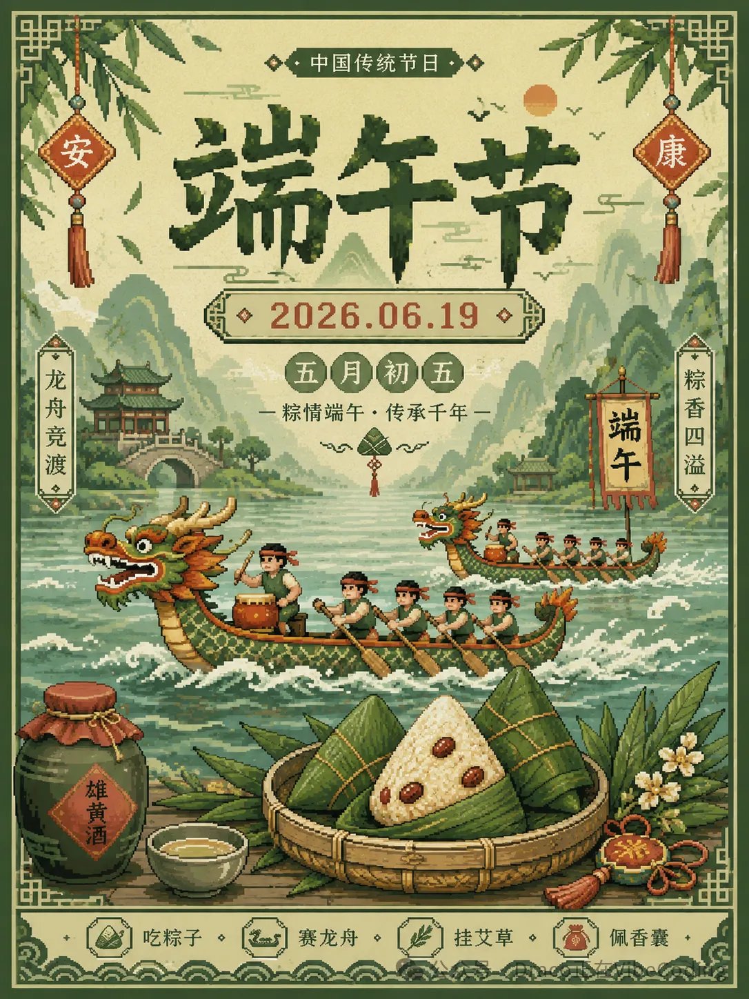
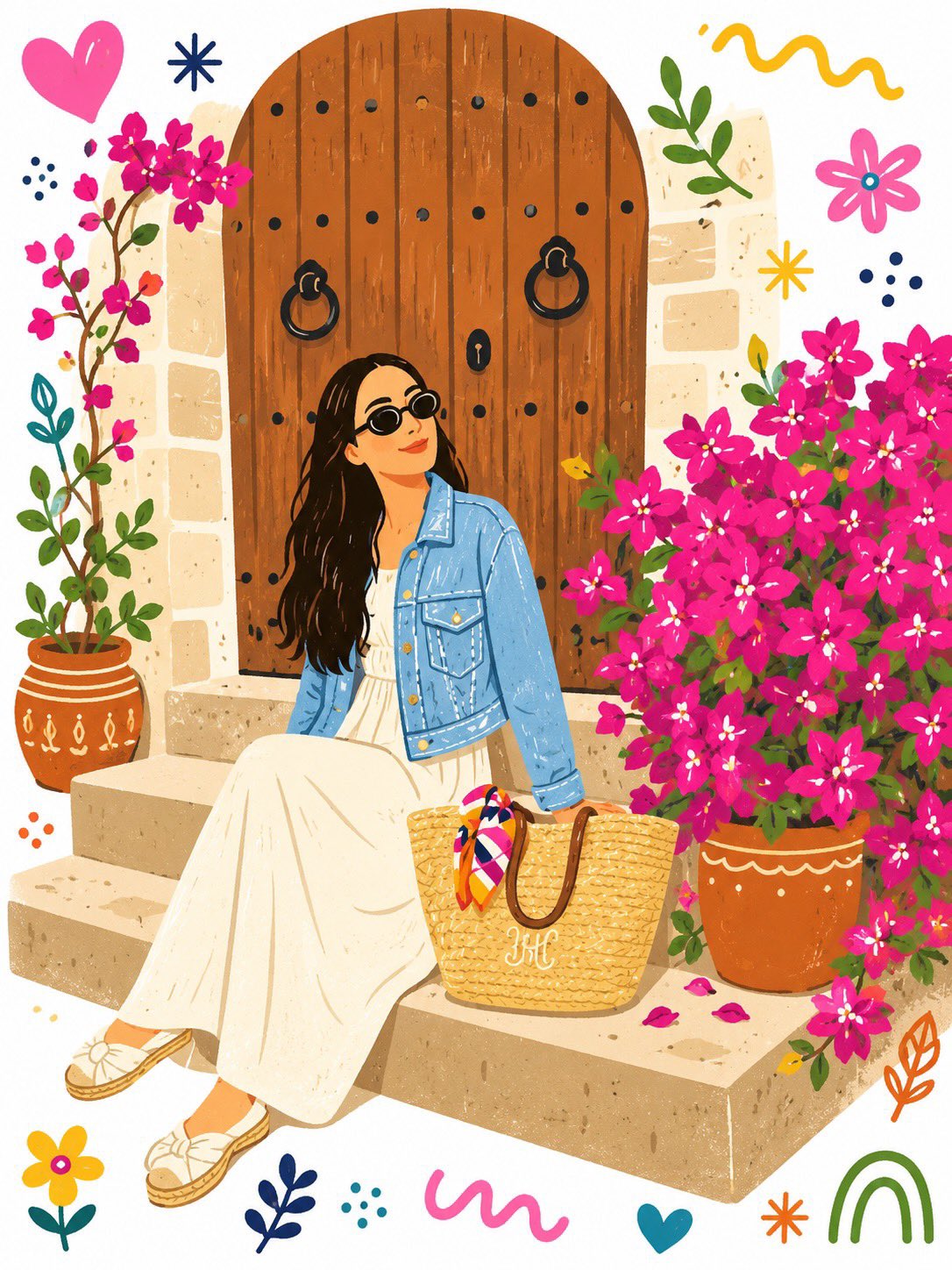
- The clearest style signals here are Poster, Illustration, Poster & Illustration, so those should usually stay in your first rewrite.
- Pay close attention to layout rhythm, headline hierarchy, illustration texture, and how information is staged in the frame.
- This case keeps 2 media outputs, which makes it easier to check whether the style remains stable across multiple results.
How The Prompt Is Structured
- The prompt reads as a long, highly specified prompt, which is useful when you want to judge how much specificity this direction needs.
- Its keyword cluster is centered on Poster, Illustration, Poster & Illustration, so you can usually keep that cluster while swapping subject, camera, layout, or copy details.
- A practical rewrite path is: keep the outcome, keep the strongest style cues, then replace only the subject and environment blocks.
Good Follow-up Questions
- What changes first if you keep Poster, Illustration, Poster & Illustration but switch the subject matter?
- Which part of the result comes from section-level structure (Poster & Illustration) versus tag-level style cues?
- Which related cases in the same section give you a cleaner or more extreme variation of the same direction?
Full Prompt
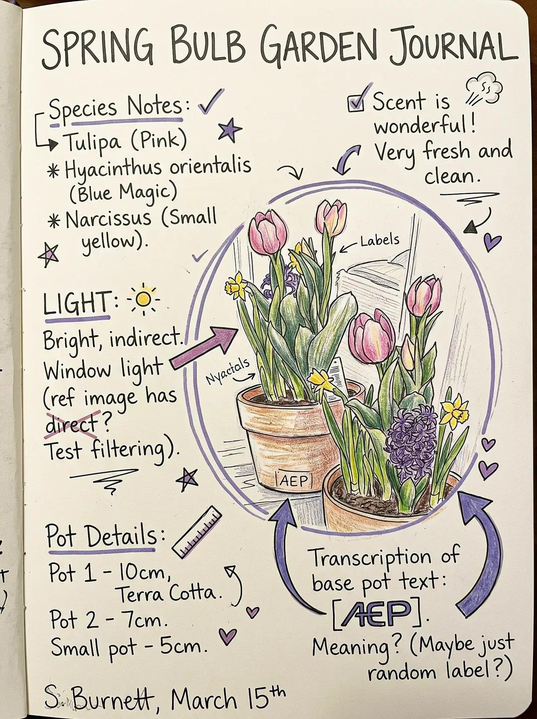
Create a composition inspired by messy handwritten notes, while maintaining clear visual hierarchy and readability. Core Structure: - Establish a clear focal element (text or object) - Position focal near center or slightly offset (rule of thirds) - Ensure it occupies the largest visual weight Elements: - Handwritten-style text blocks (vary size and importance) - Arrows, circles, highlights, underlines - Small doodles and icons (stars, lines, simple shapes) Hierarchy Control: - Primary: focal element (largest, clearest) - Secondary: supporting notes (medium size) - Tertiary: small doodles and accents (smallest scale) Chaos Control: - Use clustered messiness, not full-frame randomness - Keep clear breathing space around focal - Avoid overlapping critical content Structure: - Hidden grid alignment underneath - Intentional spacing between clusters - Guide the eye using directional elements (arrows, lines) Color System: - Base: white / paper tone - Ink: black or dark grey - Accents: maximum 1–2 colors only Style: - Imperfect, human, slightly chaotic - Controlled, not cluttered - Sketch-like but readable Mood: - Personal, expressive, slightly playful Balance Rule: - 60–70% structured space - 30–40% “messy” expression