Case Media
Case Notes
This page keeps the media, full prompt, and original source together so you can inspect the result first and decide whether the prompt is worth copying, saving, or comparing.
Case Insights
To make this page easier to search, cite, and reuse later, the case is also broken down into practical guidance about usage, visual cues, and prompt structure.
Best Fit Scenarios
- Use this as a poster & illustration benchmark when you need a fast style baseline before rewriting your own prompt.
- It is especially helpful if your target overlaps with Fashion, Poster, Illustration and you want to judge the image result before tuning wording.
- Keep it as a control sample when you compare nearby prompt variants one variable at a time.
Visual Signals To Notice
- The clearest style signals here are Fashion, Poster, Illustration, so those should usually stay in your first rewrite.
- Pay close attention to layout rhythm, headline hierarchy, illustration texture, and how information is staged in the frame.
- This case keeps one primary output, so the first image should be treated as the main visual reference.
How The Prompt Is Structured
- The prompt reads as a long, highly specified prompt, which is useful when you want to judge how much specificity this direction needs.
- Its keyword cluster is centered on Fashion, Poster, Illustration, so you can usually keep that cluster while swapping subject, camera, layout, or copy details.
- A practical rewrite path is: keep the outcome, keep the strongest style cues, then replace only the subject and environment blocks.
Good Follow-up Questions
- What changes first if you keep Fashion, Poster, Illustration but switch the subject matter?
- Which part of the result comes from section-level structure (Poster & Illustration) versus tag-level style cues?
- Which related cases in the same section give you a cleaner or more extreme variation of the same direction?
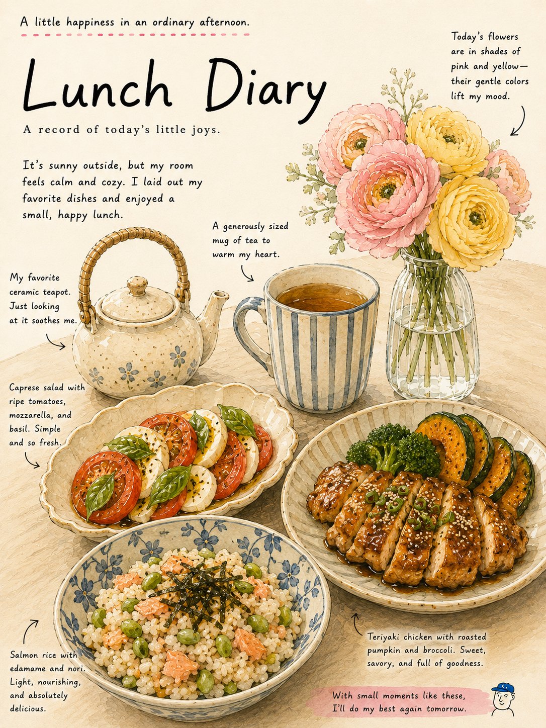
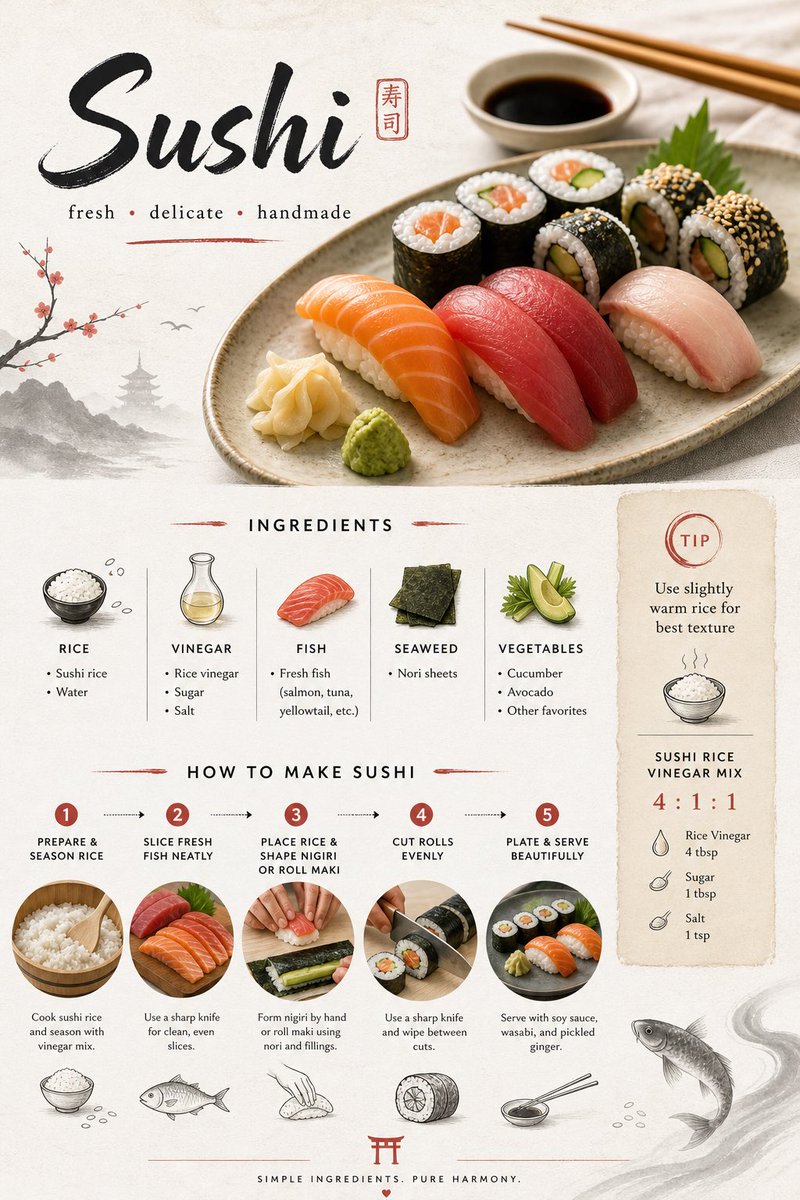
Full Prompt
Create a visually stunning, modern recipe card for “Sushi (Japanese Style)” designed for social media sharing. Style: Minimal yet artistic. Blend clean layout with soft Japanese-inspired design. Use rice paper textures, brush strokes, and elegant typography. Balanced negative space with a calm, premium feel. Layout: Single-page vertical composition (not a collage), divided into clear sections with visual hierarchy. Top Section: - Title: “Sushi” - Subtitle: “fresh • delicate • handmade” - A beautiful hero image of sushi (nigiri + maki) with soft natural lighting Middle Section (Ingredients): - Cleanly arranged ingredient list with small icons: rice, vinegar, fish, seaweed (nori), vegetables - Minimal bullet points, neat alignment Lower Section (Steps with Visual Flow): Include 4–5 steps with small supporting visuals or icons: 1. Prepare and season sushi rice 2. Slice fresh fish neatly 3. Place rice and shape nigiri or roll maki 4. Cut rolls evenly 5. Plate with soy sauce and wasabi Add thin connecting lines or arrows for flow. Side Element: - Small tip box: “Use slightly warm rice for best texture” - Optional ratio note: rice vinegar mix Design Details: - Soft neutral colors (white, beige, light grey, subtle red accents) - Japanese brush-style dividers - Tiny doodles (chopsticks, fish, rice grains) - Clean, uncluttered layout Mood: Calm, refined, elegant, satisfying to look at Composition: Highly balanced, lots of breathing space, premium editorial feel Aspect ratio: Vertical (2:3), high resolution, Instagram/Pinterest ready