Case Media
Case Notes
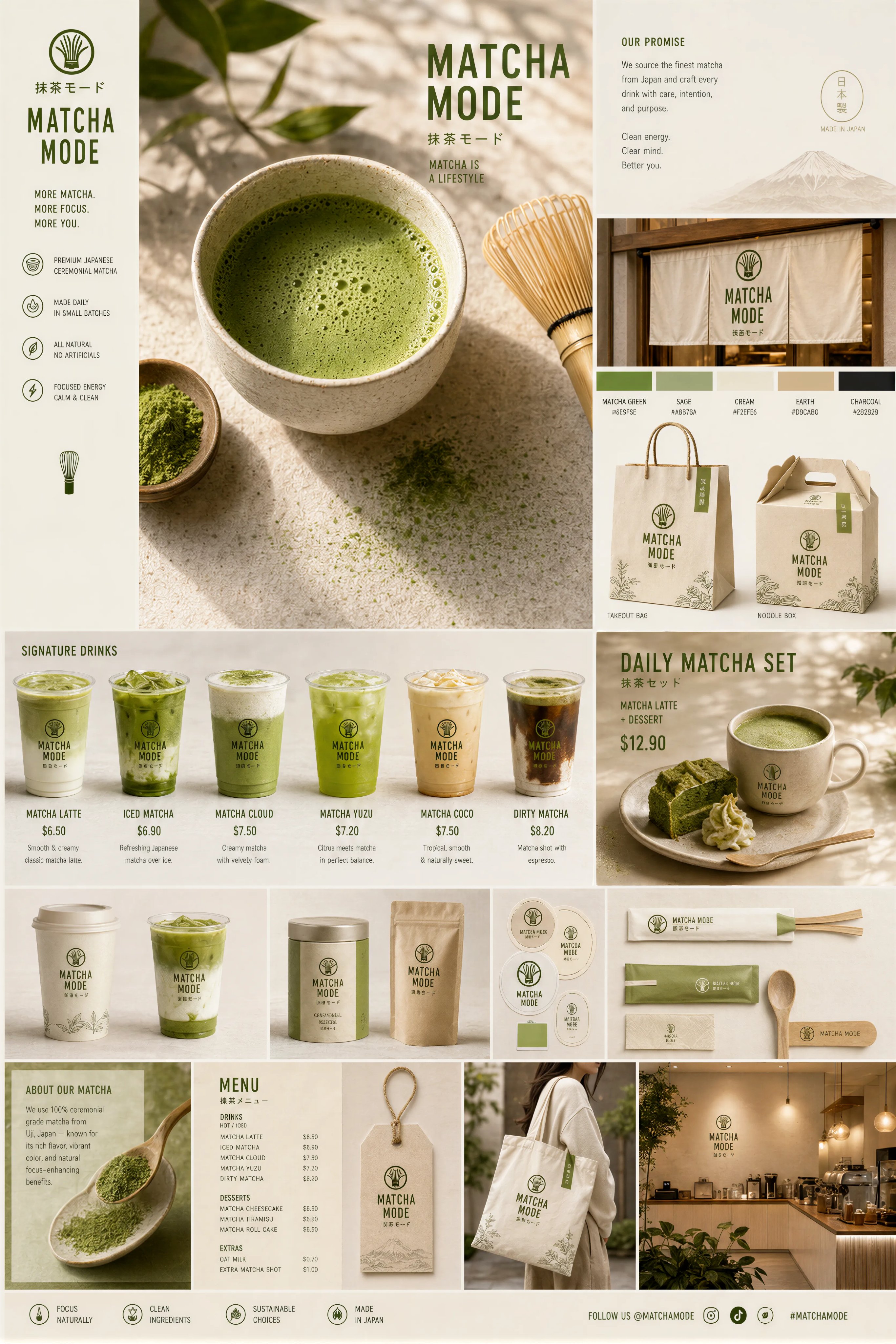
This page keeps the media, full prompt, and original source together so you can inspect the result first and decide whether the prompt is worth copying, saving, or comparing.
Case Insights
To make this page easier to search, cite, and reuse later, the case is also broken down into practical guidance about usage, visual cues, and prompt structure.
Best Fit Scenarios
- Use this as a poster & illustration benchmark when you need a fast style baseline before rewriting your own prompt.
- It is especially helpful if your target overlaps with Poster, Illustration, Minimal and you want to judge the image result before tuning wording.
- Keep it as a control sample when you compare nearby prompt variants one variable at a time.
Visual Signals To Notice
- The clearest style signals here are Poster, Illustration, Minimal, so those should usually stay in your first rewrite.
- Pay close attention to layout rhythm, headline hierarchy, illustration texture, and how information is staged in the frame.
- This case keeps one primary output, so the first image should be treated as the main visual reference.
How The Prompt Is Structured
- The prompt reads as a long, highly specified prompt, which is useful when you want to judge how much specificity this direction needs.
- Its keyword cluster is centered on Poster, Illustration, Minimal, so you can usually keep that cluster while swapping subject, camera, layout, or copy details.
- A practical rewrite path is: keep the outcome, keep the strongest style cues, then replace only the subject and environment blocks.
Good Follow-up Questions
- What changes first if you keep Poster, Illustration, Minimal but switch the subject matter?
- Which part of the result comes from section-level structure (Poster & Illustration) versus tag-level style cues?
- Which related cases in the same section give you a cleaner or more extreme variation of the same direction?
Full Prompt
Create a premium “Matcha Brand Touchpoint System” visual board for a modern lifestyle brand called: “MATCHA MODE” Build a full brand identity system, not a single image. HERO SCENE: A hyper-realistic matcha drink in a ceramic cup placed on a clean natural surface. – vibrant green matcha foam with micro-bubbles – bamboo whisk (chasen) nearby – soft natural light – slight matcha powder dust on the surface – minimal Japanese aesthetic ATMOSPHERE: – calm, warm, soft daylight – clean background (off-white or beige) – subtle shadows and reflections – feeling of wellness and luxury FULL BRAND SYSTEM: – takeout cups (paper + glass bottles) – packaging boxes (minimalist design) – tote bags (premium lifestyle) – labels, stickers, seals – menu cards with pricing ($6.50, $8.90, etc.) – small typography everywhere – subtle imperfections (realism) DESIGN LANGUAGE: – modern minimalist typography – Japanese-inspired layout – soft green palette – elegant spacing INCLUDE: – matcha latte – iced matcha – matcha desserts – combo sets – lifestyle shots The composition must feel like a high-end design agency presentation. Ultra-detailed, realistic, clean, aesthetic, and highly shareable.