Case Media
Case Notes
This page keeps the media, full prompt, and original source together so you can inspect the result first and decide whether the prompt is worth copying, saving, or comparing.
Case Insights
To make this page easier to search, cite, and reuse later, the case is also broken down into practical guidance about usage, visual cues, and prompt structure.
Best Fit Scenarios
- Use this as a poster & illustration benchmark when you need a fast style baseline before rewriting your own prompt.
- It is especially helpful if your target overlaps with Poster, Illustration, Brand and you want to judge the image result before tuning wording.
- Keep it as a control sample when you compare nearby prompt variants one variable at a time.
Visual Signals To Notice
- The clearest style signals here are Poster, Illustration, Brand, so those should usually stay in your first rewrite.
- Pay close attention to layout rhythm, headline hierarchy, illustration texture, and how information is staged in the frame.
- This case keeps 2 media outputs, which makes it easier to check whether the style remains stable across multiple results.
How The Prompt Is Structured
- The prompt reads as a long, highly specified prompt, which is useful when you want to judge how much specificity this direction needs.
- Its keyword cluster is centered on Poster, Illustration, Brand, so you can usually keep that cluster while swapping subject, camera, layout, or copy details.
- A practical rewrite path is: keep the outcome, keep the strongest style cues, then replace only the subject and environment blocks.
Good Follow-up Questions
- What changes first if you keep Poster, Illustration, Brand but switch the subject matter?
- Which part of the result comes from section-level structure (Poster & Illustration) versus tag-level style cues?
- Which related cases in the same section give you a cleaner or more extreme variation of the same direction?
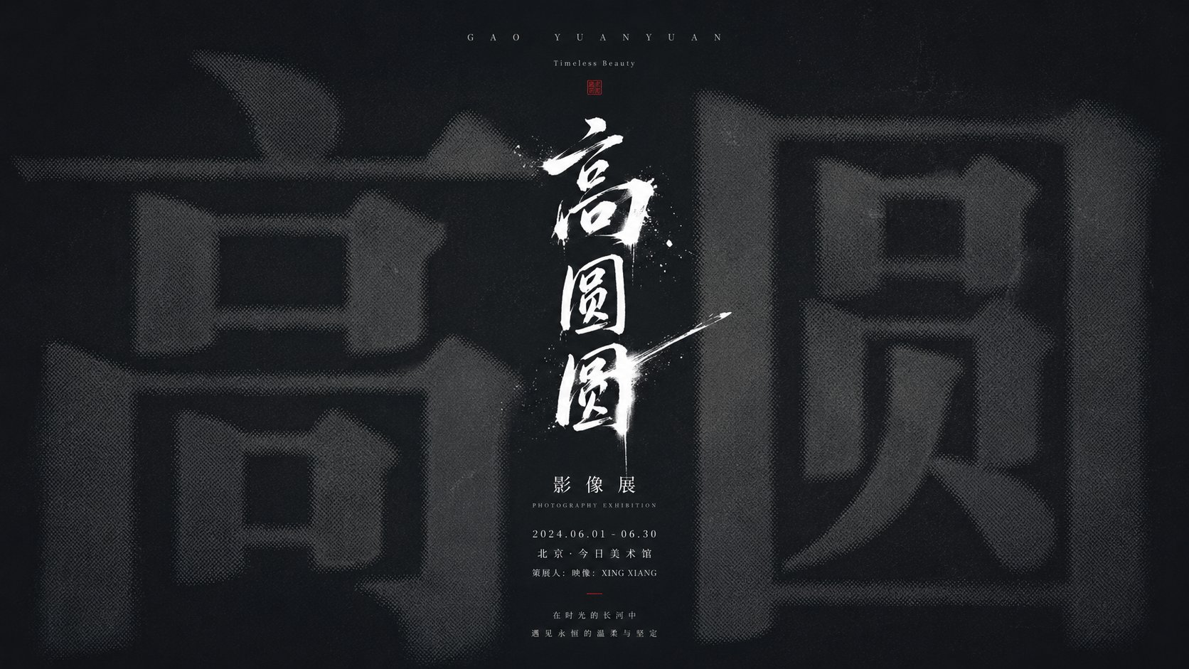
Full Prompt
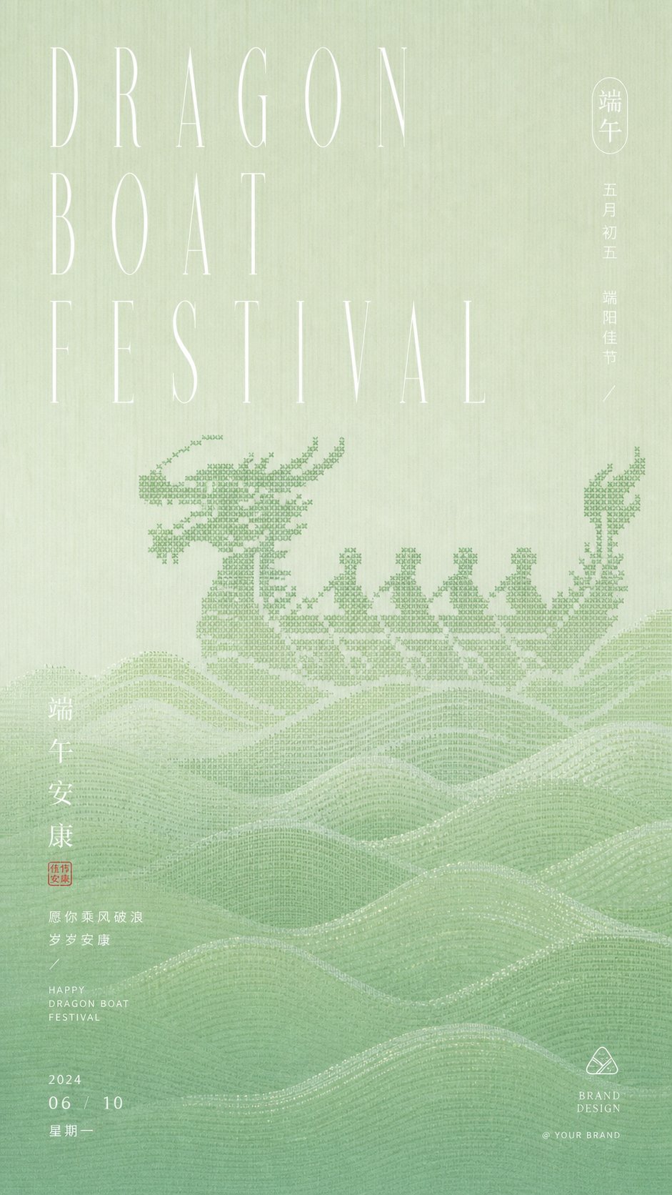
Generate a cold, solemn, and exhibition-style information visual around the subject Liu Yan: The image uses a large area of low-brightness theme base color as a structural field, with the base color extracted from the history, material, or emotion of the subject, maintaining a dominant relationship that is deep and clean, low saturation, and with little hue interference; in the background, an extremely enlarged core glyph, symbol, or information form of the theme is placed, making it occupy the main visual weight, but it recedes into the depths of the background through out-of-focus, halftoning, softened edges, and slight diffusion processing, forming a first-impression impact of being first suppressed by volume and then gradually recognized. In the center, a high-brightness, sharp, and strongly handwritten theme symbol or title stroke is superimposed, like a short and accurate white light cutting into the blurred giant shape; the lines have writing speed, ink breaks, and vertical tension, becoming the clearest focus of the entire image. The text system establishes a quiet order along the central axis, with sparse small English or Pinyin-style information at the top as a calm introduction, a small amount of clear titles in the middle to press down on the focus, and compact small text, dates, signatures, locations, or descriptions at the bottom to form a rhythmic decrease, with restrained letter spacing and stable line spacing, and information accurately placed like an archive. Color roles shift with the theme: the background undertakes the quiet structure, the giant background information uses a low-contrast grayscale slightly brighter than the background or a dark theme color, the central handwritten symbol and key text use the clearest high-brightness information color, and a small amount of logos or details can use derived theme emphasis colors as a finishing touch; the overall feel remains calm and precise, clean and low saturation, with clear light and dark levels and a weak grain texture, avoiding a decorative illustration feel, letting the overlay relationship between blurred weight and sharp writing become the main memory point. Subject: Liu Yan. Aspect ratio 16:9.