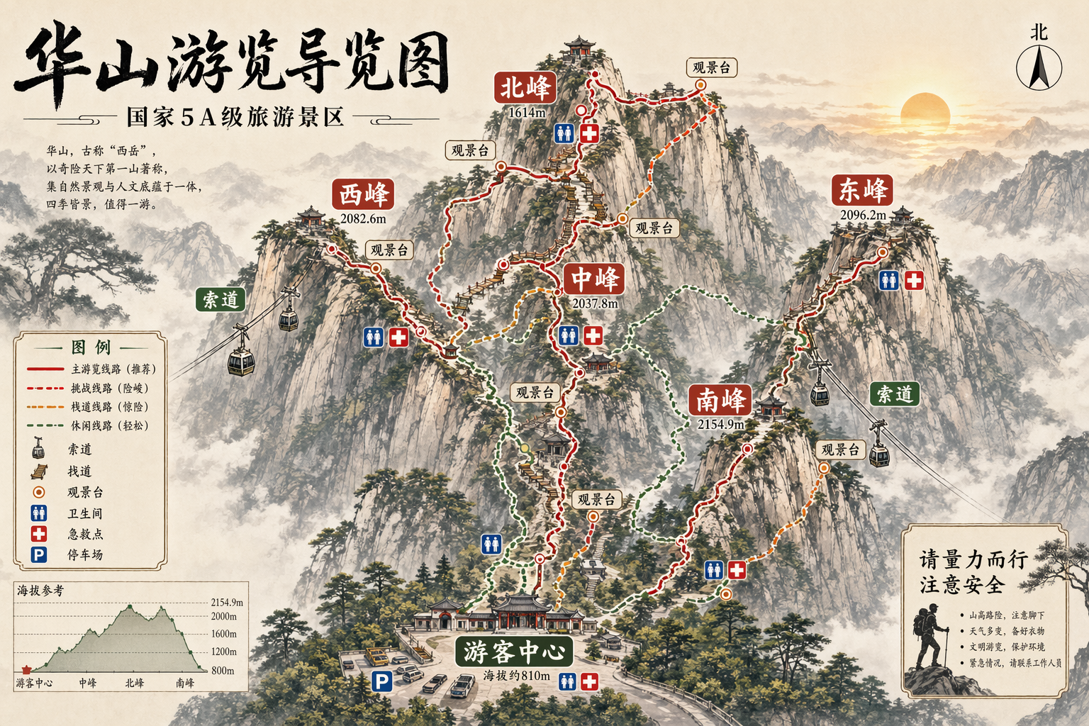
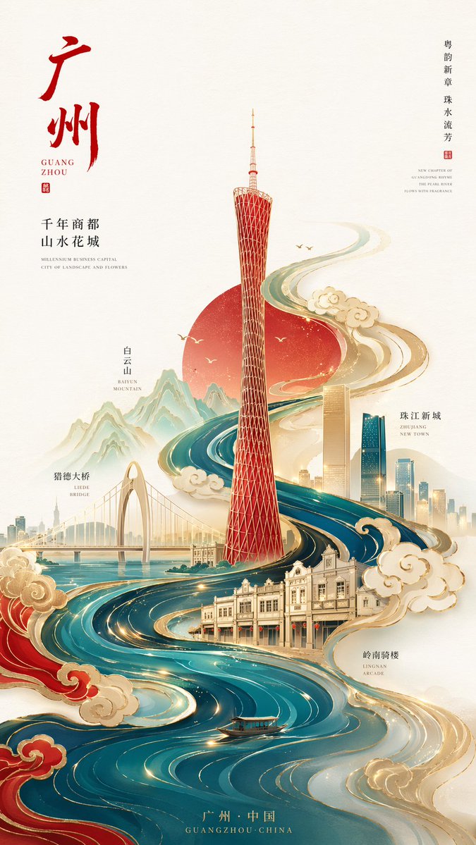
Case Media
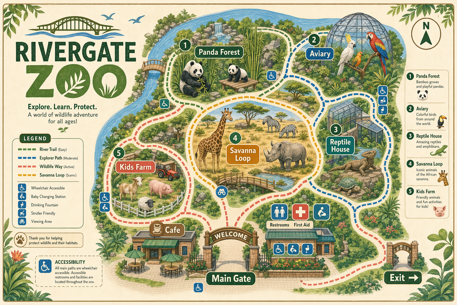
Case Notes
This page keeps the media, full prompt, and original source together so you can inspect the result first and decide whether the prompt is worth copying, saving, or comparing.
Case Insights
To make this page easier to search, cite, and reuse later, the case is also broken down into practical guidance about usage, visual cues, and prompt structure.
Best Fit Scenarios
- Use this as a poster & illustration benchmark when you need a fast style baseline before rewriting your own prompt.
- It is especially helpful if your target overlaps with Poster, Illustration, City Visual and you want to judge the image result before tuning wording.
- Keep it as a control sample when you compare nearby prompt variants one variable at a time.
Visual Signals To Notice
- The clearest style signals here are Poster, Illustration, City Visual, so those should usually stay in your first rewrite.
- Pay close attention to layout rhythm, headline hierarchy, illustration texture, and how information is staged in the frame.
- This case keeps one primary output, so the first image should be treated as the main visual reference.
How The Prompt Is Structured
- The prompt reads as a medium-detail prompt with clear visual constraints, which is useful when you want to judge how much specificity this direction needs.
- Its keyword cluster is centered on Poster, Illustration, City Visual, so you can usually keep that cluster while swapping subject, camera, layout, or copy details.
- A practical rewrite path is: keep the outcome, keep the strongest style cues, then replace only the subject and environment blocks.
Good Follow-up Questions
- What changes first if you keep Poster, Illustration, City Visual but switch the subject matter?
- Which part of the result comes from section-level structure (Poster & Illustration) versus tag-level style cues?
- Which related cases in the same section give you a cleaner or more extreme variation of the same direction?
Full Prompt
Design a polished visitor wayfinding map for a fictional modern city zoo named "RIVERGATE ZOO". Landscape 3:2 orientation (1536×1024), friendly illustrated navigation-map style, clean paths and zones, readable labels, cute animal icons, and practical visitor signage. Include crisp in-image text: "RIVERGATE ZOO", "Main Gate", "Panda Forest", "Savanna Loop", "Aviary", "Reptile House", "Kids Farm", "Cafe", "Restrooms", "First Aid", and "Exit". Show color-coded walking routes, numbered landmarks, small legend, north arrow, accessibility icons, and soft botanical details. Palette: warm cream paper, zoo green, sky blue, coral, amber, and charcoal labels. Make it charming, useful, and map-like rather than a generic poster; avoid fake sponsor logos and cluttered microtext.