Case Media
Case Notes
This page keeps the media, full prompt, and original source together so you can inspect the result first and decide whether the prompt is worth copying, saving, or comparing.
Case Insights
To make this page easier to search, cite, and reuse later, the case is also broken down into practical guidance about usage, visual cues, and prompt structure.
Best Fit Scenarios
- Use this as a poster & illustration benchmark when you need a fast style baseline before rewriting your own prompt.
- It is especially helpful if your target overlaps with Poster, Illustration, Character and you want to judge the image result before tuning wording.
- Keep it as a control sample when you compare nearby prompt variants one variable at a time.
Visual Signals To Notice
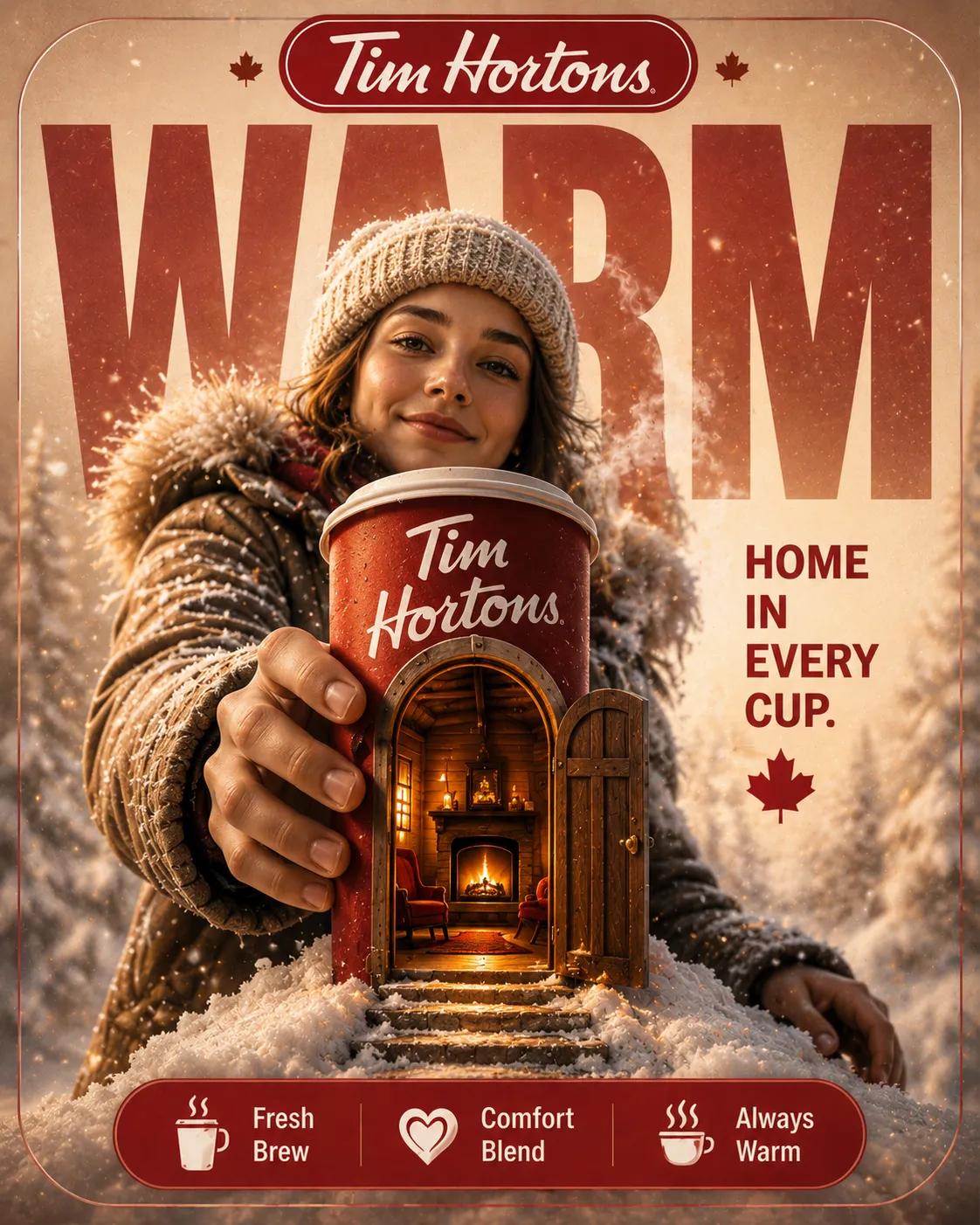
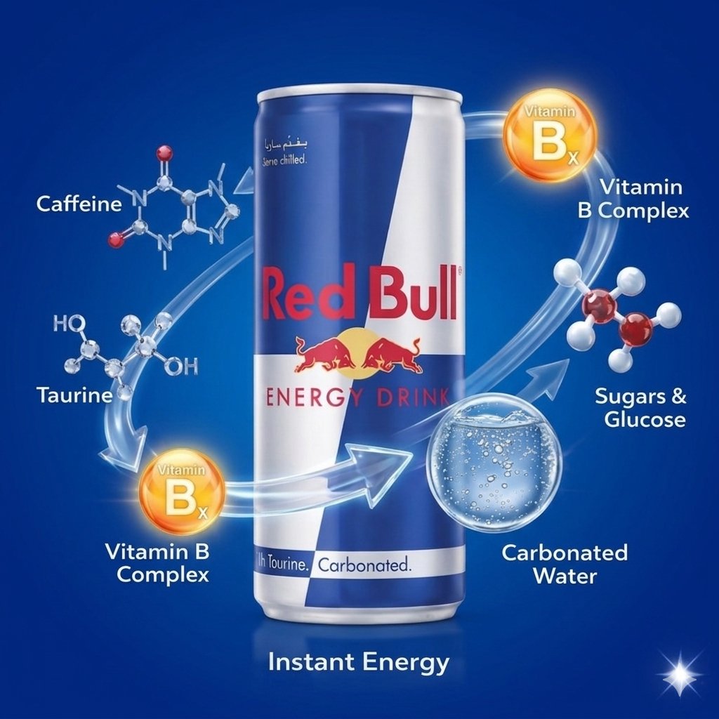
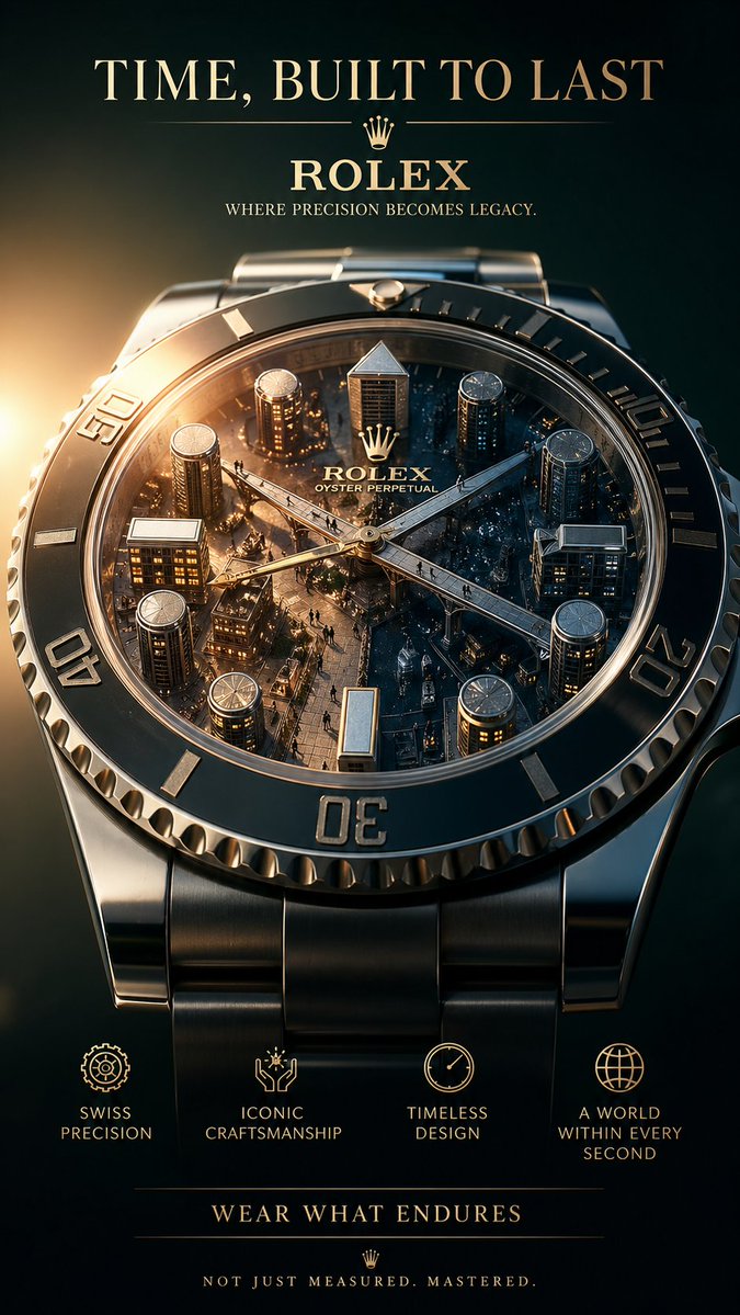
- The clearest style signals here are Poster, Illustration, Character, so those should usually stay in your first rewrite.
- Pay close attention to layout rhythm, headline hierarchy, illustration texture, and how information is staged in the frame.
- This case keeps 2 media outputs, which makes it easier to check whether the style remains stable across multiple results.
How The Prompt Is Structured
- The prompt reads as a long, highly specified prompt, which is useful when you want to judge how much specificity this direction needs.
- Its keyword cluster is centered on Poster, Illustration, Character, so you can usually keep that cluster while swapping subject, camera, layout, or copy details.
- A practical rewrite path is: keep the outcome, keep the strongest style cues, then replace only the subject and environment blocks.
Good Follow-up Questions
- What changes first if you keep Poster, Illustration, Character but switch the subject matter?
- Which part of the result comes from section-level structure (Poster & Illustration) versus tag-level style cues?
- Which related cases in the same section give you a cleaner or more extreme variation of the same direction?
Full Prompt
Apple designer thinking, top-tier poster master thinking, use Takahashi-style thinking to present poster design. Input one or multiple segments of long text. Intelligently understand the text content, no need to copy verbatim. Automatically analyze the user's comprehension process and organize information according to cognitive logic. Extract the text's core value, key knowledge points, central ideas, and highlight views. Present information in the order of human reading and comprehension to let users naturally get the core content. Compress long text into essential content that can be quickly understood within 30-45 seconds. Ensure text is clearly readable in default mobile display mode, with reasonable font size, line spacing, and hierarchy. Use extra-large fonts or key annotations to highlight core information, avoiding lengthy or obscure expressions. Intelligently determine color logic, layout structure, and information hierarchy, ensuring visual breathing space. Flatten user comprehension costs, making information simple and clear, grabbing the main points at a glance. Eliminate comprehension barriers, ensuring readers can quickly grasp the central idea after reading the poster. Do not add extra irrelevant text. Maintain the poster's captivating and striking expressiveness.