Case Media
Case Notes
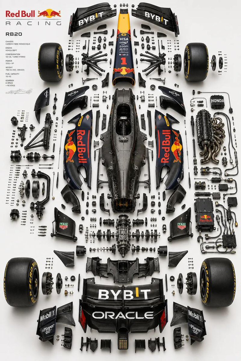
This page keeps the media, full prompt, and original source together so you can inspect the result first and decide whether the prompt is worth copying, saving, or comparing.
Case Insights
To make this page easier to search, cite, and reuse later, the case is also broken down into practical guidance about usage, visual cues, and prompt structure.
Best Fit Scenarios
- Use this as a poster & illustration benchmark when you need a fast style baseline before rewriting your own prompt.
- It is especially helpful if your target overlaps with Poster, Illustration, Typography and you want to judge the image result before tuning wording.
- Keep it as a control sample when you compare nearby prompt variants one variable at a time.
Visual Signals To Notice
- The clearest style signals here are Poster, Illustration, Typography, so those should usually stay in your first rewrite.
- Pay close attention to layout rhythm, headline hierarchy, illustration texture, and how information is staged in the frame.
- This case keeps one primary output, so the first image should be treated as the main visual reference.
How The Prompt Is Structured
- The prompt reads as a medium-detail prompt with clear visual constraints, which is useful when you want to judge how much specificity this direction needs.
- Its keyword cluster is centered on Poster, Illustration, Typography, so you can usually keep that cluster while swapping subject, camera, layout, or copy details.
- A practical rewrite path is: keep the outcome, keep the strongest style cues, then replace only the subject and environment blocks.
Good Follow-up Questions
- What changes first if you keep Poster, Illustration, Typography but switch the subject matter?
- Which part of the result comes from section-level structure (Poster & Illustration) versus tag-level style cues?
- Which related cases in the same section give you a cleaner or more extreme variation of the same direction?
Full Prompt
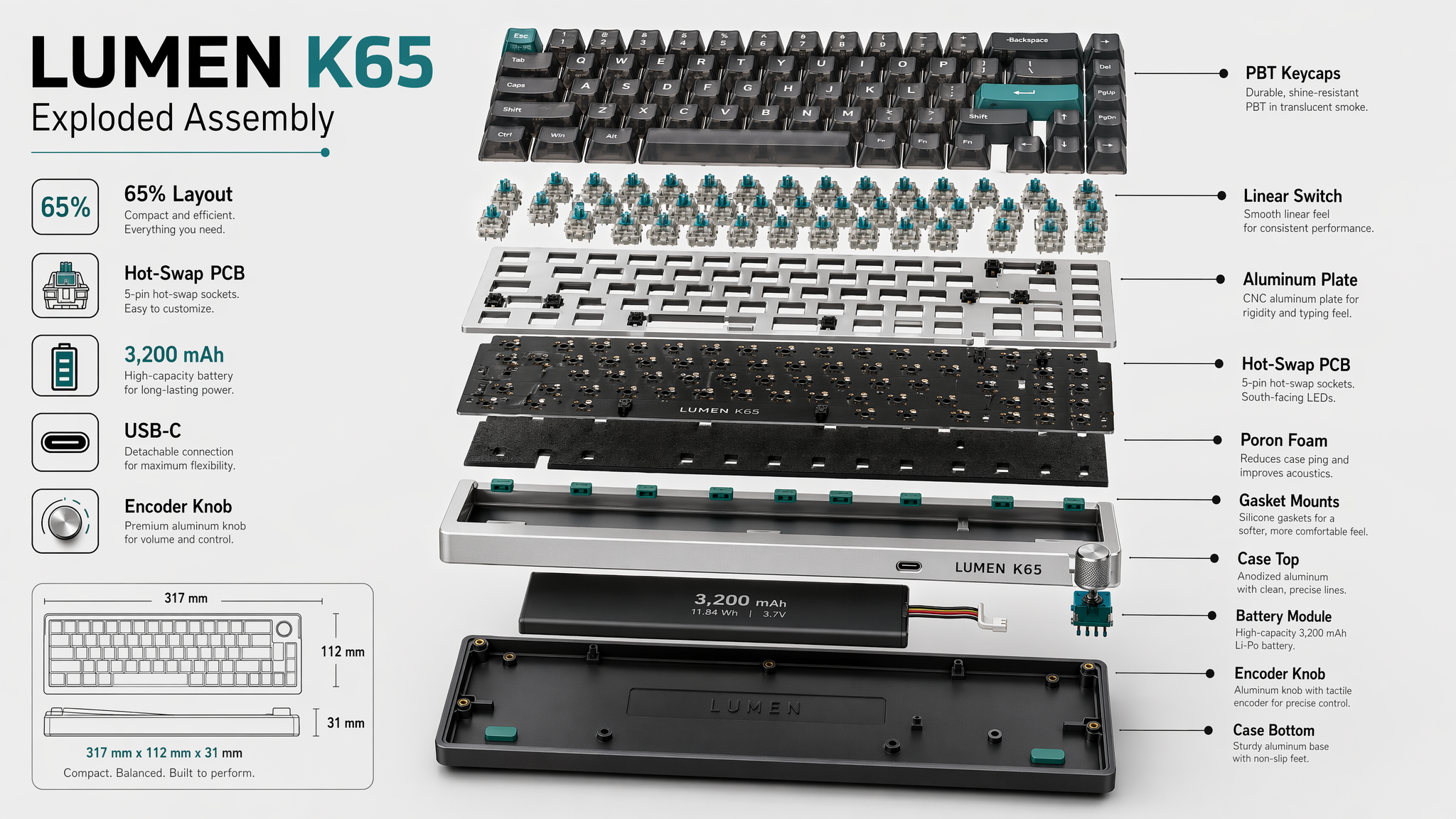
Design a crisp exploded-view product illustration of a custom mechanical keyboard named LUMEN K65, shown in three-quarter perspective on a pale gray background with subtle shadow. Separate the layers clearly: keycaps, switches, plate, PCB, foam, gasket mounts, case top, battery module, rotary knob, and case bottom. Use anodized silver, matte black, translucent smoke keycaps, and small teal accent parts. Add clean technical callouts and in-image text reading "LUMEN K65", "Exploded Assembly", "65% Layout", "Hot-Swap PCB", and "3,200 mAh". Include labels for "PBT Keycaps", "Linear Switch", "Aluminum Plate", "Poron Foam", "USB-C", and "Encoder Knob". Show a compact dimension note "317 mm x 112 mm x 31 mm". The composition should feel like an industrial design presentation board: precise spacing, realistic materials, sharp typography, correct labels, and highly legible component hierarchy.